~~~~~~~~~~~~~~~~~~~~~~~~~~~~~~~~~~~~~~~~~~~~~~~~~~~~~~~~~~~~~~~~~~~~~~~~~~~~~~~~~~~~~~~~~~~~~~~~~~~~~~~~~~~~~~~~~~~~~~~~~~~~~~~~~~~~

Some landing page dos and don’ts

As I’m working on the first landing page version for Thymer, I thought I’d write a bit about some observations about what (not) to include.

The H1

The H1, i.e. the main title, named after the <h1> HTML element for a large title. This is the elevator pitch when you only have one floor to explain. You have 5 seconds to prevent someone from closing the browser tab. What are you doing?

You need to come up with a way to explain your product in just a few words. No need to cram all the details in one sentence, but just say what it is so someone who is in your target audience might care enough about it not to close their browser.

❌ Use fuzzy language, such as “We deliver results and synergize your business”. I have no idea what that even means. Generic things like “Work better together” or “Market faster” sound more specific (oh it’s about productivity or it’s about marketing!), but that still mostly works if you’re a big startup. Actually I’m quite sure it doesn’t work, but at a certain size it just doesn’t really matter any more what your H1 is. Be more specific than that.
✅ Use your own voice. Read the title out loud. If that sounds super awkward and you wouldn’t use that in a conversation to explain it to a friend, try picking something which sounds more… human.

A good call (to action)

The call to action or CTA is the main action you want the visitor of the page to take. Something like “start a trial” or “sign up for the mailing list”.

✅ Make it easy to find, and prevent too many distractions pointing the user somewhere else.
✅ Make it easy to do. If you just want to collect an email address for users who are interested in your product, don’t create a link “sign up” to a new page where users need to fill out a form. Add an input with a button next to it on the page and remove all the friction.
✅ Think about the simplest action you really need. If you want people to sign up for your service, don’t make it “Contact us”, let them try the service!

Answer concerns

Ideally you should answer any concerns a visitor/potential customer might have before they even have time to worry about it.

When you’ve bought something online (either a product or service) from a company you didn’t order with before, you have probably tried to do a bit of research about them. Can I trust them? Will they actually ship the product? Can I trust them with my data?

Don’t make people search for this. They will want to know the answer anyway, and if you don’t provide it, they’ll leave your site and search for it (and might not come back). Especially in a market which is as impersonal as software, it helps to know the faces behind the product.

Depending on the stage of your product, the questions users might have are different. The security features of your data center are not relevant when collecting email addresses for a prototype, but you need to include those details when you’re selling to larger companies. Think about the kind of person your visitor is. What are they thinking, what are their concerns? Answer them before they worry about it.

Bonus don’ts

Ending with a few don’ts which I’m personally not a fan of, so I’m trying to convince people to stop these 🙂

❌ Tracking! Nobody likes to be tracked. And thanks to GDPR and friends, tracking now also has a real cost (next to making your site slow!). You can simply collect some simple anonymized traffic statistics using privacy-first analytics services.
❌ Obsessive A/B testing. Related to the previous point, but if you don’t have large amounts of traffics, it’s just not needed. It won’t be statistically relevant.
Cookie banners. Just make it stop! Luckily, if you don’t track, you don’t need them 🙂

More UI mockups

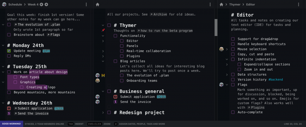
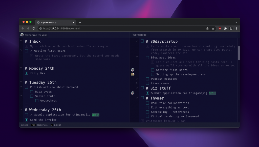
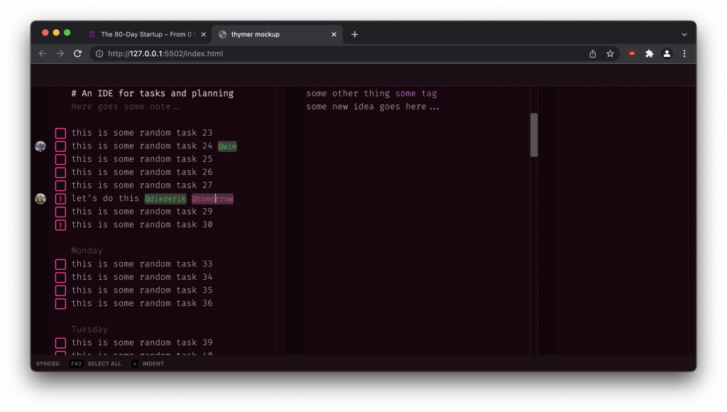
A quick update entry again on how the work on the user interface mockups is progressing. I spent most of the day pushing pixels again: designing and redesigning.

Obviously it’s still just a starting point, and a demo screenshot won’t be able to fully show what the product can do anyway (plus we’ll still need to figure out a lot of parts as we build it). For now, we only need to give a general impression of how the product works to support the pitch for our solution and as a starting point for the implementation.

Some elements which are visible now are the “real editor” aspect (selection, cursor), having multiple panels, mixing notes and tasks, task flags, linking, scheduling and assigning, indentation.

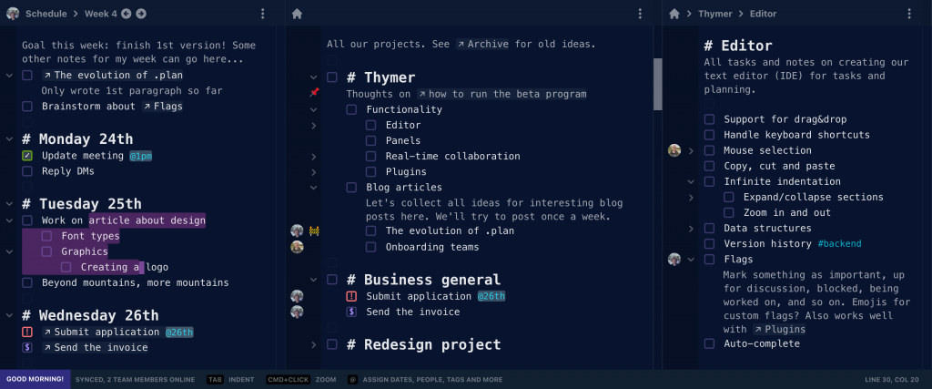
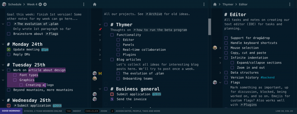
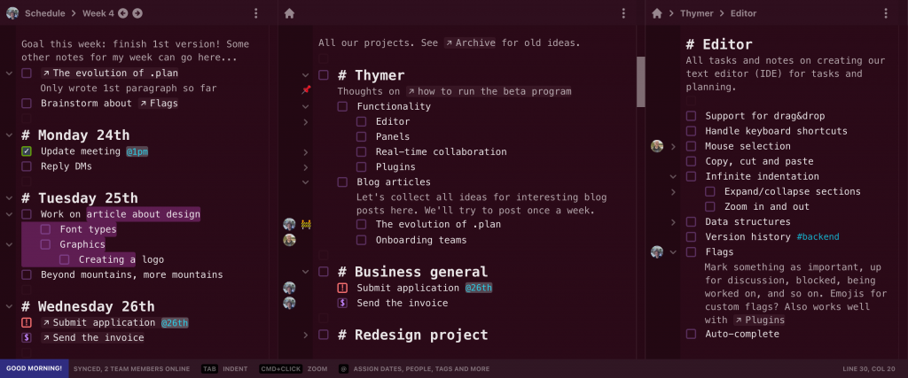
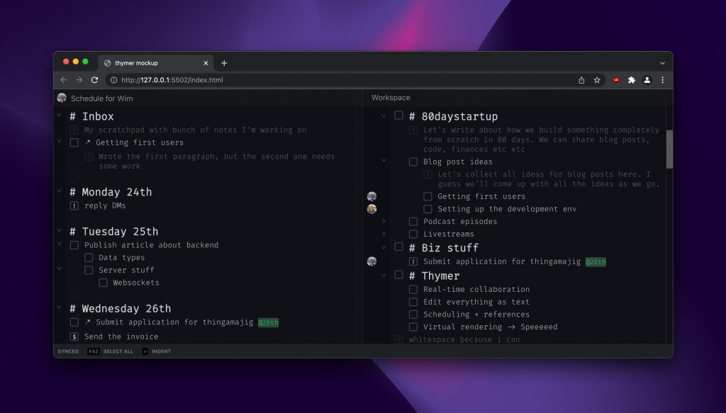
We like the idea of personal computing to be reflected in software. Especially workflows related to todos, thoughts and planning are very personal, so we’ll also allow for custom color themes, plugins and so on. As an example I tried styling the elements in some different colors.

Hopefully we get to finish the landing page tomorrow!

Metal with a sprinkle of cloud: our CALM server stack

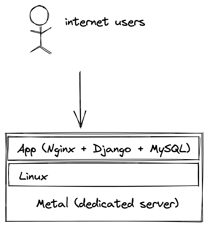
Which stack to pick is a recurring topic, and we’re big believers in how dedicated hardware [1] is (still!) a great option, especially for bootstrapped (SaaS) startups.

A few people pointed out we use a few cloud services as well, so which is it, cloud or metal? And what exactly does our favorite stack look like then?

I like to call our stack CALM. The purpose of CALM is in the name: we want the most bang for buck while keeping things simple and boring. We’re a tiny team and want our SaaS to scale to many customers (potentially millions of users) without having to worry about complexity and cost. Let’s look at the different parts:

1U ought to be enough for anybody!

If you’re puzzled by the “one machine” part: yes, that’s how ridiculously cheap and powerful metal is these days.

For ~$150/month you can get an absolute beast of a machine, with 128GB of RAM, 2 TB SSDs and dozens of 5Ghz cores. You don’t pay for each byte of traffic, each cycle of CPU or a few GBs extra of RAM. It makes tiny cloud compute nodes look like a toy. It’s powerful enough you can run everything on one machine for a long while, so your architecture becomes super simple as this point. When things start to grow further, we’ll have plenty of RAM to cache queries and dynamic parts of the app.

Sprinkle on the cloud!

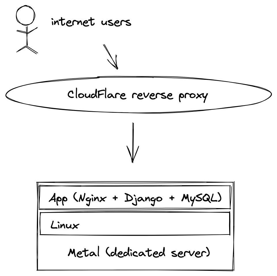
This already is enough to handle many thousands of users, no problem. But to make this even more robust, this is where we like to sprinkle a bit of cloud on top:

By using CloudFlare as a reverse proxy, we significantly reduce the number of requests which hit our server. It’s literally set and forget. We set up the CloudFlare proxy in their dashboard and firewall everything else off. It doesn’t add any real complexity to our stack. And it’s cheap (even free for what we need). We can cache and serve static assets from CloudFlare from a location close to the user. There’s really a lot of traffic you can serve this way.

Reliability through simplicity

Servers these days are super reliable. I like to compare it to ETOPS for planes. You no longer need 4 clunky engines, if you use new hardware.

By design, the entire stack has very few moving parts. It’s easier to set up, simpler to maintain, and cheap. The more parts, the more can break. No 3am magic automatic migrations, noisy neighbors, billing alerts, or having to refactor your app because some inefficient query is eating up all your profits in cloud costs, none of it.

Another advantage is that a small dev VM on our laptop can mirror the entire architecture, so even if we want to make changes to the server set up (which we hardly ever do), we can test the exact thing on our laptop.

We’ve never had significant outages but of course, catastrophe can always strike, and that’s a fair point (and the cloud is not immune to these either!). You can find examples of an OVH datacenter literally catching fire. It’s very rare, but we want to be prepared!

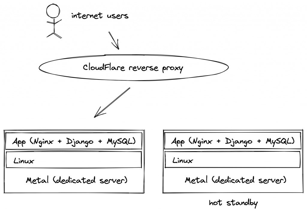
When starting out we simply stored a backup of the entire server at a different location (again, cloud sprinkled on top). That’s OK, but in a worst case disaster we would have to spend half a day to restore things, which isn’t very calm. Because servers are so cheap, we’ve now simply added a completely identical mirror as hot standby in a datacenter in a different part of the world.

If something goes terribly wrong, we simply point the DNS to the other server. And in an even worse case we could even completely switch hosting providers and move our entire architecture somewhere else (not that we’ve ever had to deal with problems like these).

CALM

So there we have it, our CALM stack: Cloudflare (or other CDN/proxy) -> App -> Linux -> Metal.

Of course, some percentage of startups is going to have special requirements (petabytes of storage, 99.99999% uptime) and this won’t work for everyone. But when your database is only a hundred gigabyte or so and the whole thing fits into RAM, you don’t need to worry about “big data” problems. Similarly, lots of websites and apps can get away with a minute downtime per month (if that happens at all).

It will be a long time before we outgrow this architecture, which only costs about $500/month, and that means we can worry about the product and customers instead.

[1] Earlier this week, we wrote about how You Don’t Need The Cloud.

Work on the landing page

Today I spent a lot of time trying out different copy, layouts and designs for a landing page.

On the one hand we don’t want to spend too much time on it, and we’ll be updating the page anyway as we build the actual product (the screenshots are only mockups after all). We do need to make sure though that it’s something which is good enough so people get an idea of what we’re building are interested in giving it a try.

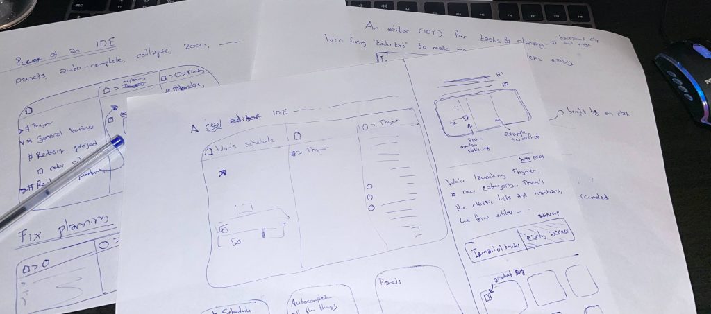
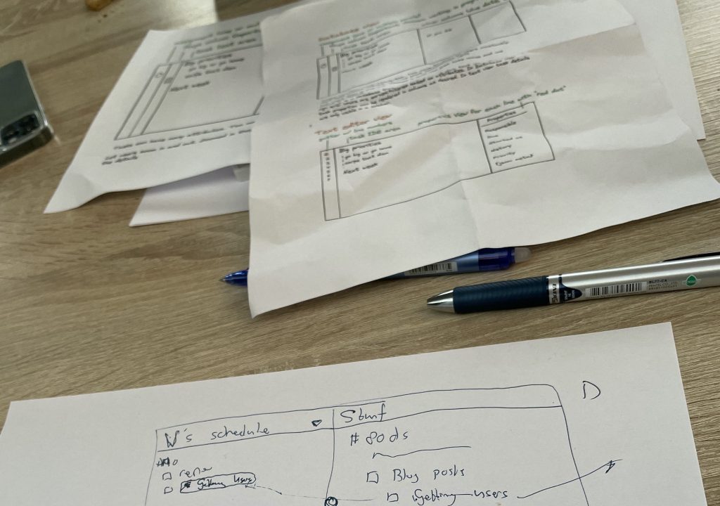
I usually start with trying out different layouts on paper, to sketch out the “shape” of the site. In this case, I was thinking of several parts:

  • A catchy heading, describing in a few words what the product is. You often see things like “work better together“, or “we support your business!“, but that doesn’t tell you anything. Same goes for trying to explain what it is in a few paragraphs of text. If you need that much explanation, your vision for the product isn’t clear enough yet. It’s fine to do some long-form “pitch” after the headline of course. It’s also OK if not everybody understands it, as long as the audience we think would be interested initially gets it right away.
  • A screenshot to “demo” the product. We don’t really have a product yet, so this will be a mockup of what the UI could look like. I’m also trying to come up with good examples of what to show in the screenshot itself. Something our audience understands, relates to, and might need the product for themselves. It also helps to sneak in some easter eggs or jokes here and there which our audience would recognize.
  • A form where people can leave their email address to sign up for early access. Probably in the form of a private beta, but we haven’t really decided about that yet.
  • A few more details of the benefits we think this solution has.

After the paper sketches, I tried to come up with an initial draft version in HTML and CSS. It’s nice if the part above the fold pops a bit to catch people’s attention. It also prevents the page from feeling bland, even if we keep the rest of the page very minimal for now. I tried dozens of combinations, but here a few examples:

It’s a very slow process at first, but usually the pieces start falling into place once a few of these main parts are done. Hopefully more to show by the end of tomorrow!

Your MVP needs to Spark Joy

It’s common startup wisdom to launch as soon as possible and be slightly embarrassed [1] about the first version.

I often see new launches where people take this advice too literally, as if any kind of polish is premature optimization. The hard part of course is knowing what the M in Minimal Viable Product really is: what parts can I leave out? There are certain things you can be embarrassed about, yes, but some things need to be really good about it.

I almost never see an MVP take off for which the core experience is not super polished. It’s more than polish actually. Something about it sparks joy, is delightful or whimsical. You want to tell others about the great experience you had.

You need initial super fans for your product to take off. Yes there are a few exceptional idea planets which have such low escape velocity that any solution goes, but most ideas are about execution. Indifference about your solution is the enemy of a new product, so you need to make an impression and stand out.

It’s embarrassing to ship your product without a password reset. It’s embarrassing to ship a smartphone without copy&paste [2]. But none of those things matter. They’re not what makes you unique, they don’t define the experience. You can get initial fans without.

You need your own version of completely useless but cool animations [3], rubber band scrolling [4], handwritten post cards to first customers or even whoopee cushions and light shows [5], or a funny demo video [6]. This is what gets press and what people tell their friends about.

Put in the creative work to make your MVP stand out in such a way that you attract initial fans. It doesn’t even need to be a lot of work, and especially for technical founders this is the kind of marketing that should be fun. Turn those early adopters into fans, and make the first impression of your product really great. Worry about the long tail feature stuff later, but at least some people need to think “wow this is cool”. That’s what’s part of the M in MVP to me.

[1] https://twitter.com/reidhoffman/status/847142924240379904

[2] https://www.engadget.com/2009-03-17-iphone-finally-gets-copy-and-paste.html

[3] https://www.youtube.com/watch?v=2GkoAa5718Y&t=113s. I could watch this all day.

[4] https://www.youtube.com/watch?v=FSv5x3V_KHY

[5] https://www.youtube.com/watch?v=Xg_0NRi-OxE

[6] https://www.youtube.com/watch?v=7QmCUDHpNzE

Designing the app part 1: sketches & mockups

Today we’re working on more sketches for the design of Thymer (👉 What are we going to build).

As I mentioned yesterday, the goal of sketching what the app should look like is to refine our thoughts on how everything should work, and to get a preview ready for the initial marketing/landing page.

Hopefully we’ll be able to get the landing page done within the next few days. I see it as the trailer of a movie. We need it to build an audience before the actual launch and to gauge the initial response. And to stay with movie analogies, the initial preview we post will be just a like a set: there’s no need yet to build a real street with real houses, just the facade.

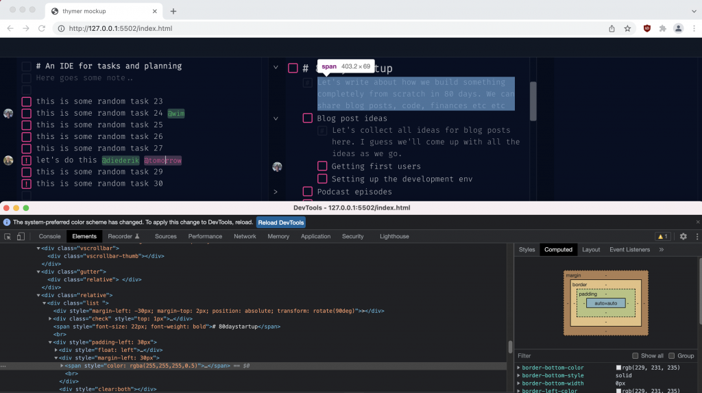
Working on all the sketches also helps to expose a lot of hidden additional design decisions we need to make. Even though it’s just a mockup screenshot, we’re making a lot of mini design decisions already. It doesn’t look like much on the screenshot, but we’ve had to think about how to deal with indentation, how task attributes work when you can edit everything in plain text, scheduling vs due dates, assigning responsibilities, and so on. We’ll revisit some of these topics in the coming weeks and explain how they work when we build them out.

As for creating those mockups, my two tools of choice are good ol’ pen+paper and creating a plain HTML file with CSS. It’s just fast to iterate this way, and using tools like the browser’s Inspect Element lets you quickly try out different colors and so on. The earlier in the design process, the simpler the tool I prefer so it’s easy to try out different approaches and throw things out.

Mockups

Worked on a few mockups today, trying out different layouts, color themes and components in CSS and HTML. The goal is to eventually settle on a first version of the design for the app, which we can use as a preview for the landing/marketing page. While designing all the different components, we hopefully also get a better idea of the exact details of how the app should work, before we actually build all those parts.

All in all not too much to show today. When I try out different designs I usually delete more than I save, that’s part of the process (we’ll upload some more of the deleted parts later as well to get an idea of how the design has progressed).

Example of a very rough sketch to test out some layouts in HTML

More livecoding

After working on some marketing yesterday, it was time for a bit more prototyping of the app today. At this stage we’re not coding the full functionality of the app yet, but we want to check if certain techniques we had in mind work well or if we need to go back to the drawing board even before we begin.

We’ll try a few of these components and meanwhile start working on some design drafts, so we can create some initial mockups + “screenshots” for our landing/marketing page, and collect an initial list of users interested in a private beta/early access.

If you’re interested in some coding and behind-the-scenes, you can find the latest livestream on Twitch (update: now on YouTube):

Initial marketing plan

Now that we know what we’re going to build, we need a way to reach our initial target audience and find some first “fans” who are willing to try the product.

First we need to determine the target audience. Our app is going to be a very horizontal product, which can make it easier to grow (lots of potential users) but harder to start (it’s very general and we need to know how to reach the very first people to get started). Step one is to think of people who could be our initial fans.

As we wrote about here, we picked something we would use ourselves on purpose, so we know the problem and we can try to reach people like us. Let’s say we look for “busy people who create todo.txt files”. Makers/creatives/startups would fall in that category and are most like us, so easiest to find. Another niche category we can probably find online is people writing about things like productivity, GTD, journaling and so on.

We’ll start creating a list of places to find the audience. Some places we can look are:

  • Twitter
  • Subreddits
  • Forums
  • Discords
  • YouTube channels
  • ProductHunt

We can use good ol’ Google, Twitter search and tools like https://thehiveindex.com to find relevant pages. Once we know where to look, we can do a few things to get the word out:

  • Be helpful and answer questions people have to get followers. This is easy and fun, but slow.
  • Directly post what we’re working on and ask feedback (on some places this is actively encouraged, others you have to be careful not to come across as spammy).
  • Search for messages where people talk about the problem or related products in the space, and reply to ask a question, or if they would be interested in our idea (examples are Twitter threads, DMs on Reddit/Forums, etc.)

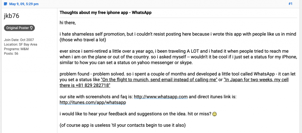
Especially the last two can feel awkward because it’s a cold outreach of sorts, and they have the biggest chance of resulting in negative reactions (rejection!), or no reaction at all. That’s all just part of the journey though, at some point you need to tell people you exist. Just a random example, look at how a tiny app called WhatsApp posted like this in 2009: https://www.flyertalk.com/forum/travel-technology/952359-thoughts-about-my-free-iphone-app-whatsapp.html

And of course in many cases feedback will also be very positive and people actually like to discover new cool things.

While finding all those users, we also need to tell them what we’re building and point somewhere to our product. For this we need to create a proper landing page. To get people excited about the product, we want the landing page to do a few things:

  • Explain what we’re building
  • Show a little demo video or nice screenshot (we’d let people demo the app if possible, but we don’t have an app yet)
  • Offer something like early access, a private beta or even accept pre-sales. Ask for a way to contact them so we can email them when we launch.

Sometimes a landing page can just be some text explaining what you’re doing. In case of our app, which is in a busy space, it’s probably necessary to showcase a bit of the app itself (like a compelling demo, to show how it sets itself apart from all the other products). To do this, we need to do a bit of prototyping over the coming days, and create a pre-MVP. We don’t need something people can use yet, but at least some sort of (design) mockup for a “screenshot” or video, to show the vision behind the idea.

In parallel, we’ll continue building everything in public and share our startup lessons. We would do this anyway of course as that’s the point of the 80daystartup, but there will also be some overlap with the target audience for the app, so this too might result in more users for our launch list.

We’ll then need to keep building to create the first minimum viable version of the product (focusing on the core features), while we keep posting, replying and doing “mini launches” up to the official launch day itself.

All of this is a very manual process at the beginning. The aim is to find ways to grow faster organically once we have some first initial fans.

Recap Week #1!

We started the 80-day startup one week ago, so time for a recap!

The past week was like pouring a foundation of sorts. Much of what we’ve started isn’t really visible yet, but we’ve decided on what (and why) we’re going to build so that the actual building and marketing can begin. Some important decisions and topics we wrote about were:

The idea

As we discussed on Day 3, we’re going to build Thymer: an editor (IDE), but for tasks and planning. We want to solve the problem we keep ending up with todo.txt files because it’s way faster to type out thoughts that way. It just doesn’t scale well, there’s no structure and doesn’t work in teams. We believe an editor specifically tailored to tasks and planning would be the best of both worlds. Productivity is a very busy space, but we think it would be a novel approach compared to classic todo lists and Kanban-style apps. And as a nice bonus it fits the 80-day startup well in terms of topics we’d cover!

What’s next

As we wrote in the initial stages of a SaaS product, we’re now moving on from the Idea phase to the Prototype phase. We’ll start to work out the exact details and prototype parts of the product, while we come up with a way to find some initial users in our target audience who might be interested in the product.

As a preview of some of the technical prototyping for the coming days, we livestreamed some initial coding we did today.

Links

As always you can view all topics we’ve written about so far at https://80daystartup.com/topics/.

We also decided this was a good time to finally start using Twitter. You can follow Diederik at https://twitter.com/jdvhouten/ and Wim at https://twitter.com/wcools/ (Wim’s livestream is at https://www.twitch.tv/wcools/).

~

Thanks for following our story! Let us know on Twitter or at [email protected] if you have any questions or topics you would like us to cover 🙂