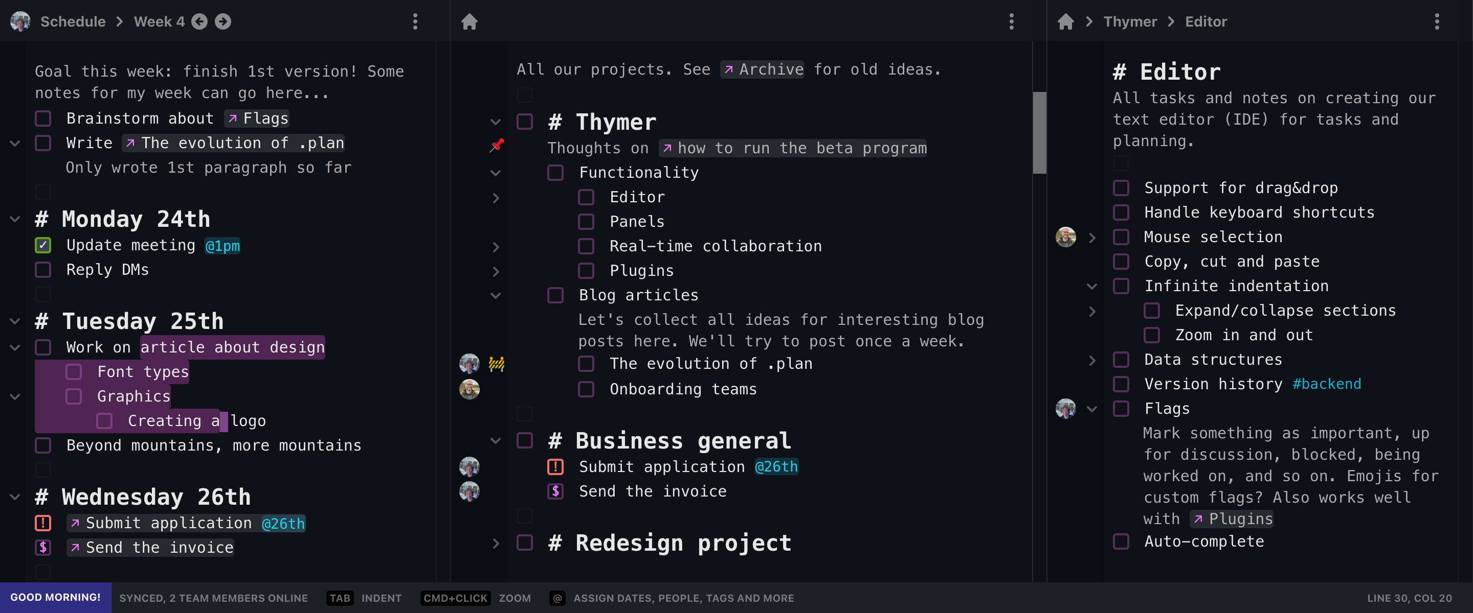
Although we haven’t done much marketing for Thymer.com yet, we are getting a steady trickle of new email signups for the private beta. It doesn’t prove that we’re on the right track with Thymer, but it suggests that that there are at least some people who want to try an app that looks something like this:

The big trend in web design in the last decade has been towards simplicity: bigger fonts, more whitespace, more visuals, mobile first, and fewer buttons. With Thymer we are heading in the opposite direction. Thymer is keyboard focused, information dense, programmable, and feature rich.
I get why the trend is towards the simplest possible apps. Simple apps are easy to make and easy to support. And the world is huge so there is always demand for apps that get the basics right. Apps like these can look brilliant during the first 30 minutes, and then you run into the first limitation. Soon after into the second one. Then you wish that you could see more of your stuff, but you can’t. These apps are made primarily for mobile devices and on a big screen you just get more whitespace. You want to do some bulk actions, but that’s unwieldy or impossible. Even productivity apps have followed the trend where usability is sacrificed for visual appeal. It makes perfect sense, though, because it’s screenshots that sell your app, and dense apps look intimidating.
We’re taking a big risk by running counter to the trend. We know that there are many programmers who love apps that look like Thymer. The runaway successes of Sublime Text and VSCode are proof of that. Our hope, still unsubstantiated, is that there is a much larger group of people out there — not just programmers — who want a productivity/planning app that’s designed like an IDE. People who aren’t familiar yet with something like a Command Palette, but who are willing to try something new.
Design trends change. First skeuomorphism was cool, then flat design was the only game in town. Maybe, in the future people will demand apps that are simple on the surface but not at the expense of functionality. A new trend towards text-first interfaces for applications that are mainly about text, perhaps.
We’re deep into code now. A good deal of plumbing left to finish before we have something that resembles a buggy prototype. Then we finally have something substantial to show people and then we can ask people on the beta email list and here on 80daystartup what they think and what kind of features they would like to see. For me this is one of the most exciting parts of building a new product. Ideas that started as sketches on napkins and pizza boxes slowly start to take shape.

