Just like it’s easiest to come up with a product idea by solving your own problem, the best way of figuring out how it should work is by dogfooding, i.e. using your own product.
For some of the problems we want to fix with Thymer it’s very clear how the app should work and solve them. These are things we’re currently trying to do with a plain text editor but don’t work well. In a way, the workarounds we’re using now because the app doesn’t exist yet are a sort of pre-MVP prototype, giving us plenty of ideas to work with.
For some elements of the app, we know what problem it should solve, but we don’t know yet if a solution we came up with on paper (literally, as a paper sketch is usually the first step) works really well. That’s where it’s helpful to build small prototypes to bring the idea to to life.
It doesn’t need to be complete yet, but just enough so we can actually start using these parts of the product and see if this matches the experience we had in mind. Over time a product will change a lot anyway, but making sure the core works really well by using it ourselves helps getting an MVP out with enough initial fans to get more feedback where to improve in the first place.
It’s not always possible to dogfood every aspect of the app yourself. Our existing product for example is used by companies 100x our size. In this case it’s still important to test the app, using a sort of test persona, i.e. trying to think like the end-user and about what their workflow might be. Another useful tool is populating the app with test data. If we’re a team of two and only have two items in a list, but our target audience persona works at a company of 100, what happens if we add a 100 items? Usually this goes a long way towards fixing the most obvious problems.
Thinking about these UX/UI issues from the beginning can feel like premature optimization, and of course launching a new product is always a bet in a way. But simply sitting back and waiting for feedback to roll in is not without risks. If an MVP doesn’t feel polished enough in the right places, users might drop off before you get to hear about these issues. Another problem is that fundamental design decisions regarding the very core of the app are very costly to fix. To take the example of our existing product again, we originally shipped with a permission system which was too complicated when teams had dozens or hundreds of users, and those are our best customers! As you can imagine, permissions touched pretty much every part of the app, so we could have saved a lot of time getting this right from the beginning and not having to change it later on.
You can usually tell when products or services aren’t really used by those who designed it. They’re often confusing or come with very obvious mistakes, which everyone would run into it, if only it was used enough. The same is true for individual features within an app. That’s why we try to avoid having too many core features we can’t dogfood ourselves.
Sometimes you’ve thought a design over many times, made a bunch of sketches and think you have a clear idea about how everything works. But sketches and prototypes are very rough by design, so it’s easy to look at the same sketch in different ways, or discover some parts of the concept need more work when you start working on the nitty gritty details.
Although everything about a startup and launching an MVP shouts “ship ASAP! ship yesterday!”, quite often taking the extra time to think things over a bit more helps making sure you take the right turn, which saves a lot of time down the road.
Today we spent most of the day meeting and going back to the drawing board about some design decisions for Thymer’s core features.
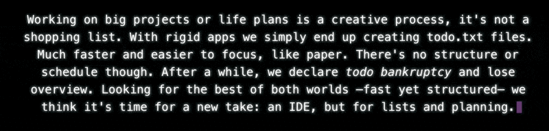
Having worked on the app a bit more by now, what features do we really find important? How do we keep the scope for V1 small? How do we balance the fine line between making a product too narrow to be useful, or making it too broad so it automatically gravitates towards becoming a platform with unlimited scope. The USP of Thymer is it’s a powerful IDE for people to get things done. Part of the “internal USP” of this product is that it won’t take years and VC funding to build. We need to make both of them work.
One feature we talked about for example is related to dates. Thymer has some notion of dates, which is important for planning. Not doing the “hard work”, actually thinking through what this means and how it should work, most often leads to the wrong solution by default: the one easiest to come up with and hardest to make.
In this example, that would be a calendar. But jotting down some thoughts on what to work on tomorrow is different from a tool where people schedule an appointment with multiple participants using a start time in timezone A and an end time in timezone B. It’s not Google Calendar, which is a completely different product in and by itself. Not only would building all of that be way too much work, it would offer nothing new, and it would make the product less interesting, watering down the vision.
So we looked at how the concept of dates within the scope of the app is actually useful, what parts you need, what parts you don’t. In what way it wouldn’t conflict with using other tools like an existing calendar on the side.
In terms of scope we also looked at some other features we most likely won’t be able to build in V1. For example, in the case of end-to-end encryption (E2EE), we need to make sure that we don’t take decisions now which will rule out being able to encrypt data on the client. Another example was mobile access. Although we can’t launch a dedicated mobile app when we launch V1, we thought about whether a companion mobile version, just covering the most important use cases for on the road, would be compatible with our idea of the core version of the app.
We made good progress refining the vision today. Really look forward to launching V1, but there’s also still a lot left to build!
We’ve been working on a bunch more UI components the past two weeks. They’re all part of the core for the MVP for Thymer, but one thing we won’t have time to look at before the launch is making these work on smaller devices like phones.
Part of the process of building an MVP is that we inevitably have to say no to things we really care about. In our case one such aspect is starting with just one platform: the desktop (specifically the web). The first version will be unapologetically desktop-only.
The USP of Thymer is that it works like an editor/IDE. As planning and brainstorming are creative processes, we think being able to simply type, select, copy/paste and change your ideas or schedule as if it was text is a big boost in productivity.
We want to solve this one problem really well. In our case, the UI really matters. If we decide to build something for desktop, iPhones, iPads, Android watches etc etc from the get-go however, not only will we take forever to launch, but we’ll need to take shortcuts at some point to launch at all.
One such approach of building for all platforms at the same time is by building something which is mobile-first. But mobile-first is all-the-rest-last. Instead of coming up with the solution we think is best and then building that, we’ll end up shoehorning a toy UI onto the desktop just to match the constraints of a mobile device.
Of course not having a mobile app from day one is far from ideal. We all work on the road from time to time on our mobile phones. Yet a lot of the real creative work we’re building Thymer for gets done behind a laptop or something else with a keyboard and mouse/touchpad. To solve that problem really well, we think it’s worth delaying some sort of solution to work on a mobile for a while.
So we have the choice: hack something mediocre together for the launch as quickly as possible that works on all platforms, but is perfect for none. Or build exactly what we envision, but start with one platform.
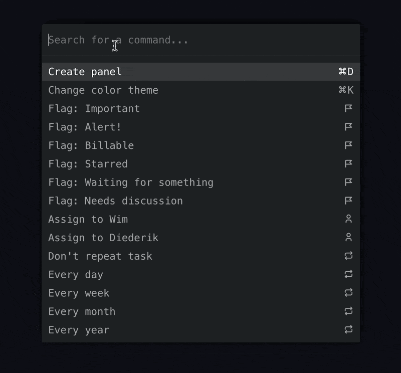
Some of the components we’ve worked on the last two weeks: panels and a command palette. UI components we think will be super productive on desktop.
These choices are hard to make when you need to decide what to launch with. In the end it’s better to start with making something smaller in scope but which you think is really great. We need those initial fans who really like the solution we’re building to get off the ground. With some cross-platform responsive app approach we can’t build the kind of editor we want, and it will just look like all the rest.
Once we know people really like the concept, we can look into options to make it easier to work on the road. Because of the way the app works in the backend, it will be quite easy to add offline support so it’s no problem to keep working on your laptop on a long flight. As for mobile, we’ll still have to look into that later.
Because we want to create the best experience we can for desktop without the constraints of it needing to work on mobile, it will most likely be a completely separate app (although we can reuse the API/backend of course). That way we can design the other way around, too: come up with the best possible user interface controls for mobile, without having to stick to desktop concepts. Plus this might make it easier for us to outsource work on the app for a specific platform if we want to go that route.
We also kind of like the idea of a “companion app”. A smaller version specifically designed for mobile use. Rather than cloning every exact feature from the desktop version for mobile, we add just the things you might need most on the road and make those very easy to use. Like looking something up or quickly jotting a thought down which you can then work on once you’re in front of a laptop again.
But all of that is for later. We first want to focus on building something great for just one platform and see if people like the idea in the first place.
When working on a product, you spend a lot of hours building and refining. Everything about your startup feels important when you’re so invested. It’s easy to project this feeling onto your customer: you’ve created such as beautiful service, of course they won’t mind having to spend their precious time to use it!
Of course that’s not how it works, and customers just want to use your app or service and get on with their day. Every hoop they need to jump through is a reason to close your website or churn.
Some examples where I think it’s really easy to improve a workflow with almost no effort:
Login == password reset Why do I need an account, set up a password, and so on? I see this a lot with websites you hardly need to use anyway, like online stores where you order from once a year. Before you can check out, you need to set up another account.
As a user I’m going to have to track yet another password or create an entry in a password manager (and not everyone has one, and certainly not one where it takes zero time to use it across all devices). If you’re the owner of a service, you’re probably logged in all the time, but for many of your users the next time they return they won’t remember anything about their account.
So they use password reset. Which is exactly the same as if you would have only asked for their email address in the first place, rather than a “Register new account” form. Much simpler to build, much simpler check out process for the user. And next time they can still use their email address to get a link to access their previous orders (or just opt out of the process altogether, if they don’t want their email stored).
Auth links in support emails I recently had to go through the process of updating my credit card details for a bunch of services. This is another workflow where services can easily reduce churn and friction for their users.
For example, if your app sends out a notification email to remind users to update their card details, why not include a link that takes them right to the form to do it?
It’s such a small change, but in my case there were plenty of services where I had to spend time to find out how to pay them! The number of users churning on this is going to be larger than zero for sure.
And again, if you include a link, add some sort of one-use auth code to the email for the update form, so I don’t need to go through the whole password reset again.. just to receive another email with the actual code.
Inviting team members As we’re developing a web app which can be used in teams, one piece of functionality we need to add is a way to add other users to a workspace.
The way it works is fairly standard. You typically add one or more email addresses and click a button called something like “Invite to Workspace”. With our existing app, we’ve gone through many iterations over time, to make it easier and better based on the feedback from our customers. For example, we allowed admins to include a custom message to the invitation emails. Then we allowed admins to resend the invitation, in case people missed it. Then people wanted to change the subject. Or the template itself. If it’s possible for us to send the email from their company’s email domain? Then some asked if everyone on a specific domain name could be invited all at once.
The obvious solution here is to just make it much simpler and remove all the friction: just generate an invitation link and let admins send it any way they want. They can send it to a user, through a text message, to their entire mailing list, whatever they want. With exactly the text they want to onboard the users, with their logo and from their domain, and as often as they like.
With many of these workflows, it turns out that the best solution is both more convenient for your users, removes a lot of friction, and is much faster to build, too. Win-win-win.
The number one priority right now is to get the first version of our product out as soon as possible.
One advantage of time or budget constraints is that it forces you to really think about what the focus should be of your product. Spending a bit of extra time at the beginning to think about how you can simplify the product and reduce the scope saves a lot of time in the long run. The “If I had more time, I would have written a shorter letter” quote is applicable to code, UI, product and marketing as well.
The most obvious way to ship faster is to build less.
Every line of code we’re adding to the product is code we might not have needed in the first place. Maybe certain ideas won’t work out and we need to scrap them later. Or maybe nobody cares about the product in the first place. If the product does take off, we need to maintain all of it. It’s much harder to remove features than it is to add them, in terms of keeping users happy.
This is not the time for premature optimization in our code or being architecture astronauts: we need to ship. That said, spending a bit of time sketching out what screens should roughly look like helps us identity places for re-use.
For example, one of the main components for Thymer will be the editor. On top of that, we also want people to be able to schedule their tasks. If we would dive right in without thinking these features through, we might end up building two completely separate controls for them. Looking at it more closely, they can actually be the same component. We simply might have to make some parts read-only, and date headings will be like headings in a doc, but dynamically generated. And instead of spending a lot of time on a preferences panel, we might just reuse the editor again to show a configuration file or sorts.
Simple products are better products.
Reducing the number of “concepts” doesn’t just reduce the number of components to build. It also makes it much easier for users to understand the product. When there are only one or two core concepts, it’s easy to get a good “mental model” of what the app is and how it works.
For example, many text editors in the past had several modes. Different options were available in different modes, like a view mode and an edit mode. Not only would you need to build both as a developer, but users had to understand the two concepts and deal with working with both. Larry Tesler worked on the idea that interfaces should be modeless (and famously drove around with a “NOMODES” license plate).
Both a good and a bad example of reducing UI concepts is Windows. The Start Menu, introduced with Windows 95, is absolutely brilliant in that sense. Even the most technophobic users only had to learn one concept: whenever you want to do something or you get lost, just click “Start”. Simple to build, simple to pitch, simple to understand.
Windows 8, by huge contrast was a complete mess. There’s a bunch of different start menus, with completely different styles. You had to learn all those concepts and they had to explain why it was better. Same for Settings vs Control panel (and there’s probably more). It takes more time to build, and just confuses the user.
The Home screen and Home button on iPhone is similar to the simple concept of the start menu. I notice how explaining how an Android phone works to a family member without too much tech experience is much more difficult than explaining how to navigate an iPhone. With iPhone you just explain they click one button at any time to get back. Onboarding is way faster with products introducing fewer concepts.
Simplifying the USP and marketing
As a bootstrapped startup, you won’t have the resources to be everything to everyone and outbuild your competitors. You also shouldn’t, because it’s easier to pitch a smaller product to a specific niche than selling large integrated solutions to everyone. You need to build more, need to explain more, need to onboard more, and need more buy-in from more decision makers.
Focusing on just a few core concepts is also important when thinking about your USP and describing why your app is better. Competing against another product which does “A, B and C” by building “A, B, C and D” is typically a bad idea, especially when bootstrapped. So rather than a mix of features and concepts, narrow things down to one simple concept you can describe in a sentence. A lot of marketing is about repeating yourself, and if there are dozens of concepts you need to explain, it waters downs the message about what makes your product worth trying.
Although we haven’t done much marketing for Thymer.com yet, we are getting a steady trickle of new email signups for the private beta. It doesn’t prove that we’re on the right track with Thymer, but it suggests that that there are at least some people who want to try an app that looks something like this:
The big trend in web design in the last decade has been towards simplicity: bigger fonts, more whitespace, more visuals, mobile first, and fewer buttons. With Thymer we are heading in the opposite direction. Thymer is keyboard focused, information dense, programmable, and feature rich.
I get why the trend is towards the simplest possible apps. Simple apps are easy to make and easy to support. And the world is huge so there is always demand for apps that get the basics right. Apps like these can look brilliant during the first 30 minutes, and then you run into the first limitation. Soon after into the second one. Then you wish that you could see more of your stuff, but you can’t. These apps are made primarily for mobile devices and on a big screen you just get more whitespace. You want to do some bulk actions, but that’s unwieldy or impossible. Even productivity apps have followed the trend where usability is sacrificed for visual appeal. It makes perfect sense, though, because it’s screenshots that sell your app, and dense apps look intimidating.
We’re taking a big risk by running counter to the trend. We know that there are many programmers who love apps that look like Thymer. The runaway successes of Sublime Text and VSCode are proof of that. Our hope, still unsubstantiated, is that there is a much larger group of people out there — not just programmers — who want a productivity/planning app that’s designed like an IDE. People who aren’t familiar yet with something like a Command Palette, but who are willing to try something new.
Design trends change. First skeuomorphism was cool, then flat design was the only game in town. Maybe, in the future people will demand apps that are simple on the surface but not at the expense of functionality. A new trend towards text-first interfaces for applications that are mainly about text, perhaps.
We’re deep into code now. A good deal of plumbing left to finish before we have something that resembles a buggy prototype. Then we finally have something substantial to show people and then we can ask people on the beta email list and here on 80daystartup what they think and what kind of features they would like to see. For me this is one of the most exciting parts of building a new product. Ideas that started as sketches on napkins and pizza boxes slowly start to take shape.
On Day -1, before we actually started, we wrote a bit about creating the website you’re reading now. Now that the landing page for the app we’re building is live, I thought I’d do the same for thymer.com.
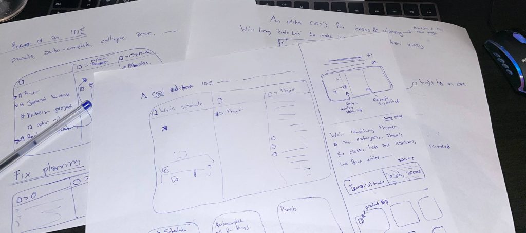
With each new design, I usually start with sketching out some ideas on paper. What elements should go on the page, what message do we want to convey.
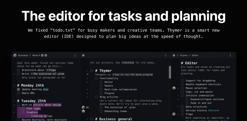
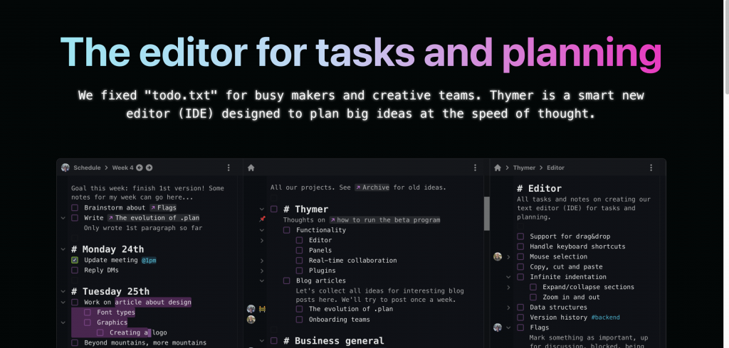
Because the product itself isn’t ready yet, we can’t really have a video or demo of the product on the page. That’s why I made a few mockup screenshots before.
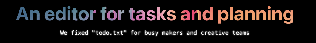
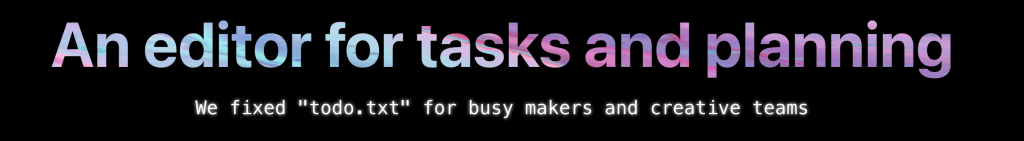
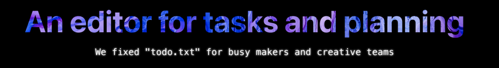
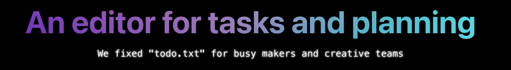
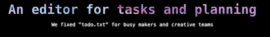
I also worked on a few different headings and subtitles to try to make it clear what the product is about and what the pitch is. Hopefully the main heading, H1, will tell our initial target audience why this might be interesting in 5 seconds.
For the look and feel of the site I was thinking about dark mode. It seems to be popular with many apps our likely initial users are familiar with, and it fits well with other related software such as IDEs, editors and terminals, and in general many modern apps too.
This was actually the first time I really worked with just dark mode, so I started reading a few concepts first, such as this page. The book RefactoringUI is a great resource too (for anything UI design really).
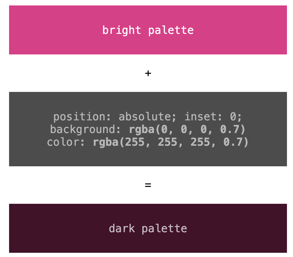
With that, I picked some basic colors for both the screenshots and the site. Rather than going for 100% black or 100% white, one trick I often use is to pick a few colors, and then overlay them with another div, position: absolute with a dark background color (and light foreground color) and alpha-blend them.
As for the font, just like in the product and the screenshots, using some accents with a monospaced font felt like a good match, so I picked those for the H2 sub-headers.
This looked like a good start but other than the screenshot it looks rather boring, so time to think about adding some colors and other elements. When thinking of the monospaced font a bit more, I thought maybe it would be a fun effect to add a bit of the glow from those retro terminals:
Another technique I always like to use to add some pizzazz while being able to keep the rest of the page simple is to use some sort of gradient or colorful image as a background for the H1 heading.
I usually just browse on Unsplash, and search for something like abstract or certain color names. I then use the image as the background-image with the background-clip: text effect, and see what it looks like.
In the end I didn’t use any of the images directly, but it gave me some inspiration for a gradient, which I then generated with some online gradient tool (I think it was https://cssgradient.io/, but there are many of them).
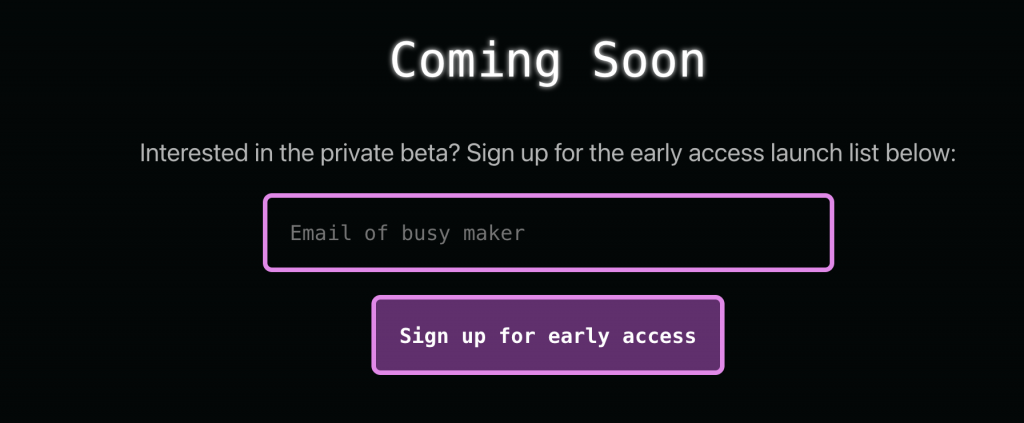
Next up was adding a call-to-action (we want to build a launch list for the private beta) and some more details/benefits about the product we’re building. The CTA is nothing special, just a form and hook it up with an online form provider.
Even though we have to keep the first version of the product small, just the flexibility of the core editor component gave us quite some ideas of cool use cases users might use the product for. I first I thought of adding a detailed “tour” highlighting all of those, but that would take way too much time. Especially because we can’t easily take screenshots from the product itself, as it’s not ready yet. Plus our main goal is to just generate some initial interest. We’ll be able to let the product speak for itself and let users discover all the extra’s once it’s ready.
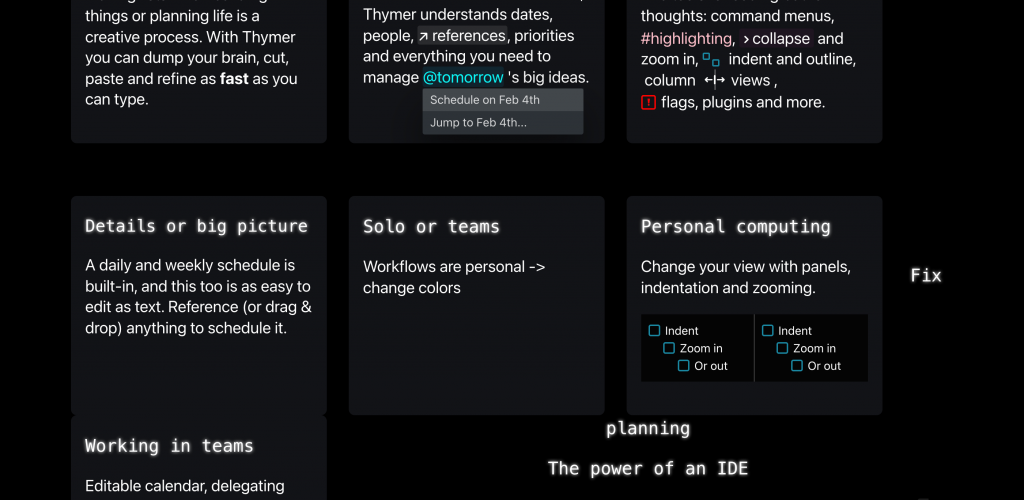
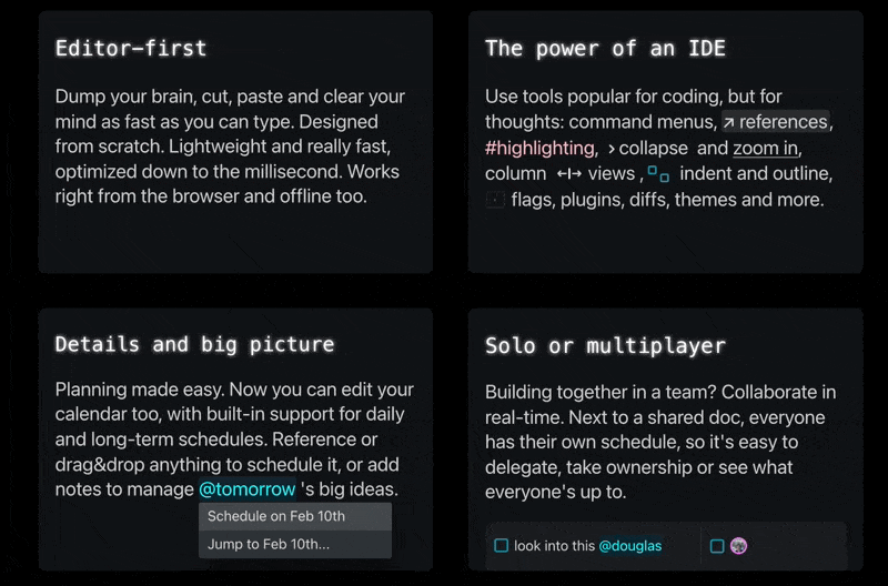
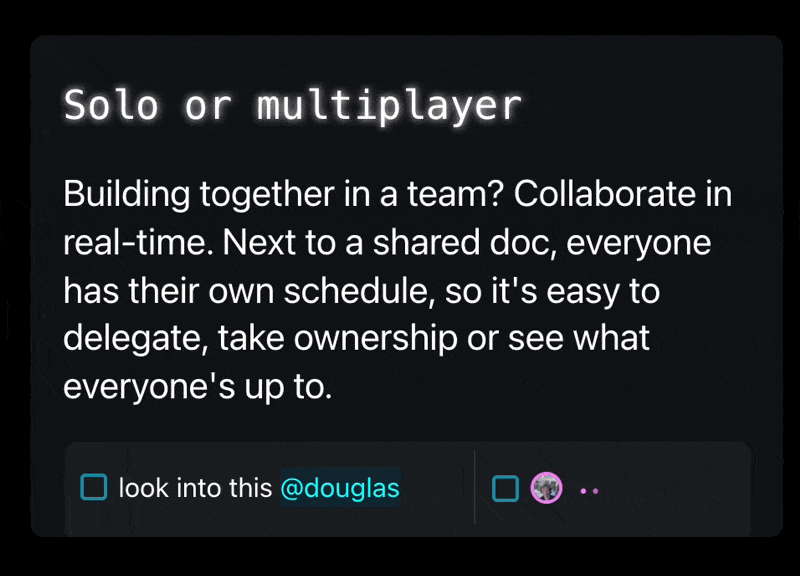
I picked 4 core parts of Thymer to highlight: how it being an editor of sorts is a different approach from classic lists/kanbans, how we think tools like IDEs are a great match for managing big plans, how we think this is better for planning too, and highlight the fact that Thymer also works in teams.
To make the page less text-heavy, it would be nice to have something accompany the text explaining the benefits. Instead of screenshots or animated gifs (which again, we don’t have yet) or drawing something (which would cost time), I thought using some UI elements within the text might be interesting. They should be instantly recognizable for our users, help explain what it is and make it look a bit more colorful. Plus, it’s easy to make, and there’s a lot on our todo list right now.
I probably rewrote the entire thing at least five times, but that’s just how that process works ;), see the messy work in progress screenshot:
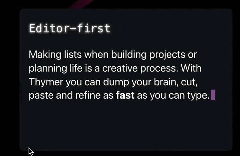
Eventually I settled on four “tiles” with a few animations/UI elements in each. The autocomplete menu will show the actual date of tomorrow at the time someone visits the page. The “someone’s typing” animation will probably be instantly recognizable to show the editor supports multiplayer. Very little work to describe things with less text and more colors.
I also added a quick summary of why we’re making Thymer at the end. I’m not sure if it adds a lot, but if we’re going to explain to anyone what we’re doing, a valid first question would be “seriously, another to-do list?”, so this would hopefully explain that part 😅. Added the blinking cursor effect to emphasize the editor part again.
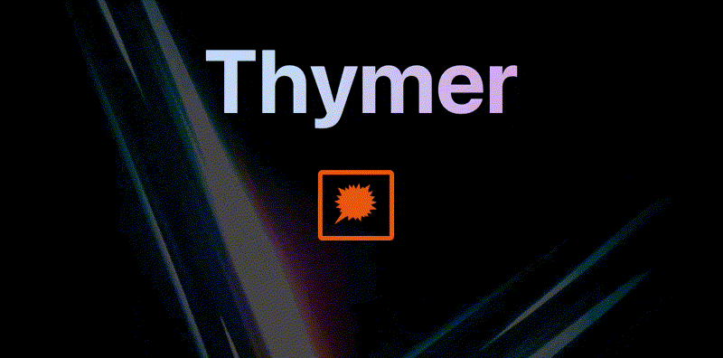
I thought it looked OK enough for a V1. Maybe this was the point I should have just shipped it ;), but I still wanted to add some cool effect above the fold. In one of the messy paper drafts, I had added a few lines around the product screenshot, which were meant to be some bright colors popping out against a dark background.
I looked around in all the abstract photos I had found on Unsplash, and one in particular (https://unsplash.com/photos/gbY7XxB8Pzs) was a great fit with the colors of the app and the landing page. Using the same rgba(0,0,0,0.X) trick as for the color palette, I got it to blend in a bit more. To make it more dynamic, I added a very subtle animation to it by very slowly making it scale. Also gave the screenshot a subtle shadow to work better with the new background.
@keyframes pulse {
  from { transform: scale(1.0); }
  to { transform: scale(1.2); }
}
.pulse {
 animation: pulse 6s linear infinite;
 animation-direction: alternate;
}
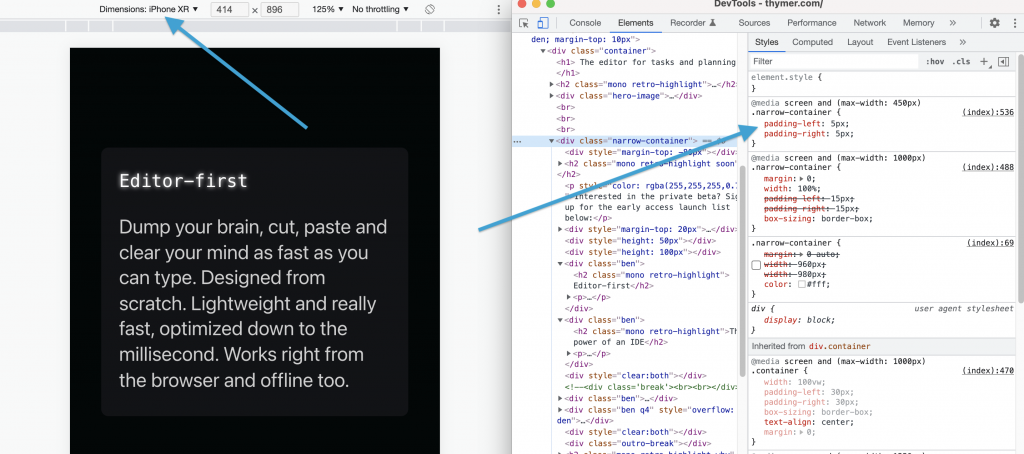
The last part was making the website responsive. I just quickly hacked together some media queries using Inspect Element and checking which elements didn’t look good on smaller screens. It was mostly adding a bit of extra padding when not showing the benefit blocks next to each other, and making sure the desktop-size screenshot would stay large and scrollable so phone users can see the details too.
All in all the landing page is just a single .html file with a few lines of inline CSS/JS, and a few images.
And that’s the landing page. Now time to continue the work on building the actual thing, which is a tiny bit more complicated 😉
As I’ve been working on the landing page, I’ve tried to sneak in a few animations here and there. On the one hand it’s really easy to overdo it, but done right it can really help to give your product a bit of personality. Software by itself is not terribly exciting, and using animations (and sounds for that matter) make it a bit less boring, more fun to use and make it spark joy.
There’s this fun talk about how adding small juicy effects can really make something a lot more interesting. In the case of the talk it’s about games, but I think the same applies to all kinds of software and devices we use everyday. Life’s too short for boring, and even software should be fun to use, so there’s a lot we can learn from games and movies here.
Of course the amount of work we need to spend on animations, sounds and lighting is absolutely nothing compared to the huge projects needed in games and movies.
The only thing we need is a few subtle animations here and there, and just using plain CSS3 this is super easy. If you’ve worked with CSS before this isn’t news, but if you still remember the old days of the web it’s amazing how much you can do nowadays with just a few lines and it actually works in all browsers. Random animation:
On Day -1 I already wrote a bit about the animation on the front page for the 80-Day Startup blog. For the landing page for Thymer, I’ve been experimenting with adding a few small animations to help explain the concept better on an otherwise completely static page (we only have a “fake” screenshot at this point).
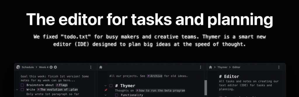
For example, to convey the concept of an editor, adding something dynamic like a blinking cursor makes it immediately recognizable. And because we’re building our own custom editor, even something as simple as the cursor we can customize and make its style part of the brand in a way.
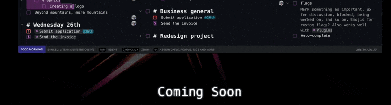
Another feature in Thymer we’ve been thinking of is flags. Rather than just having a checkbox on a line if it describes a task, this way you can add a flag to a task to assign some status to it (like important, working on it, blocked, and so on). Because there’s many things you can track this way, I thought it might be fun to have a kind of animation where one flag morphs into the next.
Animations are also really useful to show what’s happening without having to explain it with a bunch of text. For example, the idea is that Thymer will support collaborative editing, where you can work together with people in a team. When multiple people are typing at the same time, we don’t have to add a lot of clutter like “John is typing…”, but can simply use a convention we’re all used to now, animated dots:
Anyway, back to work on finishing the landing page! I’ll try to get to a more detailed write-up of all the steps building it next week.
Ending with another fun demo video (I already shared it before but it’s just a great example of how paying attention to making something mundane more interesting can help your product stand out)
A quick update entry again on how the work on the user interface mockups is progressing. I spent most of the day pushing pixels again: designing and redesigning.
Obviously it’s still just a starting point, and a demo screenshot won’t be able to fully show what the product can do anyway (plus we’ll still need to figure out a lot of parts as we build it). For now, we only need to give a general impression of how the product works to support the pitch for our solution and as a starting point for the implementation.
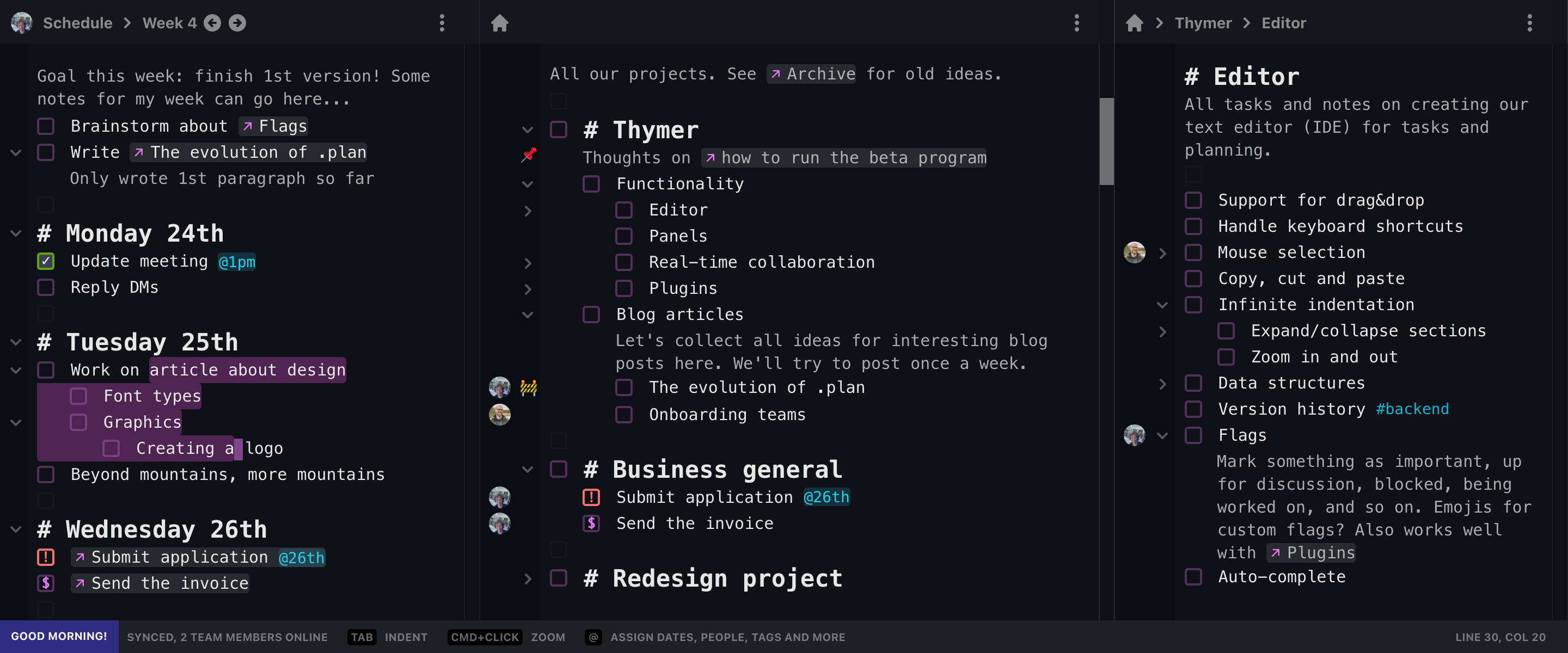
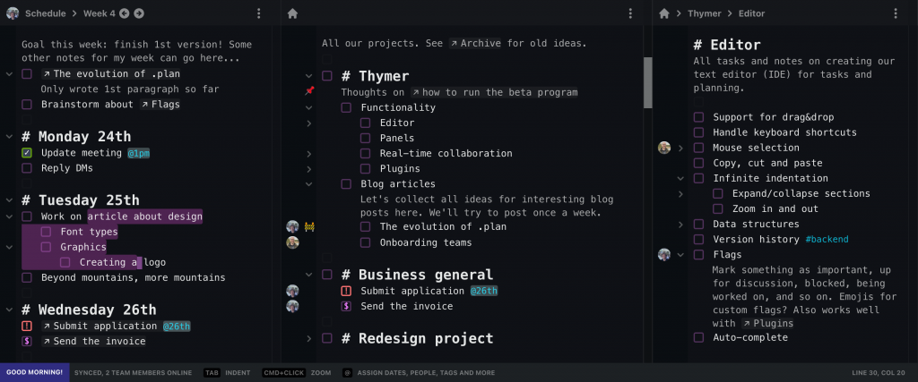
Some elements which are visible now are the “real editor” aspect (selection, cursor), having multiple panels, mixing notes and tasks, task flags, linking, scheduling and assigning, indentation.
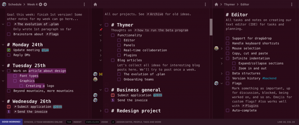
We like the idea of personal computing to be reflected in software. Especially workflows related to todos, thoughts and planning are very personal, so we’ll also allow for custom color themes, plugins and so on. As an example I tried styling the elements in some different colors.
Hopefully we get to finish the landing page tomorrow!
Today I spent a lot of time trying out different copy, layouts and designs for a landing page.
On the one hand we don’t want to spend too much time on it, and we’ll be updating the page anyway as we build the actual product (the screenshots are only mockups after all). We do need to make sure though that it’s something which is good enough so people get an idea of what we’re building are interested in giving it a try.
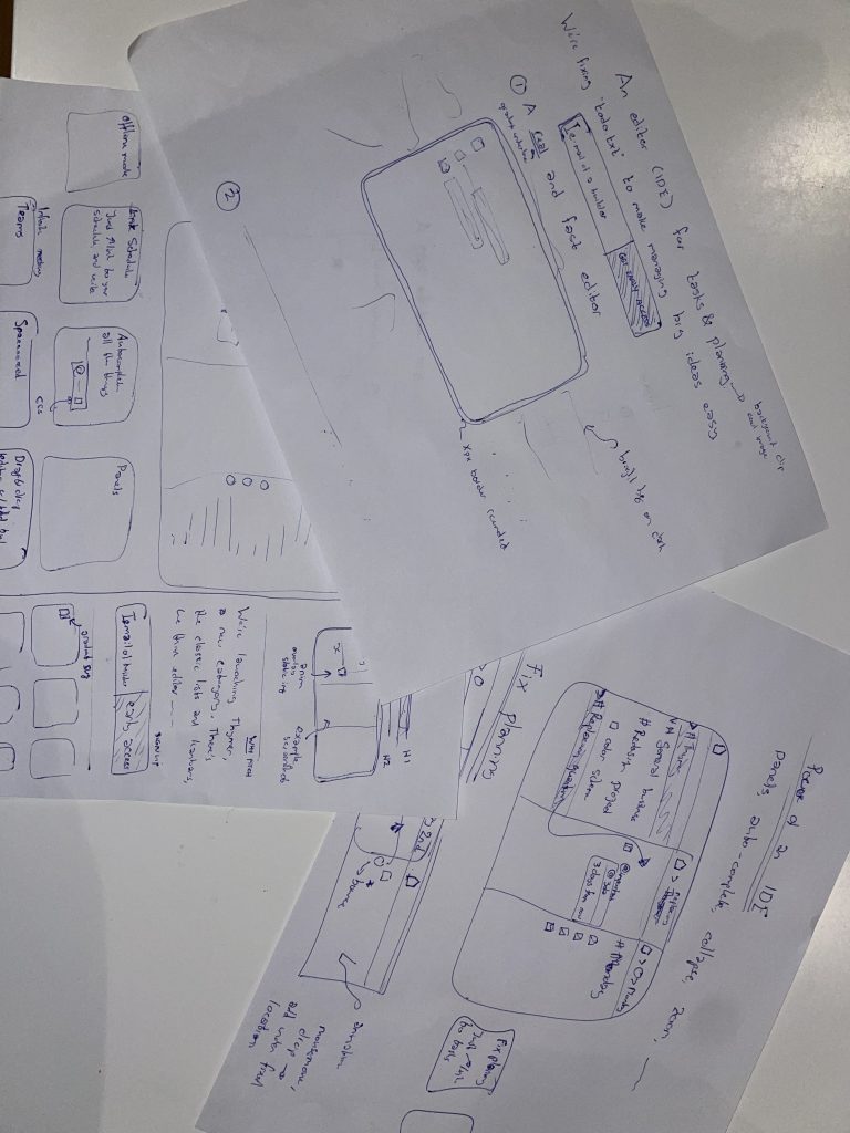
I usually start with trying out different layouts on paper, to sketch out the “shape” of the site. In this case, I was thinking of several parts:
A catchy heading, describing in a few words what the product is. You often see things like “work better together“, or “we support your business!“, but that doesn’t tell you anything. Same goes for trying to explain what it is in a few paragraphs of text. If you need that much explanation, your vision for the product isn’t clear enough yet. It’s fine to do some long-form “pitch” after the headline of course. It’s also OK if not everybody understands it, as long as the audience we think would be interested initially gets it right away.
A screenshot to “demo” the product. We don’t really have a product yet, so this will be a mockup of what the UI could look like. I’m also trying to come up with good examples of what to show in the screenshot itself. Something our audience understands, relates to, and might need the product for themselves. It also helps to sneak in some easter eggs or jokes here and there which our audience would recognize.
A form where people can leave their email address to sign up for early access. Probably in the form of a private beta, but we haven’t really decided about that yet.
A few more details of the benefits we think this solution has.
After the paper sketches, I tried to come up with an initial draft version in HTML and CSS. It’s nice if the part above the fold pops a bit to catch people’s attention. It also prevents the page from feeling bland, even if we keep the rest of the page very minimal for now. I tried dozens of combinations, but here a few examples:
It’s a very slow process at first, but usually the pieces start falling into place once a few of these main parts are done. Hopefully more to show by the end of tomorrow!
 @wcools
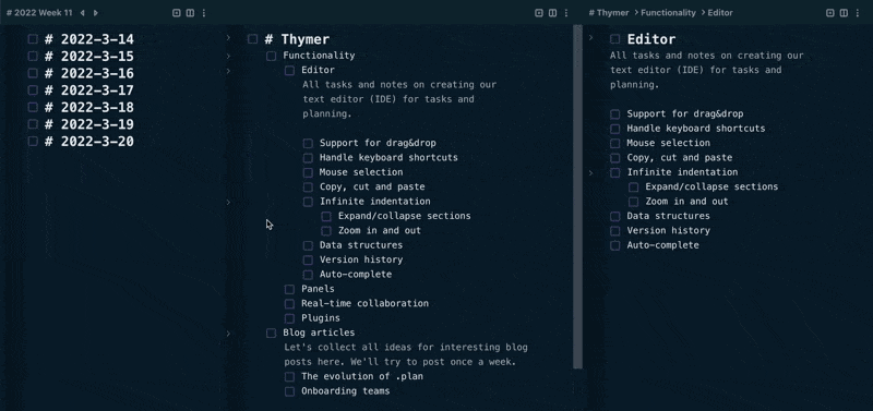


