~~~~~~~~~~~~~~~~~~~~~~~~~~~~~~~~~~~~~~~~~~~~~~~~~~~~~~~~~~~~~~~~~~~~~~~~~~~~~~~~~~~~~~~~~~~~~~~~~~~~~~~~~~~~~~~~~~~~~~~~~~~~~~~~~~~~

An update on the coding work

Where we spent a lot of time on the idea, mock screenshots, landing page, and first prototypes in the first weeks, we’ve now been working a lot on the code for the actual Thymer app again the past week. So as a quick status update on the work we’ve been doing, let’s have a look at the different parts of the code base so far.

We’ve split up the work into two code bases for now, so we both work on a different app in a sense, and then plan to merge the code bases sometime soon.

The idea is that we can both continue work on the prototypes we’ve started earlier, and build out all the functionality for those parts as quickly as possible. Because we don’t need to coordinate all the small decisions on our own part of the code this part is going relatively fast so far. And our development set-up helps too.

As both code bases get more and more functionality, at some point we will both need the features from other code base to build on, so we shouldn’t postpone the merging too long. We hope we will only need a few large “decision-time meetings” when integrating the parts. We’ll probably first start with a small glue layer and add the smallest amounts of hooks needed in each code base, and then stitch them up in a sense.

A quick look under the hood:

“Diederik’s part” of the code base deals with the editor component. We decided early on that rather than using the browser’s built-in editor functionality (called contenteditable), we’re building our own editor from scratch. Contenteditable isn’t very good nor flexible and we would never be able to create the experience we have in mind for the app. This part of the code base includes things like keyboard input, logic to deal with text position calculations (from cursor coordinates to dealing with unicode emoji graphemes to line wrapping), text formatting and rendering different tags, text selection, cursor movement and so on.

“My part” of the code base deals with the app’s UI and data. This part we’re writing from scratch, too. The UI part includes things like theming, panels, virtual rendering, drag&drop and custom scrollbars. The data layer takes care of event handling, the in-memory database with async IndexedDB storage (for offline use), an API backend server, and real-time collaboration (using websockets and CRDT based data replication between clients and server).
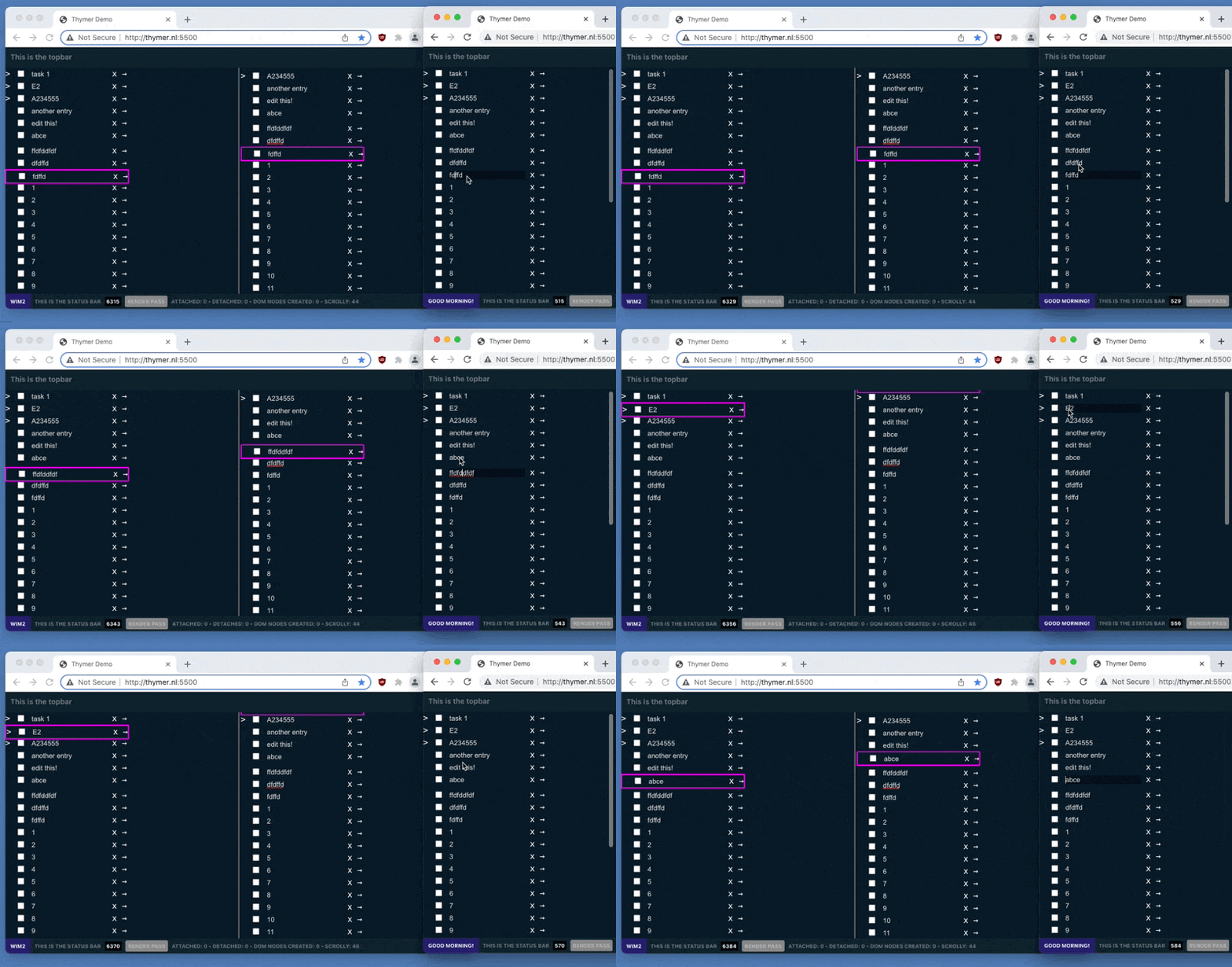
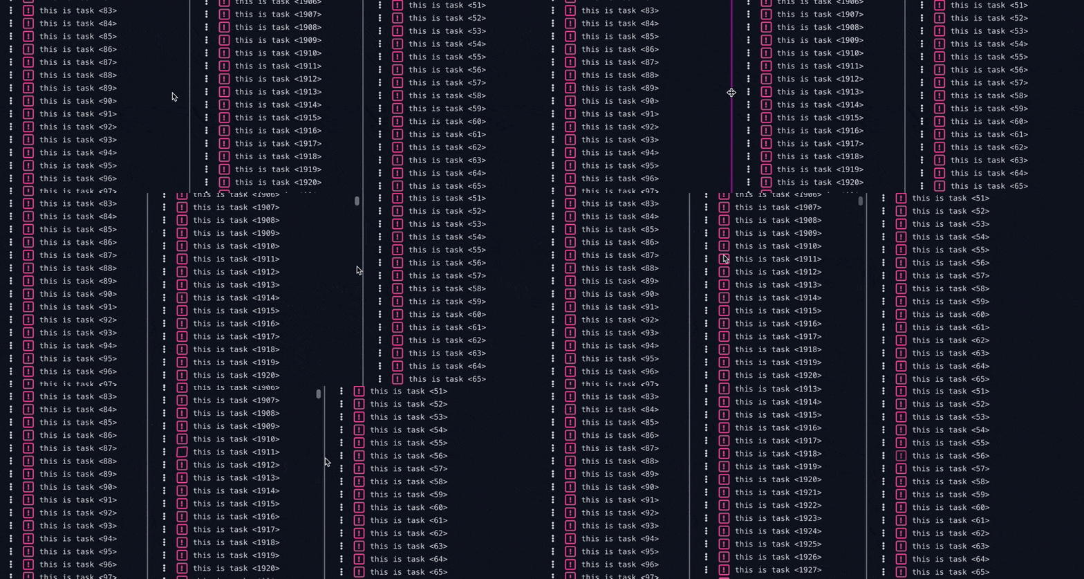
Having worked on large apps together for a while now, how we decide what to work on feels like a very organic process by now. It’s probably part intuition, part having ideas for something and diving in right away and probably part random.

We’ll soon get to the point where we need to go forward with one integrated code base. For example work on indendation in the editor and syncing tree-based data structures can result in a different set of assumptions if we keep the code diverged for too long. The same goes for undo logic, which we’ve written logic for in both parts. Once the code is merged it will also make it easier to make design decisions on the other features.

Once the main architecture of the app is done we can work on the long tail of fixes (in all parts), and work on the other features for the MVP.

We’re planning to do more technical write-ups about the different individual parts as well, but so far we’ve spent most of the time doing some focused coding this week. And of course we don’t have too much time, so we also need to reserve plenty of days for all the marketing ideas. Hopefully some updates there soon as well 😅

Competing with (very) large companies

In many spaces you can find yourself competing against very large players. I’m convinced that as long as you build something which your users love, it’s possible to grow your business in those spaces even as an indie/tiny team.

For our existing product, we had a large competitor when we started, and another large one emerged afterwards, so we’ve had some experience with this. Around ten years ago we launched a company intranet SaaS tool for small companies. Lots of the software at the time was either very slow, clunky or enterprisey/complicated.

The large competitor at the time was Confluence, and to a smaller extent SharePoint. We launched with a nice drag&drop editor with blocks you could drag on a page to create wiki docs, forms/databases, share files and so on. If that approach sounds familiar, you might have heard other companies which then launched afterwards like Notion. Not exactly tiny players 😉

Even as a small indie shop though, it’s been a great market for us. With Thymer, the app we’re building right now, we’ll again be competing in a busy space. For the same reasons it worked for our first app, we think competing in a market with larger players is definitely possible again, by having our own unique ideas and focus.

We focus on a different part of the market

Having a large competitor also means the market is large. It’s very rare for any product to be the best in class for every single person or company in such a large market.

If your solution is better for a subset of those users, a specific niche in the market, go after that. The reason you’re building a product in the first place is probably because you have a vision to make something better, improve on something. So focus on that and zoom in on what makes you different. Positioning yourself in the market this way helps you stand out.

Taking the example of our existing app again, we specifically focused on “intranets for small-medium companies” there, and that has worked out great for us. Technically we could have positioned it as “note-taking” for consumers, or a “wiki” or enterprise software. Especially as technical founders with a very horizontal product, it would have been tempting to try to be “everything to everyone”, but it makes it harder to get traction (especially when starting out without network and choosing the bootstrapped route). We found a corner of the market which was ripe for disruption and zoomed in on that.

With Thymer too we focus on a very niche audience. If something catches on, you can always grow from there. Even something as niche as “people who have todo.txt files” in our case will probably be a good starting point to grow from (that includes plenty of makers and small creative teams we should be able to reach). We don’t bother competing against feature sets of large public project management companies.

There are many other ways of carving out a corner. Like taking a single theme, such as products focusing on privacy when their competitor doesn’t. Or launching in a very specific vertical you know a lot about and a solution doesn’t exist. Or by using any other aspect of your product, like a unique pricing model.

We use our small team size to our advantage

There are always things your larger competitors simply won’t be able to do.

For example, we have competitors where the growth and profit clearly comes from the enterprise segment. They can’t afford to focus too much on smaller-medium businesses, which works well for us.

We also focus on automating a lot, keeping costs low and run the company as a tiny team with no investors. That way we can charge prices in segments of the market which competitors simply cannot match but are super profitable for us.

You can also jump on new trends much quicker. You’ll make a change or publish something before your large competitor can say “circle back re- outlook meeting”. A canoe will turn faster than an oil thanker after all. That can turn existing popular products stale, which is an opportunity for a new small player. You’ll be able to expand in niches this way, which competitors will happily ignore.

Even aspects which might seem like a disadvantage at first can be a benefit. Take handling customer support with a tiny team. Especially when we just started out and didn’t have the social proof from larger customers yet, companies would email us from time to time and ask about our support structures, and whether we could support a company of their size. Well, how often does it happen that you can email the CEO of a large company directly, they will look into your issue personally, and reply with a fix within a day? So far customers agree that’s a real benefit!

We don’t worry about the competition

Finally, it’s important to just stay focused on your own vision and don’t mind the competition too much. We just build what we think and know our customers love. When we just pay attention to that, the rest will fall into place.

The internet is a really big place, and even with large competitors who will out-marketing or out-spend you, there will always be plenty of people you can find who will prefer your approach! Especially as an indie maker, you only need a small % to be successful (even more so in B2B, where a dozen or two customers might literally be enough to run your business).

Not saying you shouldn’t dream big though if that’s your goal! Here’s a fun thought experiment. Let’s say you would have launched just a bit earlier than a competitor, or the press had picked up on you sooner. Would your competitor have been unsuccessful? Would they have canceled their product and launch? Probably not, and neither should you. As long as you have a product that users love and you can reach them – and that’s where the real challenge is of course – the chance that you cannot coexist with (or even outgrow) large competitors is extremely small.

The advantages of developing in a dev VM with VSCode Remote

Now that we’re both working on a lot of code, need to keep track of versions, and also need to start working on a backend, it’s time to set up our development environment.

Advantages of doing all development in a local VM

All our source code will be stored on our Git server. Locally we both use a development Virtual Machine (VM) running on our laptop/PC, on which we will check out the (mono) source repository. We will use ES6 for the frontend and python3/Django for the backend, but this works pretty much for any stack. Using a local development VM has several advantages:

  • We’ll both have identical set-ups. Diederik uses Windows most of the time, I use a Mac machine. It would become a mess if we tried to work with all kinds of different libraries, packages and framework versions.
  • Easy to create backups and snapshots of the entire VM, or transfer the entire development setup to a different machine (like in case of any coffee accidents).
  • It avoids the mess of having to install packages on our local PCs and resolving conflicts with the OS. For example, the Python version on my macOS is ancient (and even if it wasn’t, it’s probably not the same as on the production server). Trying to override OS defaults and mess with package managers like brew is a mess in practice. It’s slow, breaks things all the time and adds a lot of extra friction to the dev stack.
  • Not only do we avoid local package managers, but also the need for other tools in the stack like Python’s virtualenv. We don’t have different virtualenvs, only the env, which is the same on our VM as on the production server.
  • So not only will the packages be the same between our development environments, they will even be identical to the eventual production server (which we don’t have yet, we will have to set one up later). This way we don’t need anything like a staging server. Except for having virtual hardware, debug credentials and test data, the development VM will mimic the complete CALM production stack.
  • Because of built-in support for remote development in VSCode (which is still local in this case, but on a local VM), all VSCode plugins are going to run with exactly the language and package versions we want. No mess trying to configure Django and Python on macOS with a different OS base install. All plugins will run on the VM, so we’ll also have IntelliSense code completion for all our backend packages and frontend parts in our stack.
  • That also means that we can not only debug issues in the app, but issues in the stack as well, from nginx web server config to websocket performance.

Setting up the VM

I lile to use vagrant to easily create and manage virtual machines (which you can use with different providers such as VMWare or VirtualBox). To set up a new Debian Linux based VM:

# see https://app.vagrantup.com/debian
pc$ vagrant init debian/bullseye64
pc$ vagrant up
pc$ vagrant ssh 
# now you're in the VM!

In the resulting Vagrantfile you can set up port forwarding, so running a Django development server in your VM will be accessible on the host PC.

Because vagrant ssh is slow, you can output the actual config to ssh into your machine using

pc$ vagrant ssh-config

and then store this in ~/.ssh/config (on the local PC), so it looks something like this:

Host devvm
  HostName 127.0.0.1
  User vagrant
  Port 2020
  UserKnownHostsFile /dev/null
  StrictHostKeyChecking no
  PasswordAuthentication no
  IdentityFile /Users/wim/devvm/.vagrant/machines/default/virtualbox/private_key
  IdentitiesOnly yes
  LogLevel FATAL

To make sure we both have the same packages installed on our VMs (and server later on), we usually create Ansible playbooks (or just a simple bash script when it’s a few packages and settings). We also store our infrastructure config in git, but we’ll go into all of that some other time.

For now, we can just use a very short script to install the packages for our stack:

vm$ apt-get install aptitude && aptitude update && aptitude full-upgrade
vm$ aptitude install python3-pip python3-ipython sqlite3 git
vm$ pip install Django==3.2.12

Now we just need to add our git credentials in the VM’s ~/.ssh/config:

Host thegitserver
  HostName thegitserver.example.com
  User gituser
  ForwardAgent yes
  IdentityFile ~/.ssh/mygit_id

and check out the repository on the VMs drive:

vm$ mkdir project && cd project
vm$ git clone ssh://thegitserver/home/gituser/project.git

Remote VSCode

Now that all the packages and sources are on the VM, we can set up VSCode on our local machine to work on our workspace on the VM and run extensions on the VM as well (see VSCode’s Remote Development using SSH).

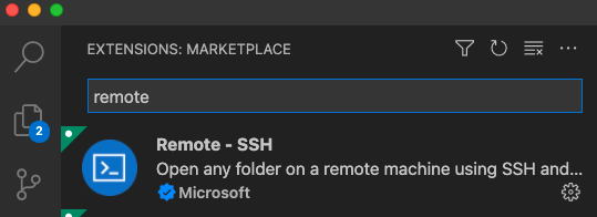
1- Simply install the Remote – SSH extension:

2- Open the Command Palette, and >ssh should show the option Remote-SSH: Connect to Host.

3- Select that, and it should show the Vagrant’s SSH config we saved in our PC’s ~/.ssh/config earlier under the name devvm.

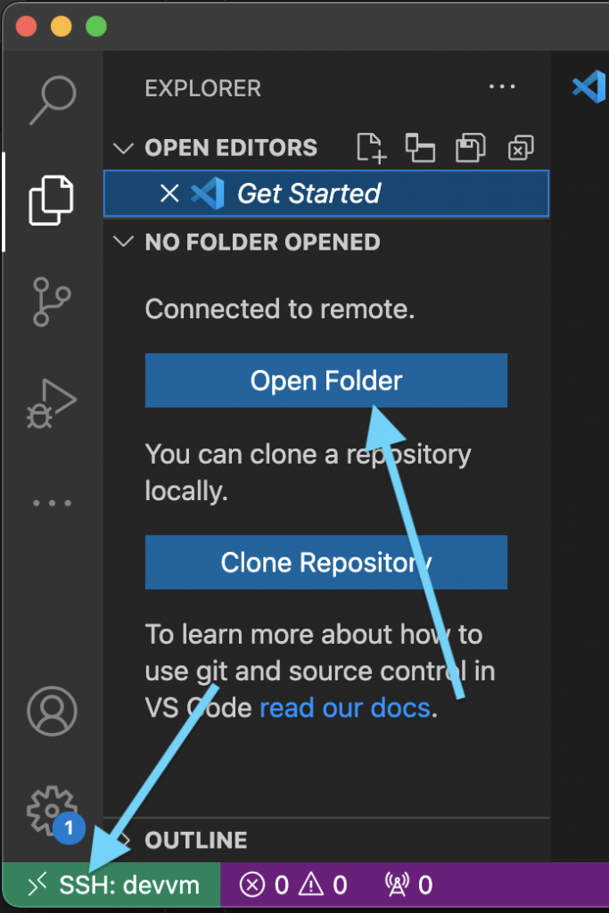
4- You’ll see we’re now connected to the devvm. Click Open Folder to open the remote workspace, ~/project in our example.

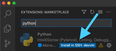
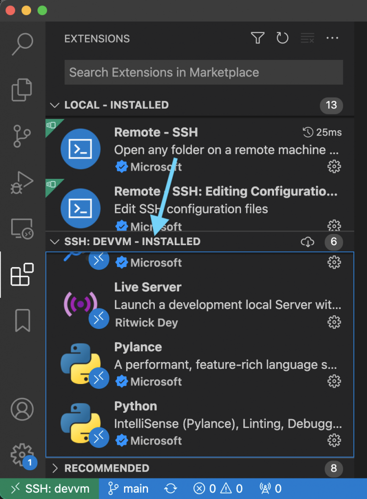
5 – The last step is ensuring all the extensions we need are installed to the VM. Click on the Extensions tab, look for the extensions you want, and click “Install in SSH”

6 – That’s it! In the screenshot you can now see the plugins are installed on the VM, the repository workspace from the VM is opened as our current project, and git integration works out of the box.

We can even use extensions like the Live Server on our ES6 frontend code like before, and run our Django API development server on the VM knowing we have all the correct packages.

Recap week #4

A lot of progress again this week, but still a lot left to do!

The most visible milestone for this week was launching the landing page — Thymer.com is now live, and we got the first few signups for the private beta launch list!

Just like the post on Day -1 about how we prepared the 80daystartup.com website, we also wrote a bit about the work for the landing page in Creating thymer.com.

We’ve been working on more prototypes as well, especially for the editor component, which we’re going to write more about soon. In A rough feature list we made a first list of other features we’re planning for the MVP, for which we’re going to start development this week, in parallel with the marketing work.

We’re still trying to find the right balance between doing the actual coding on the app, the marketing work, writing the articles for our blog and using channels like Twitter to grow an audience. We’re making good progress on all fronts, but we have to step up the work on the app as well. That’s why we’ve changed our blogging schedule a little bit and are writing more updates about what we’re working on, and fewer articles for now.

The articles we wrote on the blog this week were It’s not 0 or 1, Your app still has to be good, Animations and Good customer support means saying you’re sorry.

Next up: most likely a lot of code work, while getting initial feedback and building our launch list!

Thanks for following our story! You can see our daily updates on Twitter (@wcools and @jdvhouten). Or drop us a line at [email protected] for any reason. We’re always excited to hear from people 🙂

Creating thymer.com

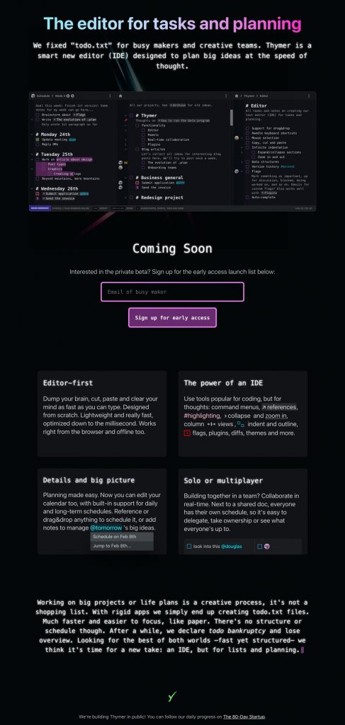
On Day -1, before we actually started, we wrote a bit about creating the website you’re reading now. Now that the landing page for the app we’re building is live, I thought I’d do the same for thymer.com.

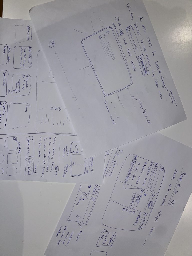
With each new design, I usually start with sketching out some ideas on paper. What elements should go on the page, what message do we want to convey.

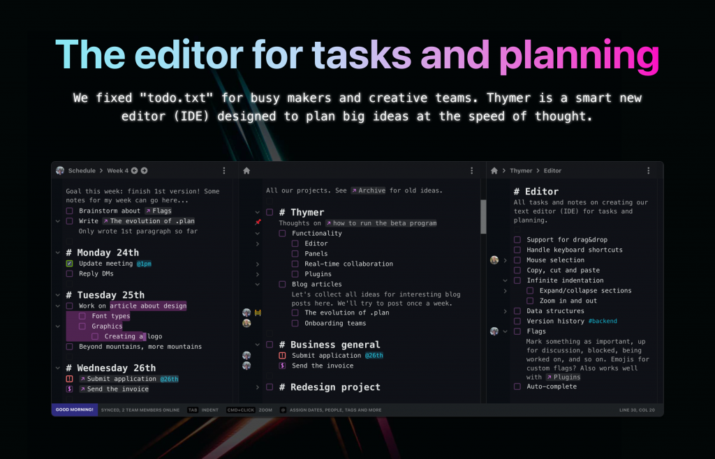
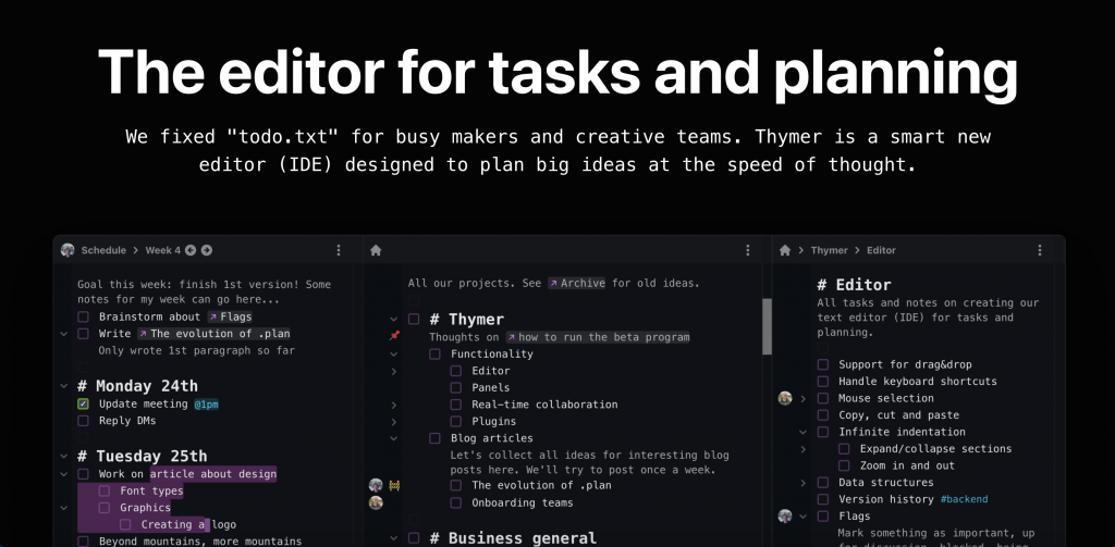
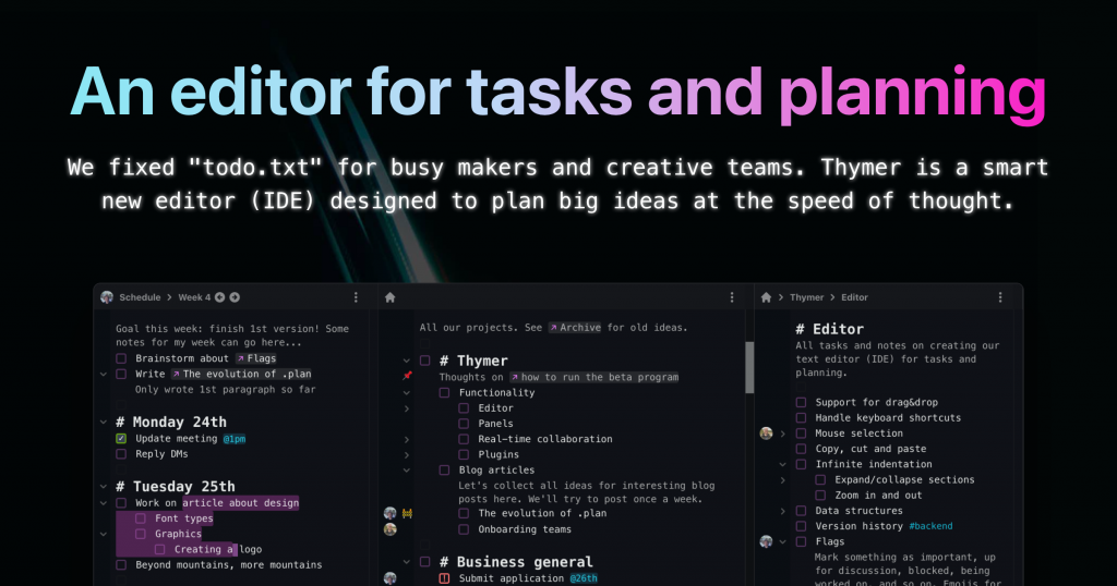
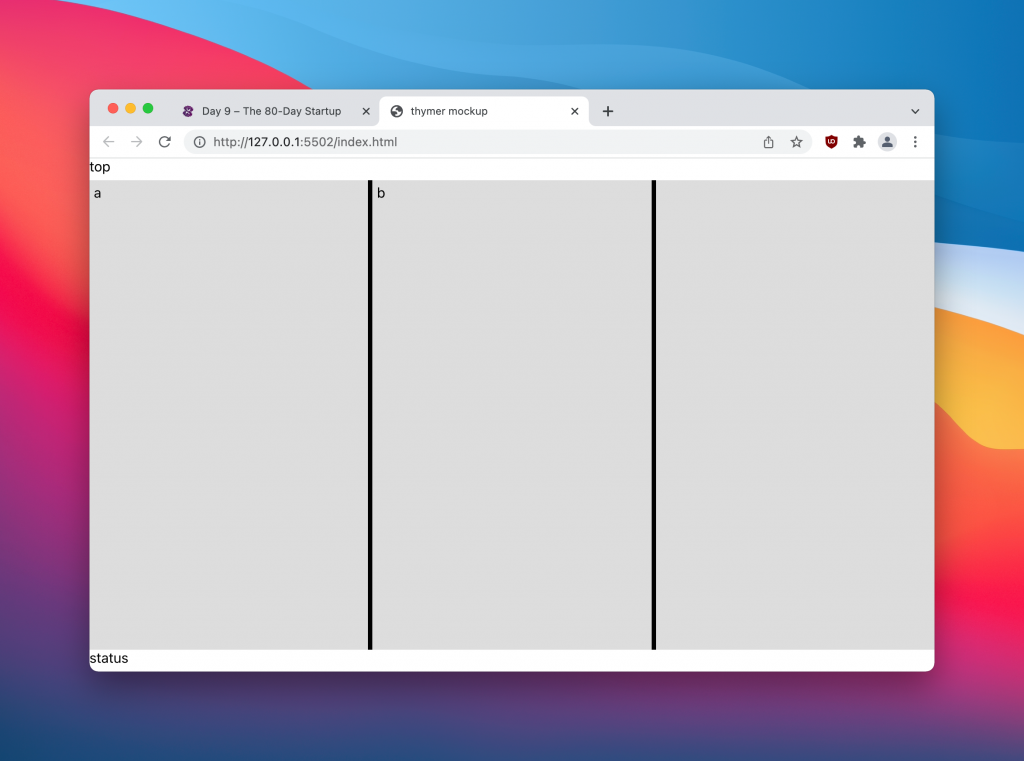
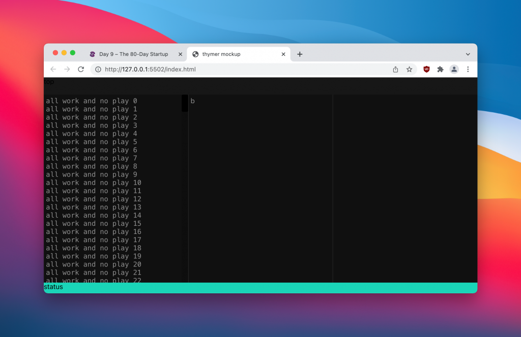
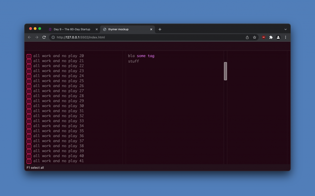
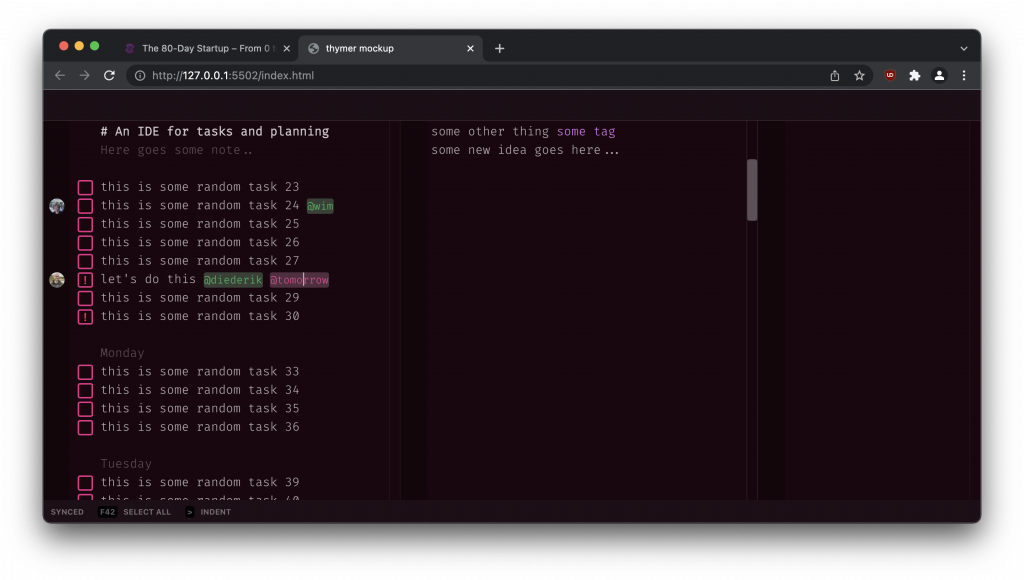
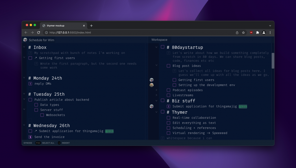
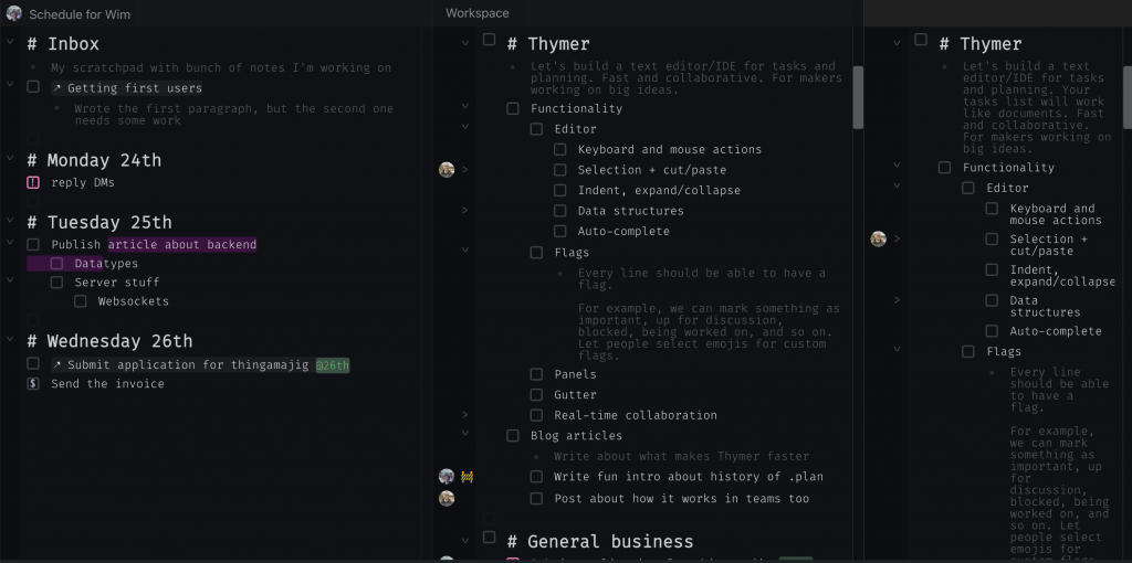
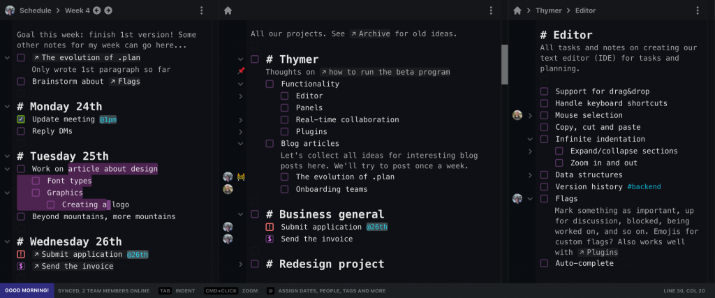
Because the product itself isn’t ready yet, we can’t really have a video or demo of the product on the page. That’s why I made a few mockup screenshots before.

I also worked on a few different headings and subtitles to try to make it clear what the product is about and what the pitch is. Hopefully the main heading, H1, will tell our initial target audience why this might be interesting in 5 seconds.

For the look and feel of the site I was thinking about dark mode. It seems to be popular with many apps our likely initial users are familiar with, and it fits well with other related software such as IDEs, editors and terminals, and in general many modern apps too.

This was actually the first time I really worked with just dark mode, so I started reading a few concepts first, such as this page. The book RefactoringUI is a great resource too (for anything UI design really).

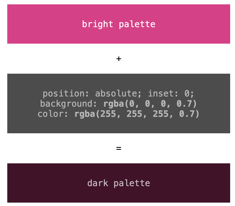
With that, I picked some basic colors for both the screenshots and the site. Rather than going for 100% black or 100% white, one trick I often use is to pick a few colors, and then overlay them with another div, position: absolute with a dark background color (and light foreground color) and alpha-blend them.

As for the font, just like in the product and the screenshots, using some accents with a monospaced font felt like a good match, so I picked those for the H2 sub-headers.

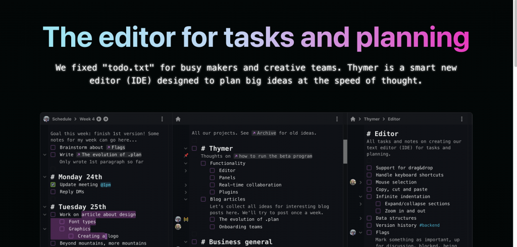
This looked like a good start but other than the screenshot it looks rather boring, so time to think about adding some colors and other elements. When thinking of the monospaced font a bit more, I thought maybe it would be a fun effect to add a bit of the glow from those retro terminals:

Another technique I always like to use to add some pizzazz while being able to keep the rest of the page simple is to use some sort of gradient or colorful image as a background for the H1 heading.

h1 {
   letter-spacing: .1px;
   -webkit-background-clip: text;
   -webkit-text-fill-color: transparent;
   background-clip: text;
   background-image: url(some_cool_picture.jpeg);
   background-position: 0% 20%; 
   color: transparent;
   ...
 }

I usually just browse on Unsplash, and search for something like abstract or certain color names. I then use the image as the background-image with the background-clip: text effect, and see what it looks like.

In the end I didn’t use any of the images directly, but it gave me some inspiration for a gradient, which I then generated with some online gradient tool (I think it was https://cssgradient.io/, but there are many of them).

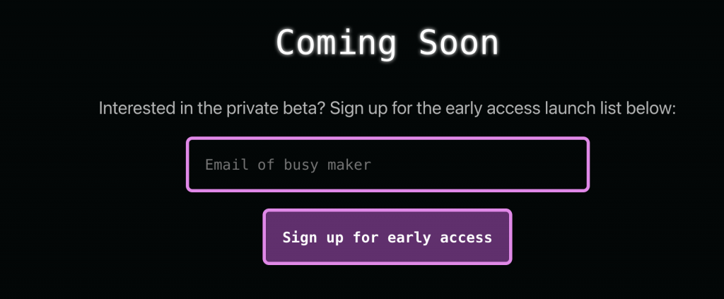
Next up was adding a call-to-action (we want to build a launch list for the private beta) and some more details/benefits about the product we’re building. The CTA is nothing special, just a form and hook it up with an online form provider.

Even though we have to keep the first version of the product small, just the flexibility of the core editor component gave us quite some ideas of cool use cases users might use the product for. I first I thought of adding a detailed “tour” highlighting all of those, but that would take way too much time. Especially because we can’t easily take screenshots from the product itself, as it’s not ready yet. Plus our main goal is to just generate some initial interest. We’ll be able to let the product speak for itself and let users discover all the extra’s once it’s ready.

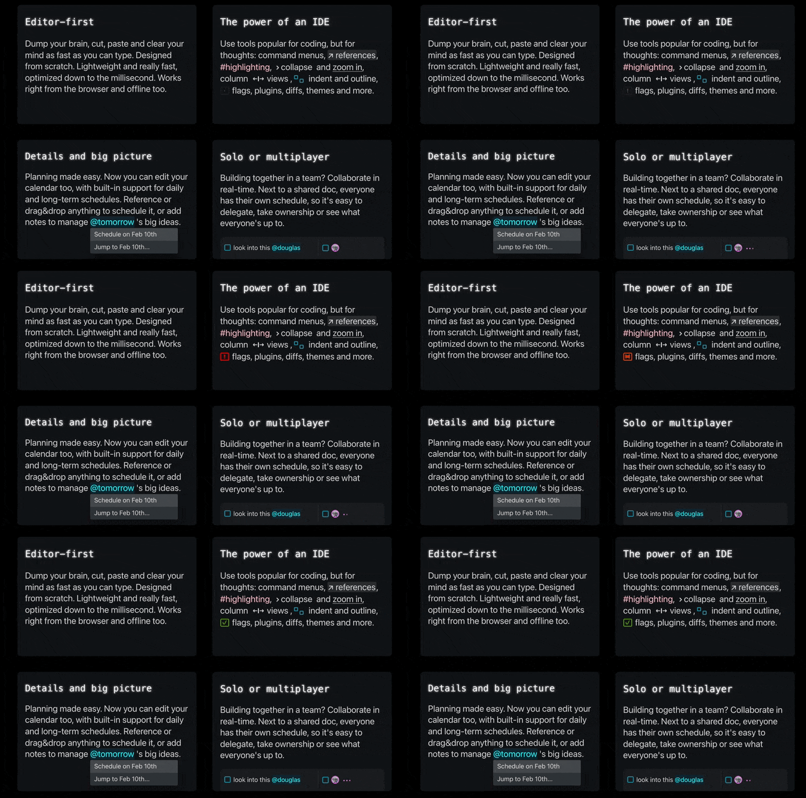
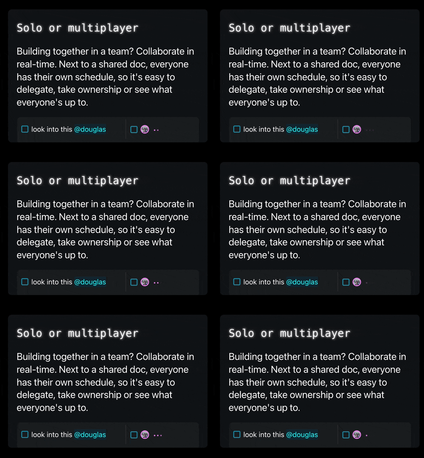
I picked 4 core parts of Thymer to highlight: how it being an editor of sorts is a different approach from classic lists/kanbans, how we think tools like IDEs are a great match for managing big plans, how we think this is better for planning too, and highlight the fact that Thymer also works in teams.

To make the page less text-heavy, it would be nice to have something accompany the text explaining the benefits. Instead of screenshots or animated gifs (which again, we don’t have yet) or drawing something (which would cost time), I thought using some UI elements within the text might be interesting. They should be instantly recognizable for our users, help explain what it is and make it look a bit more colorful. Plus, it’s easy to make, and there’s a lot on our todo list right now.

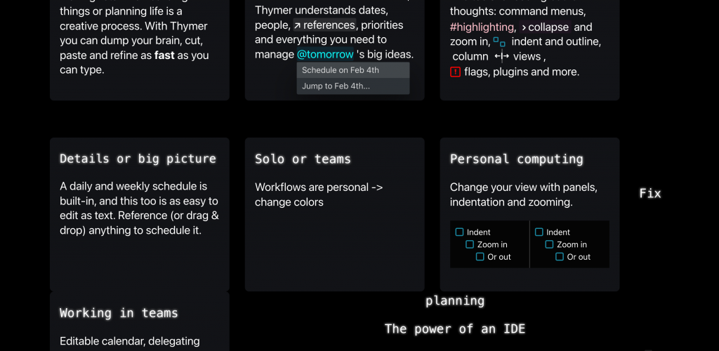
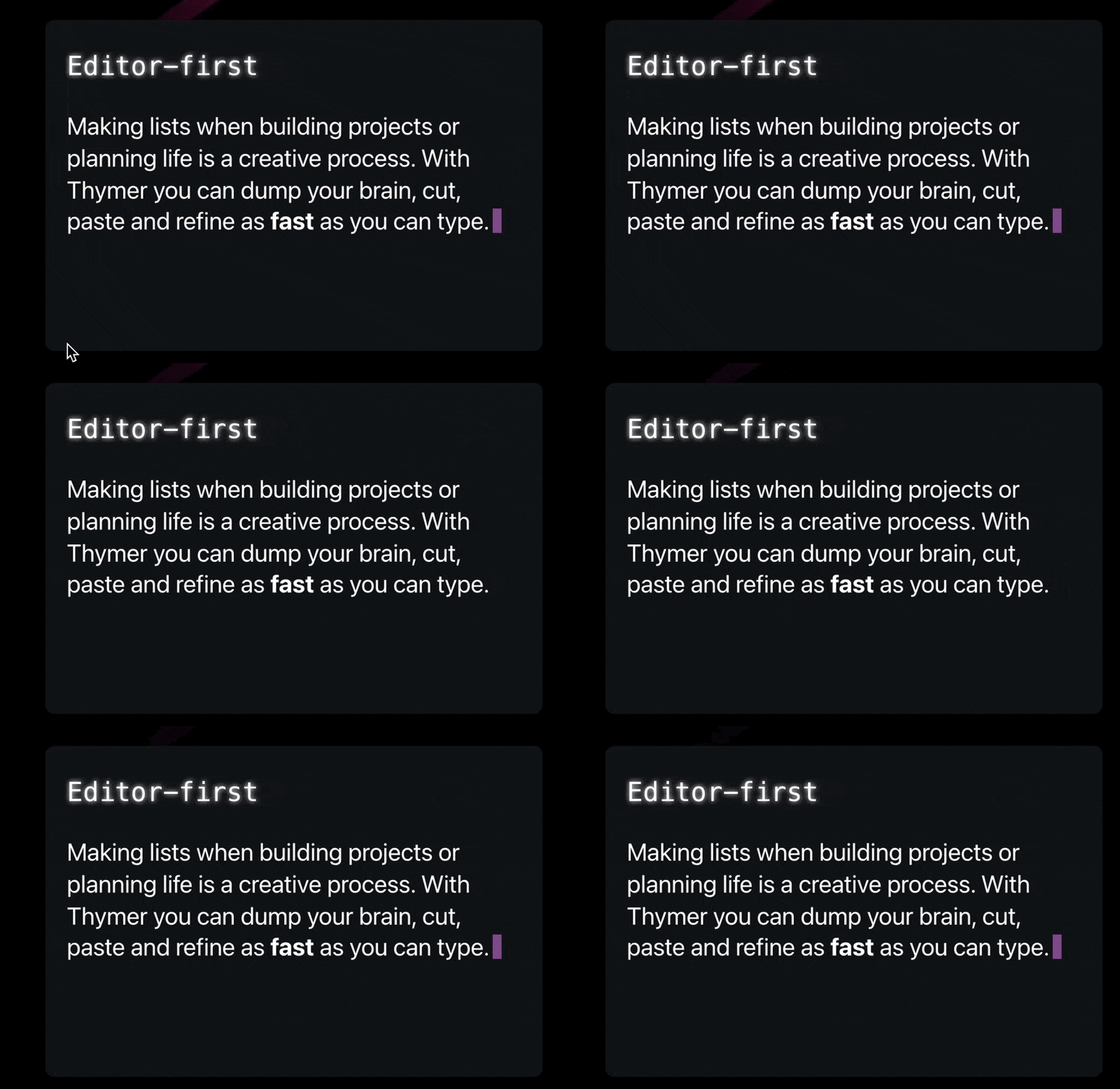
I probably rewrote the entire thing at least five times, but that’s just how that process works ;), see the messy work in progress screenshot:

Eventually I settled on four “tiles” with a few animations/UI elements in each. The autocomplete menu will show the actual date of tomorrow at the time someone visits the page. The “someone’s typing” animation will probably be instantly recognizable to show the editor supports multiplayer. Very little work to describe things with less text and more colors.

I also added a quick summary of why we’re making Thymer at the end. I’m not sure if it adds a lot, but if we’re going to explain to anyone what we’re doing, a valid first question would be “seriously, another to-do list?”, so this would hopefully explain that part 😅. Added the blinking cursor effect to emphasize the editor part again.

I thought it looked OK enough for a V1. Maybe this was the point I should have just shipped it ;), but I still wanted to add some cool effect above the fold. In one of the messy paper drafts, I had added a few lines around the product screenshot, which were meant to be some bright colors popping out against a dark background.

I looked around in all the abstract photos I had found on Unsplash, and one in particular (https://unsplash.com/photos/gbY7XxB8Pzs) was a great fit with the colors of the app and the landing page. Using the same rgba(0,0,0,0.X) trick as for the color palette, I got it to blend in a bit more. To make it more dynamic, I added a very subtle animation to it by very slowly making it scale. Also gave the screenshot a subtle shadow to work better with the new background.

@keyframes pulse {
  from { transform: scale(1.0); }
  to { transform: scale(1.2); }
}
.pulse {
 animation: pulse 6s linear infinite;
 animation-direction: alternate;
}

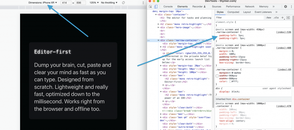
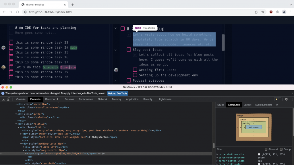
The last part was making the website responsive. I just quickly hacked together some media queries using Inspect Element and checking which elements didn’t look good on smaller screens. It was mostly adding a bit of extra padding when not showing the benefit blocks next to each other, and making sure the desktop-size screenshot would stay large and scrollable so phone users can see the details too.

All in all the landing page is just a single .html file with a few lines of inline CSS/JS, and a few images.

And that’s the landing page. Now time to continue the work on building the actual thing, which is a tiny bit more complicated 😉

Landing page is live!

The first version of the landing is finally live at Thymer.com.

We can improve it over time but we now have a site we can use for marketing, point people to describing what we’re making and start building a launch list for the private beta.

I’m still planning to write a more detailed post on designing all the elements of the page. It took more time than planned (as usual of course!), but it’s nice to start to see all the work from the past few weeks come together in something more than a pile of messy sketches on my desk 😉

There’s still so much to do, but when having a “mini launch” milestone like this I always like looking back at sketches or drafts from a while ago to remember we’re slowly making progress!

Animations

As I’ve been working on the landing page, I’ve tried to sneak in a few animations here and there. On the one hand it’s really easy to overdo it, but done right it can really help to give your product a bit of personality. Software by itself is not terribly exciting, and using animations (and sounds for that matter) make it a bit less boring, more fun to use and make it spark joy.

There’s this fun talk about how adding small juicy effects can really make something a lot more interesting. In the case of the talk it’s about games, but I think the same applies to all kinds of software and devices we use everyday. Life’s too short for boring, and even software should be fun to use, so there’s a lot we can learn from games and movies here.

Of course the amount of work we need to spend on animations, sounds and lighting is absolutely nothing compared to the huge projects needed in games and movies.

The only thing we need is a few subtle animations here and there, and just using plain CSS3 this is super easy. If you’ve worked with CSS before this isn’t news, but if you still remember the old days of the web it’s amazing how much you can do nowadays with just a few lines and it actually works in all browsers. Random animation:

.. took 1 minute and just a few lines of CSS:

<style>
.box {
display: inline-block;
position: relative;
transform: translateX(0);
width: 30px;
height: 30px;
background: purple;
animation: slide 2s infinite;
animation-direction: alternate;
transition: opacity 1s;
opacity: 1.0;
border-radius: 50%;
}
@keyframes slide {
 0% { transform: translateX(0); opacity: 0; }
 100% { transform: translateX(300px); opacity: 1.0; }
}
</style>
<div style='width: 100%'>
<div class='box'></div>
</div>

On Day -1 I already wrote a bit about the animation on the front page for the 80-Day Startup blog. For the landing page for Thymer, I’ve been experimenting with adding a few small animations to help explain the concept better on an otherwise completely static page (we only have a “fake” screenshot at this point).

For example, to convey the concept of an editor, adding something dynamic like a blinking cursor makes it immediately recognizable. And because we’re building our own custom editor, even something as simple as the cursor we can customize and make its style part of the brand in a way.

@keyframes blink {
    0% { opacity: 0; }
}        

.cursor::after {
    content: "";
    width: 8px;
    left: 3px;
    height: 22px;
    position: relative;
    top: 3px;
    background: purple;
    display: inline-block;
    animation: blink 1s steps(2) infinite;
}

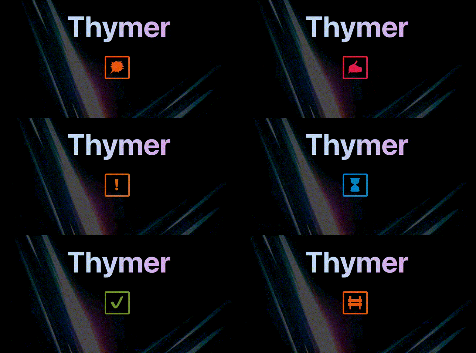
Another feature in Thymer we’ve been thinking of is flags. Rather than just having a checkbox on a line if it describes a task, this way you can add a flag to a task to assign some status to it (like important, working on it, blocked, and so on). Because there’s many things you can track this way, I thought it might be fun to have a kind of animation where one flag morphs into the next.

Animations are also really useful to show what’s happening without having to explain it with a bunch of text. For example, the idea is that Thymer will support collaborative editing, where you can work together with people in a team. When multiple people are typing at the same time, we don’t have to add a lot of clutter like “John is typing…”, but can simply use a convention we’re all used to now, animated dots:

Anyway, back to work on finishing the landing page! I’ll try to get to a more detailed write-up of all the steps building it next week.

Ending with another fun demo video (I already shared it before but it’s just a great example of how paying attention to making something mundane more interesting can help your product stand out)

It’s not 0 or 1

It seems binary thinking is not prevalent in just tech founders but when starting a business in general. Often people seem to think something needs to be done perfectly, or it isn’t possible. If that’s reason not to pursue your dream of building a product/business, that’s a shame because you can slowly work your way from 0 to 1.

All at once

At every stage in the business, you’ll deal with other issues and challenges. It’s okay to learn while doing and deal with them as they occur, otherwise it would become impossible to start. Thinking you have to do everything all at once means you can’t really start with anything.

In the beginning you don’t know yet whether anything you’re about to do will really matter. That’s when it’s best to worry about “bad problems”. That’s not a pleonasm, because there are “good problems” too. A bad problem would be not having any customers yet. Focus on that. A good problem is having so many customers that you can’t handle support anymore.

Spending time on fixing good problems you don’t have yet is a waste because it might never have been needed in the first place. Plus you won’t really understand yet what the best way to handle it is until later.

All in

Starting a business doesn’t mean you need to drop everything else. We started building our first software business when we were students. We did freelancing and work for university on the side. Admittedly it was a very busy time, and we promised ourselves to switch to full-time as soon as we financially could, but we managed to grow to our first product in this way and become ramen profitable

Going all-in when it’s an option is great, but sometimes the timing isn’t right and starting up on the side is totally possible. See if you can get a first customer, then scale it up. 

Doing less

Some things which need attention can also be fixed with a duct tape solution, and then revisit them later when it becomes really painful. For our first app we didn’t even have a password reset option. People had to email us and then we’d reset it for them, manually. We just didn’t have the time, and if we would end up with 0 customers it would have been a waste of time to invest in. 

Technical founders also like to set up their perfect environment and tech stack. Kubernetes, CI/CD, Docker, Microservices, the list goes on and on. It’s all a waste of time if you don’t have a product with customers yet, and you just won’t need it. Duct-tape it together with whatever means necessary for now (that actually sounds worse than it is, I like to think of it as just going for a simple and elegant solution). Worst case it takes off and you get to improve it while being paid for it.

Copying the big league 

Because big businesses are more visible, their approach sometimes seems like the only way to do anything. But just like when they were small, many of the challenges they have are not relevant to you.

Just because Netflix has servers all over the world doesn’t mean you can’t run your entire business from a single computer under your desk. Focus on getting some customers first. You don’t need to worry about a few minutes downtime yet (if you have any people noticing at all then that’s a Good Problem).

Just because Google is tracking the usage across their apps and A/B tests everything doesn’t mean you even have the numbers to make any of that relevant. Just get feedback on your product first.

As a founder you can (and have to, initially) do everything yourself. You are the sales department, the financial department, the technical department, the support department. Customers are not going to mind if you provide a good service. Besides, from which company you recently dealt with did you get a personal note from the CEO when you had a question. How amazing is that in terms of support?

Lots of founder also seem to worry about all kinds of legal paperwork being so complicated they don’t get started, and overestimate the problems they will get exposed to. You are not going to have the same responsibilities and issues as Amazon. Many exemptions apply to small businesses in the first place, but even the big players don’t have everything perfectly set up. Lots of things you can do yourself. For example, the entire GDPR framework is explained on a website which you can read in a day, problem solved. You don’t need expensive consultants for that. Same for accounting, just go with something simple or do it yourself for now.

Get building and find those first customers!

Recap week #3

In the second week we started with some technical prototypes, because as we wrote about in We always build the hard part first, we need to get a good sense of what’s possible. Having experimented a bit with some components of the editor, we think the core vision we have for the app we’re building is going to work (at least technically speaking).

At the same time we’ve been working on more design mockups for the app, to get a better idea of what it could all look like and how the parts might fit together.

In the coming weeks we’re going to build the actual MVP, a first version of the app. It won’t have all the features we could think of yet, but it’s important that it sparks joy, so we can validate we’re on the right track and hopefully get some initial fans of the product.

Some of the work we did on the prototypes we can recycle, other parts might need some rework, but that’s part of the process. We wrote about this some more in We build one to throw away.

While building an MVP, we also want to make sure we have a landing page up. The goal of the landing page is to tell people what we are building and generate interest. That way we can already start collecting feedback and build a list of people who want to try the app, and we don’t launch to 0 people when it’s ready. While working on the first drafts we also wrote about some Landing page do’s and don’ts.

We’ve also written a few more articles on our blog, such as Where are all the software startups, Everything is Power Law and posts about parts of our stack: Our CALM server stack and Setting up a basic git server. As always you can find a list of all our posts here.

As we wrote in our weekly stats, we’re also happy we continue to sign up more people for the newsletter (thanks everyone!), got a lot more visitors to the blog (especially after the HN traffic spike thanks to the previous week’s You don’t need the cloud) and are (very) slowly working on building an audience on Twitter.

What’s next

All in all a productive week, but time does really fly so we have a lot more to do! Up next is doing a lot more coding work on the editor, launching the landing page and doing some initial marketing around that.

Thanks for following our story! You can see our daily updates on Twitter (@wcools and @jdvhouten). Or drop us a line at [email protected] for any reason. We’re always excited to hear from people 🙂

Everything is Power Law

How and where do you begin? If you’re justing getting started, the very beginning of the entrepreneurial journey seems the hardest. Those who have success have revenue numbers which seem out of reach, a follower count you can only dream of, and they seem to be everywhere.

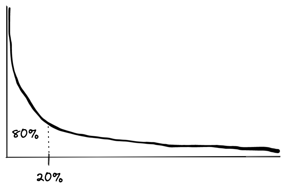
The way I like to look at this is by acknowledging that Power Law is all around us. Probably 99/100 people reading this already heard it all before, but basically a power law describes a relationship between two quantities y and x such that y(x) = x ^ some power. When you plot a power law distribution it looks like this:

Another example of a power law relationship is the Pareto principle, or 80/20 rule, where 80% of the result is caused by 20% of cases. That’s the head of the graph. All the rest is in the long tail. You could put it even more bluntly and call it “winner takes all”.

It’s everywhere, in nature, life and business. From the distribution of crater sizes, the amount of food animals of a certain size need, the distribution of wealth across a society, pandemics.

Although you might want to call it the 99/1 rule instead. Inflation, a sign of the times.

So back to the beginning. What does this have to do with starting a business? Because so much in business follows this power law, looking at it in terms of power laws makes it simpler to understand why it seems difficult to start, and why success is in fact possible, and why certain routes are harder.

Audience, followers and marketing

For example, when looking at an existing large audience an established company has, it seems impossible to get there. You start out with 0 followers. Then finally you get your first follower or signup for your newsletter. Then finally another one, maybe 4 more. This will take forever! You’re at the end of the tail, and everything looks flat from here.

But. Power law! We see the same relationship in network effects, such as building communities, an audience or a following [1]. The value of a network goes up with the number of participants squared. So next time you send something to your followers, some in the network might notice it. Before you know it, people start sharing your content with some of their followers or friends. Slow at first, but the pace of new followers will pick up.

The important lesson here is to keep going. You shouldn’t look at the slow growth as it not working out, rather you are in the tail. This is the part where you shout in the void, and need to trust that it’s working. The network effect and power law are real. Similarly, you shouldn’t look at some other products following of 100K as unattainable, but rather see it as doubling only 16 times (of course it takes work, but that’s not impossible at all).

Content and thought leadership

The same applies to writing content and sharing ideas.

  • 99% of all content is created by 1% of people
  • 99% of the public debate is determined by 1% of the people (because they publish).

It looks like there is a lot of content out there, but related to the enormous size of the internet, there is almost none. That makes it way easier to have an impact on opinions, debates and establish yourself as a brand in a field you’re interested in.

  • 99% of all traffic will come from 1% of your posts
  • only 1% of all total views for your content will occur at the beginning

Almost nobody reads any of your content at the beginning, and that’s normal and expected. It’s important to keep publishing because you need the numbers to get to that 1% post which will do well (and make the rest of the content work you did compound).

Launches, internet points and product-market fit

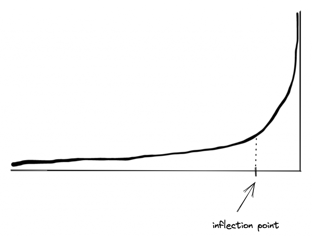
Just to name some well-known examples to many startup founders: 1% of launches on ProductHunt will get 99% of votes, only 1% posts of Hacker News will get any traction at all. When a submission to one of those sites gets traction, the long tail of upvotes will just be a handful. You need to get to the 20/80 inflection point of the graph where suddenly it takes off and starts collecting all the other votes.

Having a great post or product is completely necessary to do that, of course. But the difference between 1000 upvotes and 1 upvote is not 1000x. It’s a few votes at the beginning, after which you’ll get the 99% of other votes. Again, good to realize this and not get discouraged and take one launch of a feature or product which failed to get traction as evidence that the entire concept is flawed.

The same goes for product-market fit. It’s a lot of long tail small changes which can suddenly bring you to the 80/20 inflection point where things really take off. Once things grow really quickly, you haven’t put in 1000x times the work, but a few doublings in the tail (which are just small numbers) brought you to this moment. From there on, everything goes quickly (feedback, revenue, press, and so on).

Competition

You will only have heard of a few big players (1%) in the market. They seem to be everywhere, but in fact there’s an entire long tail of businesses which have customers! Depending on the market, that long tail can be very lucrative. If you want to build a nice lifestyle business, don’t overlook big markets because there are a few large players. Build in the niches of the long tail.

Looking to become a big player in the field yourself, but see a lot of players? Only 1% of those will become really big, so if you’re willing to go for it, there’s less competition than you think.

Customers, support, reviews and pricing

Let’s end with a few more:

  • 1% of your customers will be your biggest fans and spread the word. That’s why your MVP needs to focus on getting those!
  • 99% of support is going to come from 1% customers. Don’t be afraid to “fire” them if it becomes unreasonable.
  • Likewise, most revenue is going to come from a few customers and few price plans. Make sure your pricing plans follow the power law, and allow customers who see a lot of value to subscribe to a high pricing plan!
  • There will be features which are only used by 1% of customers. Likewise, the vast majority of customers will only use a few core features. The long tail of customers which those extra features bring in will be relevant over time, but no need to launch with those.

[1] Slightly related to the topic of audiences, I like this TED talk by Derek Sivers about starting a movement (https://www.youtube.com/watch?v=V74AxCqOTvg). I just watched it again, and without measuring the exact seconds, I’m pretty sure the number of people dancing along follows a power law.