 @wcools
On Day -1, before we actually started, we wrote a bit about creating the website you’re reading now. Now that the landing page for the app we’re building is live, I thought I’d do the same for thymer.com.
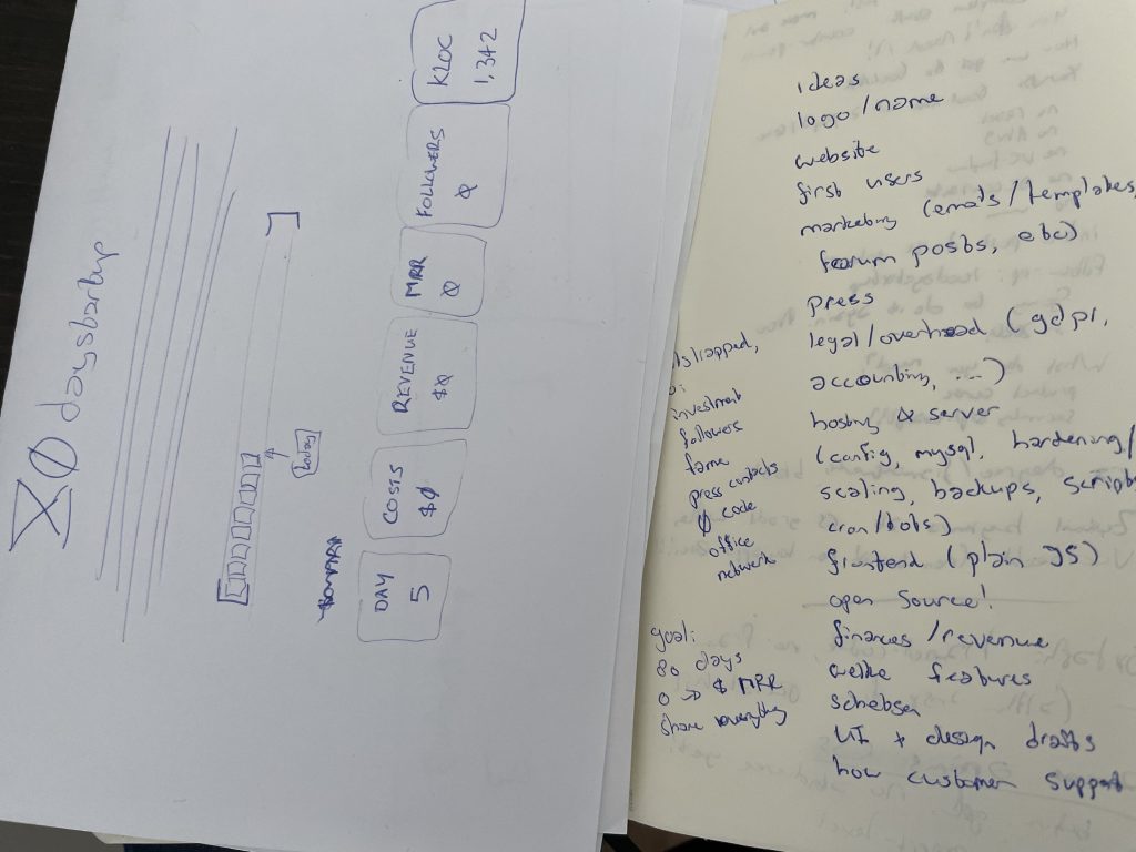
With each new design, I usually start with sketching out some ideas on paper. What elements should go on the page, what message do we want to convey.
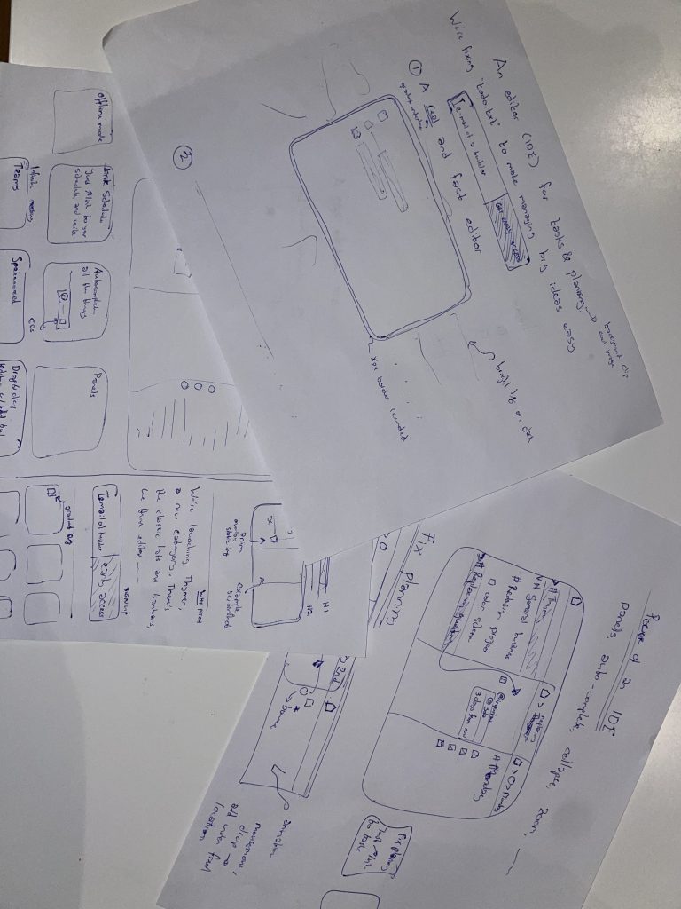
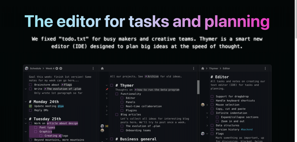
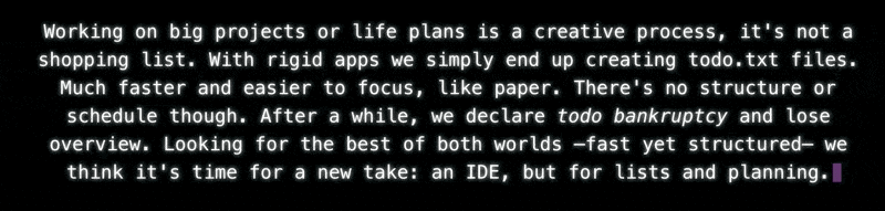
Because the product itself isn’t ready yet, we can’t really have a video or demo of the product on the page. That’s why I made a few mockup screenshots before.
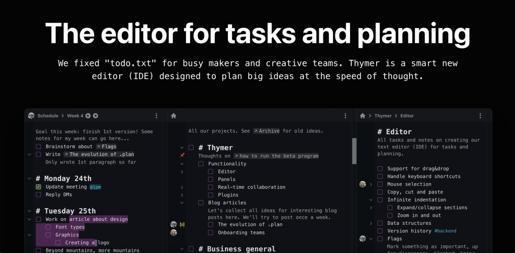
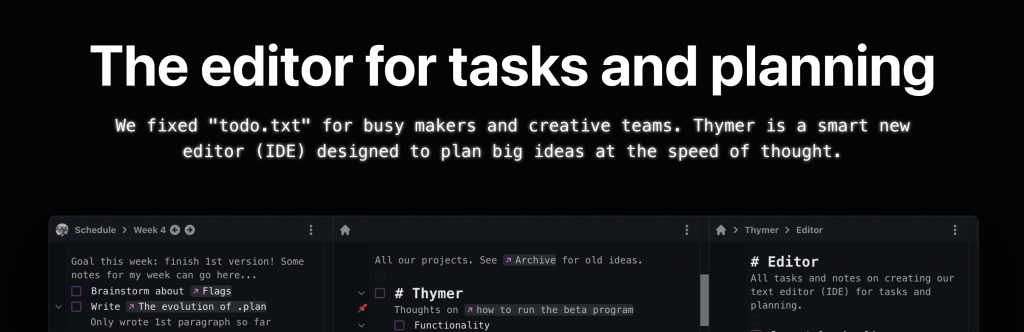
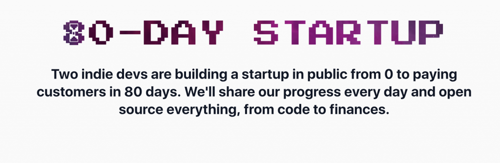
I also worked on a few different headings and subtitles to try to make it clear what the product is about and what the pitch is. Hopefully the main heading, H1, will tell our initial target audience why this might be interesting in 5 seconds.
For the look and feel of the site I was thinking about dark mode. It seems to be popular with many apps our likely initial users are familiar with, and it fits well with other related software such as IDEs, editors and terminals, and in general many modern apps too.
This was actually the first time I really worked with just dark mode, so I started reading a few concepts first, such as this page. The book RefactoringUI is a great resource too (for anything UI design really).
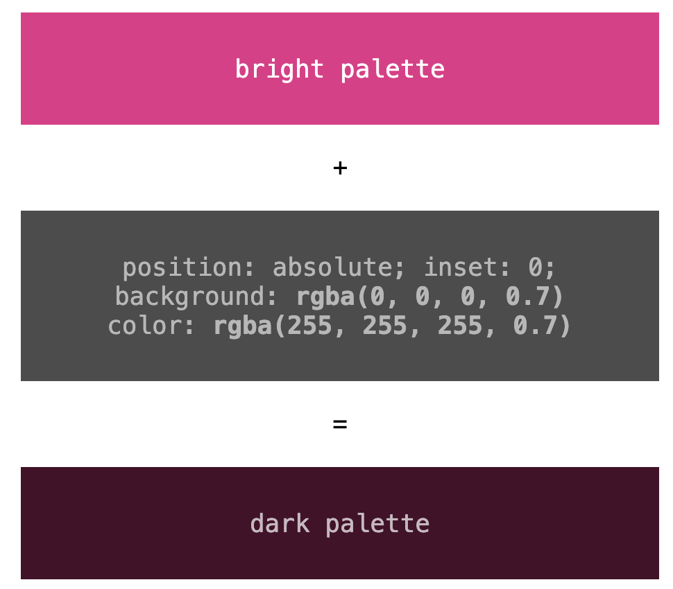
With that, I picked some basic colors for both the screenshots and the site. Rather than going for 100% black or 100% white, one trick I often use is to pick a few colors, and then overlay them with another div, position: absolute with a dark background color (and light foreground color) and alpha-blend them.
As for the font, just like in the product and the screenshots, using some accents with a monospaced font felt like a good match, so I picked those for the H2 sub-headers.
This looked like a good start but other than the screenshot it looks rather boring, so time to think about adding some colors and other elements. When thinking of the monospaced font a bit more, I thought maybe it would be a fun effect to add a bit of the glow from those retro terminals:
Another technique I always like to use to add some pizzazz while being able to keep the rest of the page simple is to use some sort of gradient or colorful image as a background for the H1 heading.
h1 {
letter-spacing: .1px;
-webkit-background-clip: text;
-webkit-text-fill-color: transparent;
background-clip: text;
background-image: url(some_cool_picture.jpeg);
background-position: 0% 20%;
color: transparent;
...
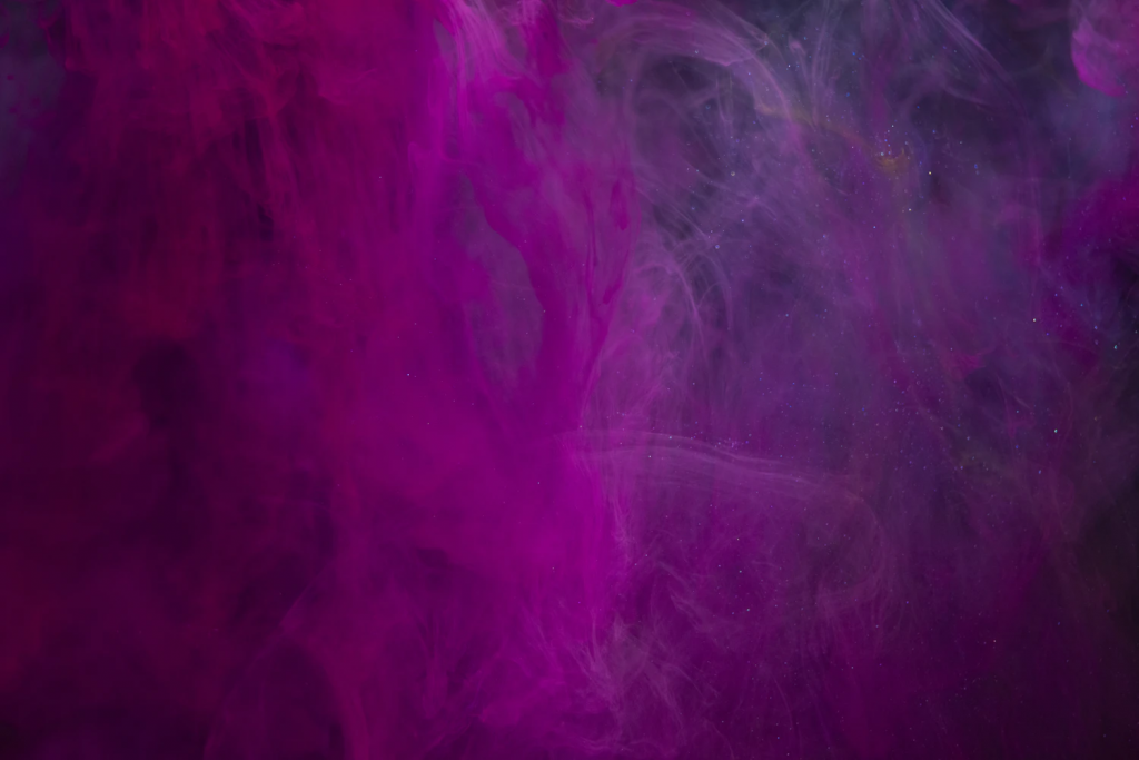
}I usually just browse on Unsplash, and search for something like abstract or certain color names. I then use the image as the background-image with the background-clip: text effect, and see what it looks like.
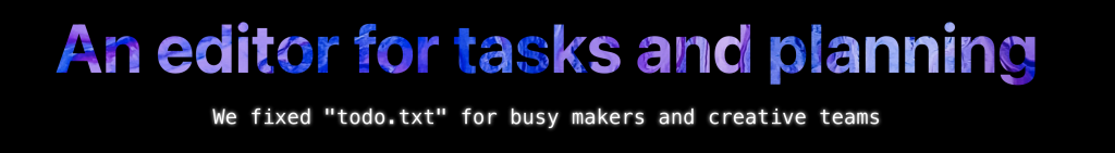
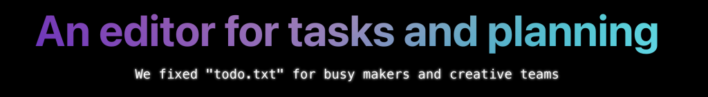
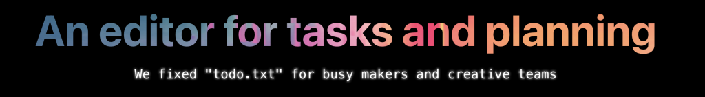
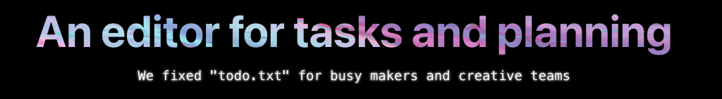
In the end I didn’t use any of the images directly, but it gave me some inspiration for a gradient, which I then generated with some online gradient tool (I think it was https://cssgradient.io/, but there are many of them).
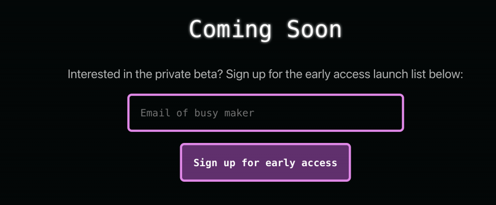
Next up was adding a call-to-action (we want to build a launch list for the private beta) and some more details/benefits about the product we’re building. The CTA is nothing special, just a form and hook it up with an online form provider.
Even though we have to keep the first version of the product small, just the flexibility of the core editor component gave us quite some ideas of cool use cases users might use the product for. I first I thought of adding a detailed “tour” highlighting all of those, but that would take way too much time. Especially because we can’t easily take screenshots from the product itself, as it’s not ready yet. Plus our main goal is to just generate some initial interest. We’ll be able to let the product speak for itself and let users discover all the extra’s once it’s ready.
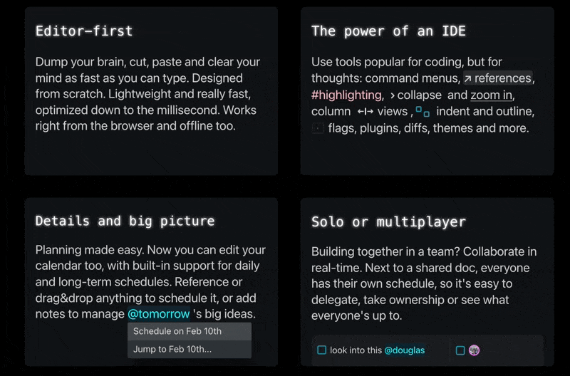
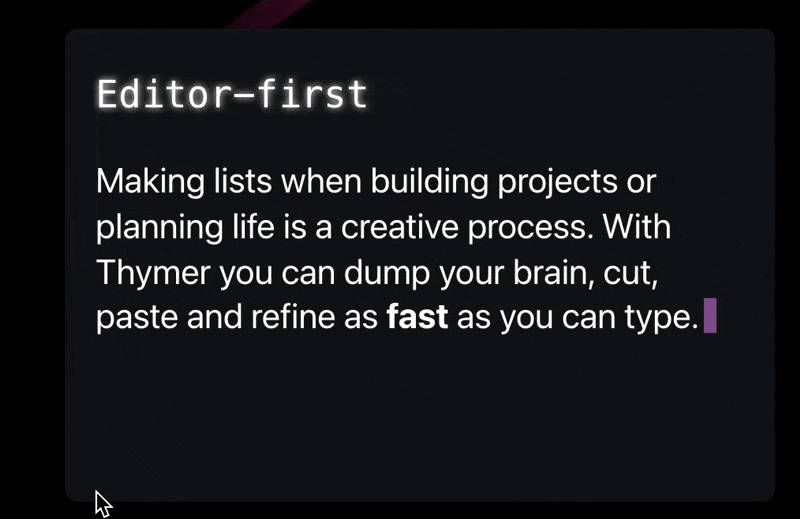
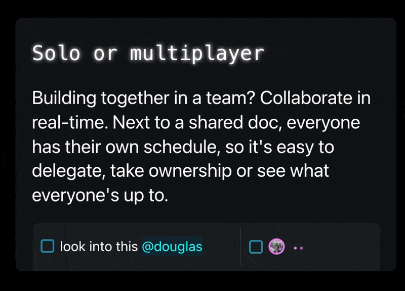
I picked 4 core parts of Thymer to highlight: how it being an editor of sorts is a different approach from classic lists/kanbans, how we think tools like IDEs are a great match for managing big plans, how we think this is better for planning too, and highlight the fact that Thymer also works in teams.
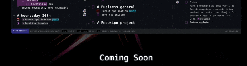
To make the page less text-heavy, it would be nice to have something accompany the text explaining the benefits. Instead of screenshots or animated gifs (which again, we don’t have yet) or drawing something (which would cost time), I thought using some UI elements within the text might be interesting. They should be instantly recognizable for our users, help explain what it is and make it look a bit more colorful. Plus, it’s easy to make, and there’s a lot on our todo list right now.
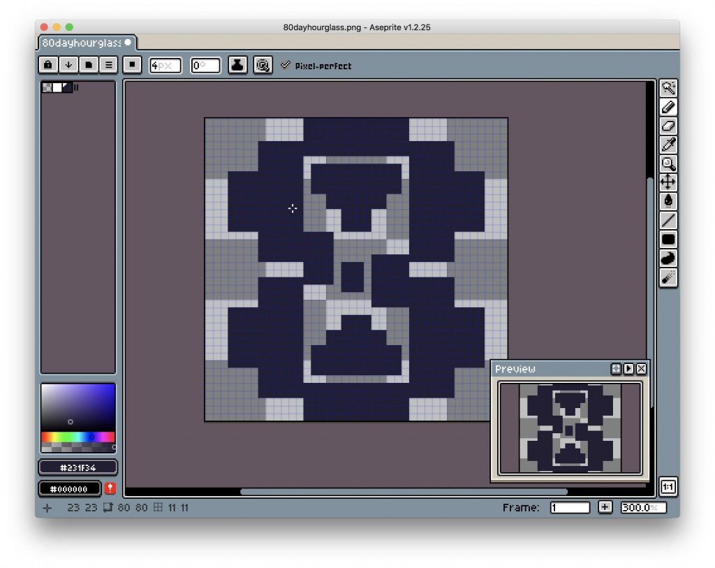
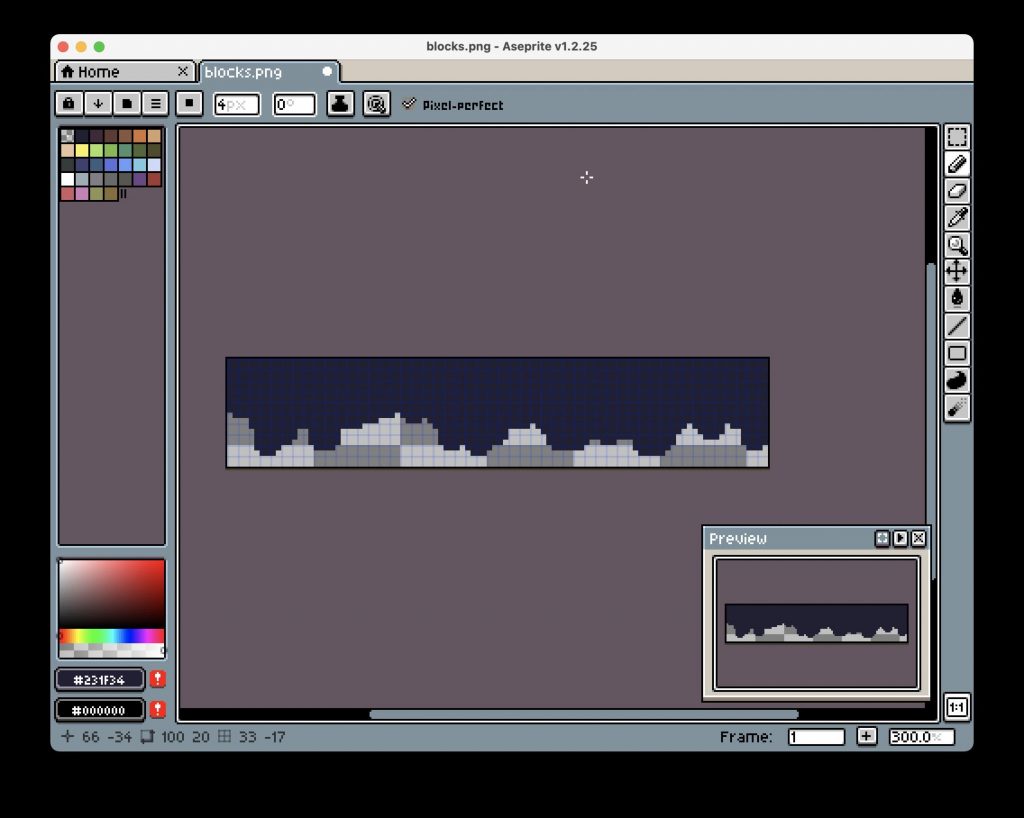
I probably rewrote the entire thing at least five times, but that’s just how that process works ;), see the messy work in progress screenshot:
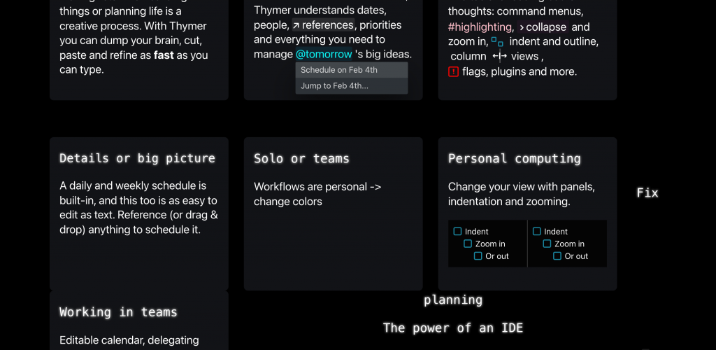
Eventually I settled on four “tiles” with a few animations/UI elements in each. The autocomplete menu will show the actual date of tomorrow at the time someone visits the page. The “someone’s typing” animation will probably be instantly recognizable to show the editor supports multiplayer. Very little work to describe things with less text and more colors.
I also added a quick summary of why we’re making Thymer at the end. I’m not sure if it adds a lot, but if we’re going to explain to anyone what we’re doing, a valid first question would be “seriously, another to-do list?”, so this would hopefully explain that part 😅. Added the blinking cursor effect to emphasize the editor part again.
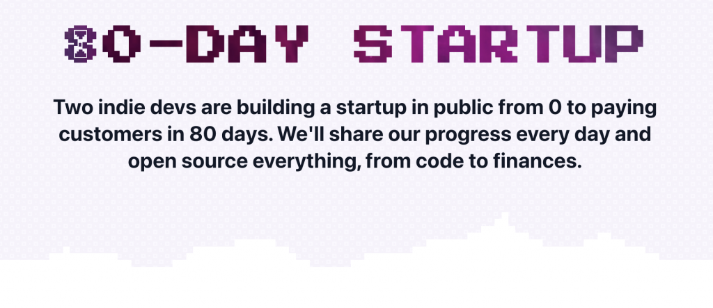
I thought it looked OK enough for a V1. Maybe this was the point I should have just shipped it ;), but I still wanted to add some cool effect above the fold. In one of the messy paper drafts, I had added a few lines around the product screenshot, which were meant to be some bright colors popping out against a dark background.
I looked around in all the abstract photos I had found on Unsplash, and one in particular (https://unsplash.com/photos/gbY7XxB8Pzs) was a great fit with the colors of the app and the landing page. Using the same rgba(0,0,0,0.X) trick as for the color palette, I got it to blend in a bit more. To make it more dynamic, I added a very subtle animation to it by very slowly making it scale. Also gave the screenshot a subtle shadow to work better with the new background.
@keyframes pulse {
  from { transform: scale(1.0); }
  to { transform: scale(1.2); }
}
.pulse {
 animation: pulse 6s linear infinite;
 animation-direction: alternate;
}
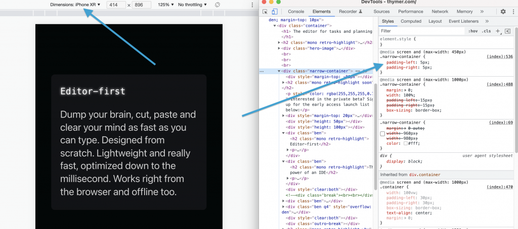
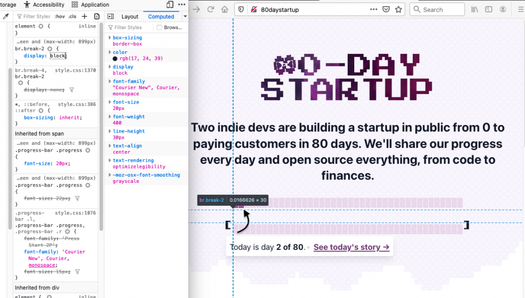
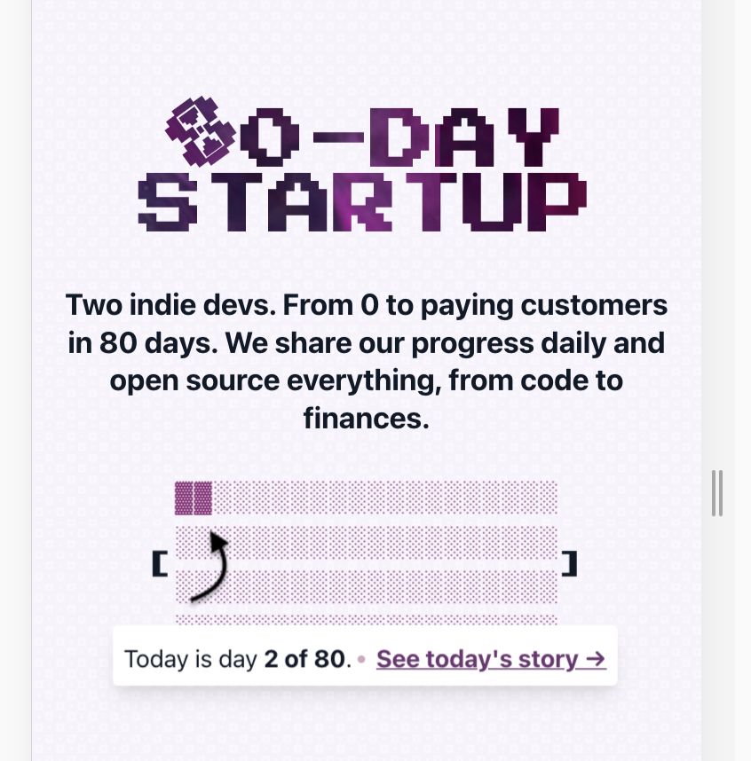
The last part was making the website responsive. I just quickly hacked together some media queries using Inspect Element and checking which elements didn’t look good on smaller screens. It was mostly adding a bit of extra padding when not showing the benefit blocks next to each other, and making sure the desktop-size screenshot would stay large and scrollable so phone users can see the details too.
All in all the landing page is just a single .html file with a few lines of inline CSS/JS, and a few images.
And that’s the landing page. Now time to continue the work on building the actual thing, which is a tiny bit more complicated 😉