As a kid I would always work on one project or another, but I would often postpone working on the hard bit. I would the easy and fun stuff first, and it felt like making great progress. If I wanted to make a video game I would start with the game engine and interface but never get around to making the actual game mechanics or levels. If I wanted to make a web app I would try five different tech stacks in order to find the “best” one. I would build user registration and password reset systems but ignore the core functionality. By the time I got to the important part I would figure out that either the concept didn’t work or that I wasn’t able to build it. Abandon project. Repeat.
It took me an embarrassingly long time to learn but eventually the lesson stuck. Build. The. Hard. Part. First. No exceptions. In other contexts this is known as “unknown unknowns“, a concept popularized by Donald Rumsfeld. Your first priority is to work on the hard parts where you don’t know what kind of problems you’ll encounter (unknown) and you don’t know what it will take to address them (unknown). Then focus on the known unknowns. Save the rest for last.
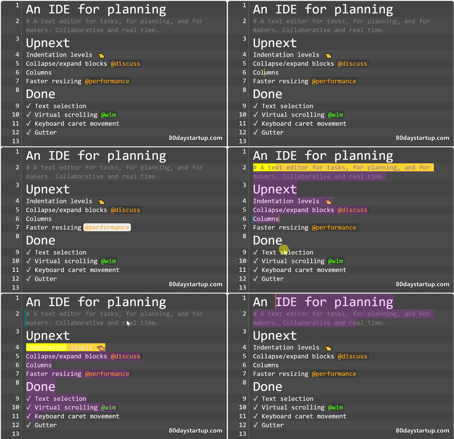
We’re making a prosumer web app. For apps like these there are two types of hard problems: technical and user experience.
Tech challenges
Challenges are technically hard when you’re not sure if you can make something work at all, or work reliably, or fast enough. Or when you have no idea how long it will take.
For these technical challenges you want to build small prototypes. If you can figure out in a short time (days, a week) what it will take to find a good solution you want to do this early on. Way early.
We’re already making tech prototypes and we haven’t even figured out yet what the core functionality of our app will be. This might strike you as backward, but it’s entirely intentional. You can’t decide what the app should be like if you don’t know what you can realistically build in the time you have.
You can never build the ultimate version of your app. That would take years. If you’re lucky you can make 5%. And your app, despite being only 5% of what you want it to be, should still provide real value to the user and present a clear vision of where it’s headed. Technical prototypes help you figure out what has to get left on the cutting board. Tech prototypes turn unknown unknowns into known unknowns.
UX challenges
It’s easy to imagine better products. We all get annoyed with apps that don’t work right. Or are slow. Or that don’t have features we consider essential. Actually making an app that is great? Not that easy. It’s a cliché but true: everything is a trade-off. Fixing bugs and making software fast takes time that could otherwise be invested in features. It’s still true when you don’t take time into consideration because you can’t make software better by just piling on more features.
That’s the real difficulty of User Interaction (UX) design. If you want to make software that is intuitive to use you can only put a handful of features front-and-center. You can hide some extra functionality in panels or settings pages, but that doesn’t change the fact that you have to direct the user’s attention somewhere. If you put the right features front and center that will make your app cohesive and intuitive, and if you get it wrong your app will be mediocre at best. UX problems are known unknowns. You know you have to solve them and they won’t blindside you like technical issues do.
UI sketches and thinking will get you only so far. At some point you have to build a primitive version of your app to figure out if the concept works at all. Innovation is great, but you don’t want to be different for the sake of being different. You want to make something that’s original and also — at least for some people — much better than anything else out there. The sooner you know if you’re on the right track the better. The only good design is redesign[1].
Leave the easy parts for last
When the core of your app is done and you’re happy with it you can go back and work on the long tail of easy parts, the known knowns. By this time you should be super excited that your app is finally coming together and you’ll have no difficulty hammering out mundane stuff like billing, user registration, and a settings page.
Conclusion
Build small prototypes before committing to a specific vision. Make something you can interact with so you can feel if you’re on the right track.
Finally, keep an open mind. It’s possible (perhaps even likely) that your original approach is just worse. Sometimes you can pivot into something that works. In most cases you have to face reality and cut your losses altogether. It’s rough to abandon what you worked on for months or a year but it’s the price you pay for trying to innovate.
[1] These UX challenges apply mostly to consumer products. For B2B software customers are willing to put up with a broken and poorly designed app if it addresses a big pain point for them or makes them money. The quality bar for consumer apps is a lot higher.


