Day 12

~~~~~~~~~~~~~~~~~~~~~~~~~~~~~~~~~~~~~~~~~~~~~~~~~~~~~~~~~~~~~~~~~~~~~~~~~~~~~~~~~~~~~~~~~~~~~~~~~~~~~~~~~~~~~~~~~~~~~~~~~~~~~~~~~~~~
We're building a startup in 80 days in public. Day 12 was on Jan 25 '22. You can find today's entry at Day 67.

Today's posts:

Work on the landing page

Today I spent a lot of time trying out different copy, layouts and designs for a landing page.

On the one hand we don’t want to spend too much time on it, and we’ll be updating the page anyway as we build the actual product (the screenshots are only mockups after all). We do need to make sure though that it’s something which is good enough so people get an idea of what we’re building are interested in giving it a try.

I usually start with trying out different layouts on paper, to sketch out the “shape” of the site. In this case, I was thinking of several parts:

  • A catchy heading, describing in a few words what the product is. You often see things like “work better together“, or “we support your business!“, but that doesn’t tell you anything. Same goes for trying to explain what it is in a few paragraphs of text. If you need that much explanation, your vision for the product isn’t clear enough yet. It’s fine to do some long-form “pitch” after the headline of course. It’s also OK if not everybody understands it, as long as the audience we think would be interested initially gets it right away.
  • A screenshot to “demo” the product. We don’t really have a product yet, so this will be a mockup of what the UI could look like. I’m also trying to come up with good examples of what to show in the screenshot itself. Something our audience understands, relates to, and might need the product for themselves. It also helps to sneak in some easter eggs or jokes here and there which our audience would recognize.
  • A form where people can leave their email address to sign up for early access. Probably in the form of a private beta, but we haven’t really decided about that yet.
  • A few more details of the benefits we think this solution has.

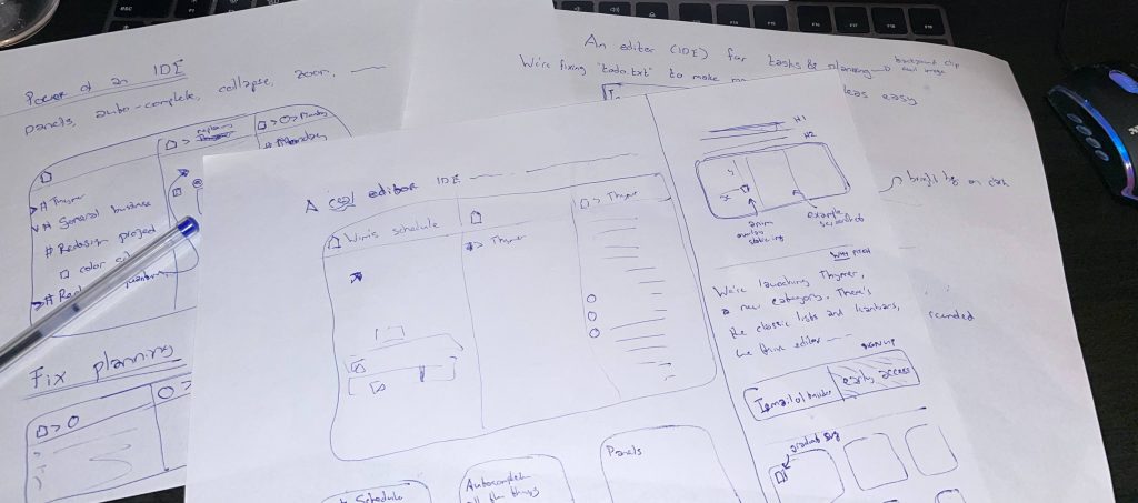
After the paper sketches, I tried to come up with an initial draft version in HTML and CSS. It’s nice if the part above the fold pops a bit to catch people’s attention. It also prevents the page from feeling bland, even if we keep the rest of the page very minimal for now. I tried dozens of combinations, but here a few examples:

It’s a very slow process at first, but usually the pieces start falling into place once a few of these main parts are done. Hopefully more to show by the end of tomorrow!

Build one to throw away

Any time you try something new you don’t know how it will turn out. And your first attempt at anything won’t be very good. You don’t have to feel bad about this. It’s just how it is. If you know in advance that something will turn out great you’re probably working on something too easy.

With the knowledge that it’s counterproductive to pursue quality prematurely, you are now free to focus on something else: discovery. Be curious. Be open minded. Build something wacky. Experiment freely.

If all good design is redesign and all good work is rework then you have already decided you’re going to throw your prototypes out. This means you don’t need to worry about having to scale to a million users. You don’t have to worry about having “the best” architecture. You don’t have to worry about every pixel being in the perfect place. Take shortcuts. Stub out what you can. Copy-paste freely. It doesn’t matter.

You’re free. You’re free to work directly on your core innovation. That thing that makes your app interesting and unique. The less code you have the easier it is to move things around, delete, and rewrite. It’s at this time that you can hone in on what works and learn what doesn’t. It’s this phase of experimentation that will determine whether you’ll have mediocre or exceptional product/market fit down the road.

Spending extra time in this exploratory phase doesn’t guarantee you’ll get a good outcome, but it helps for sure. Knowing it’s futile to pursue perfection in means you can take ugly shortcuts with a clean conscience.

Of course, in the long term you do want quality. Of course you want to make a product you can be proud of. But in order to get there you’ll need to experiment.

That’s where we’re at for the time being. We want to figure out what works. We have a couple of ideas that we want to explore. Does it make sense to use a text editor for everything? Do we want our app to be offline-first and collaborative at the same time? Are we on the right track? I don’t know. Nobody knows.

We build and throw away. Build some more and throw away. With our 80 day deadline inching closer it’s difficult to resist the temptation to rush forward. To start building the app for real. But we can’t. Not yet. First we prototype. Then we build the MVP. Then hopefully we’ll end up with an MVP that sparks joy.


← Previous day (day 11)Next day (day 13) →


You can follow us on Twitter @jdvhouten and @wcools and look for #80daystartup

Read more

Work/new-life balance
Durable tech
Dogfooding
Early user feedback
Spending time to save time
Products want to be platforms
Always be launching
Enjoying the journey
Work-life balance
Recap @ Day 59
Perils of caching
Desktop-first
Making sense of contradictions
Trust signals
DIY javascript error logging
Taxes: an automation story
Magical thinking
Start small
High conviction, low conviction
Most deals fail

Post archive