Build one to throw away

Any time you try something new you don’t know how it will turn out. And your first attempt at anything won’t be very good. You don’t have to feel bad about this. It’s just how it is. If you know in advance that something will turn out great you’re probably working on something too easy.

With the knowledge that it’s counterproductive to pursue quality prematurely, you are now free to focus on something else: discovery. Be curious. Be open minded. Build something wacky. Experiment freely.

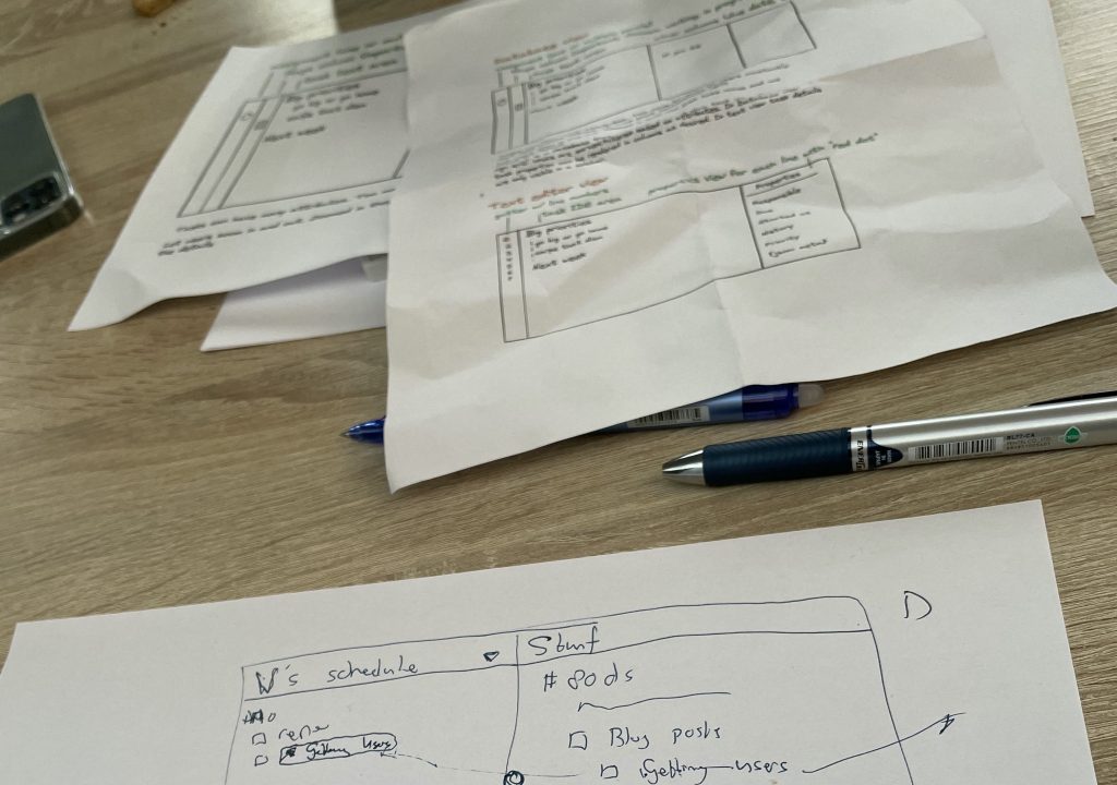
If all good design is redesign and all good work is rework then you have already decided you’re going to throw your prototypes out. This means you don’t need to worry about having to scale to a million users. You don’t have to worry about having “the best” architecture. You don’t have to worry about every pixel being in the perfect place. Take shortcuts. Stub out what you can. Copy-paste freely. It doesn’t matter.

You’re free. You’re free to work directly on your core innovation. That thing that makes your app interesting and unique. The less code you have the easier it is to move things around, delete, and rewrite. It’s at this time that you can hone in on what works and learn what doesn’t. It’s this phase of experimentation that will determine whether you’ll have mediocre or exceptional product/market fit down the road.

Spending extra time in this exploratory phase doesn’t guarantee you’ll get a good outcome, but it helps for sure. Knowing it’s futile to pursue perfection in means you can take ugly shortcuts with a clean conscience.

Of course, in the long term you do want quality. Of course you want to make a product you can be proud of. But in order to get there you’ll need to experiment.

That’s where we’re at for the time being. We want to figure out what works. We have a couple of ideas that we want to explore. Does it make sense to use a text editor for everything? Do we want our app to be offline-first and collaborative at the same time? Are we on the right track? I don’t know. Nobody knows.

We build and throw away. Build some more and throw away. With our 80 day deadline inching closer it’s difficult to resist the temptation to rush forward. To start building the app for real. But we can’t. Not yet. First we prototype. Then we build the MVP. Then hopefully we’ll end up with an MVP that sparks joy.

Design sketches

Rough UI sketches for our app. It’s going to take a while for it all to come together. Most of what we design in the very early stages won’t make it in the final version, but this time is critical for us to figure out what’s really important and what can be left out.

We know we want an editor-first experience, because typing is fast and natural. It doesn’t slow you down when you’re thinking. But we also want a structured environment so you can plan tasks and deadlines in the future and not have them get lost in the noise. Because task lists get moved and shuffled around constantly (at least if you’re like me) you want an interface that encourages this free-form use.

80 days is not enough time to get everything right, but if we get enough right we can fix our mistakes in a Version 2.0 down the road. Skipping over the ideas and prototyping phase won’t get us to the finish line any faster.

I’m going to sleep on these ideas during the weekend. Many of our Great Ideas turn into “what were we thinking!?” days or weeks later. Funny how that works. It doesn’t bother me, though. Worst case we’re going to need another complete redesign cycle or two. Best case our ideas start to converge from here on out to something with a strong conceptual core. Then we can start heads-down-coding and we should pick up speed!

This wraps up week 2 for me!

Designing the app part 1: sketches & mockups

Today we’re working on more sketches for the design of Thymer (👉 What are we going to build).

As I mentioned yesterday, the goal of sketching what the app should look like is to refine our thoughts on how everything should work, and to get a preview ready for the initial marketing/landing page.

Hopefully we’ll be able to get the landing page done within the next few days. I see it as the trailer of a movie. We need it to build an audience before the actual launch and to gauge the initial response. And to stay with movie analogies, the initial preview we post will be just a like a set: there’s no need yet to build a real street with real houses, just the facade.

Working on all the sketches also helps to expose a lot of hidden additional design decisions we need to make. Even though it’s just a mockup screenshot, we’re making a lot of mini design decisions already. It doesn’t look like much on the screenshot, but we’ve had to think about how to deal with indentation, how task attributes work when you can edit everything in plain text, scheduling vs due dates, assigning responsibilities, and so on. We’ll revisit some of these topics in the coming weeks and explain how they work when we build them out.

As for creating those mockups, my two tools of choice are good ol’ pen+paper and creating a plain HTML file with CSS. It’s just fast to iterate this way, and using tools like the browser’s Inspect Element lets you quickly try out different colors and so on. The earlier in the design process, the simpler the tool I prefer so it’s easy to try out different approaches and throw things out.