As I’ve been working on the landing page, I’ve tried to sneak in a few animations here and there. On the one hand it’s really easy to overdo it, but done right it can really help to give your product a bit of personality. Software by itself is not terribly exciting, and using animations (and sounds for that matter) make it a bit less boring, more fun to use and make it spark joy.
There’s this fun talk about how adding small juicy effects can really make something a lot more interesting. In the case of the talk it’s about games, but I think the same applies to all kinds of software and devices we use everyday. Life’s too short for boring, and even software should be fun to use, so there’s a lot we can learn from games and movies here.
Of course the amount of work we need to spend on animations, sounds and lighting is absolutely nothing compared to the huge projects needed in games and movies.
The only thing we need is a few subtle animations here and there, and just using plain CSS3 this is super easy. If you’ve worked with CSS before this isn’t news, but if you still remember the old days of the web it’s amazing how much you can do nowadays with just a few lines and it actually works in all browsers. Random animation:
.. took 1 minute and just a few lines of CSS:
<style>
.box {
display: inline-block;
position: relative;
transform: translateX(0);
width: 30px;
height: 30px;
background: purple;
animation: slide 2s infinite;
animation-direction: alternate;
transition: opacity 1s;
opacity: 1.0;
border-radius: 50%;
}
@keyframes slide {
 0% { transform: translateX(0); opacity: 0; }
 100% { transform: translateX(300px); opacity: 1.0; }
}
</style>
<div style='width: 100%'>
<div class='box'></div>
</div>
On Day -1 I already wrote a bit about the animation on the front page for the 80-Day Startup blog. For the landing page for Thymer, I’ve been experimenting with adding a few small animations to help explain the concept better on an otherwise completely static page (we only have a “fake” screenshot at this point).
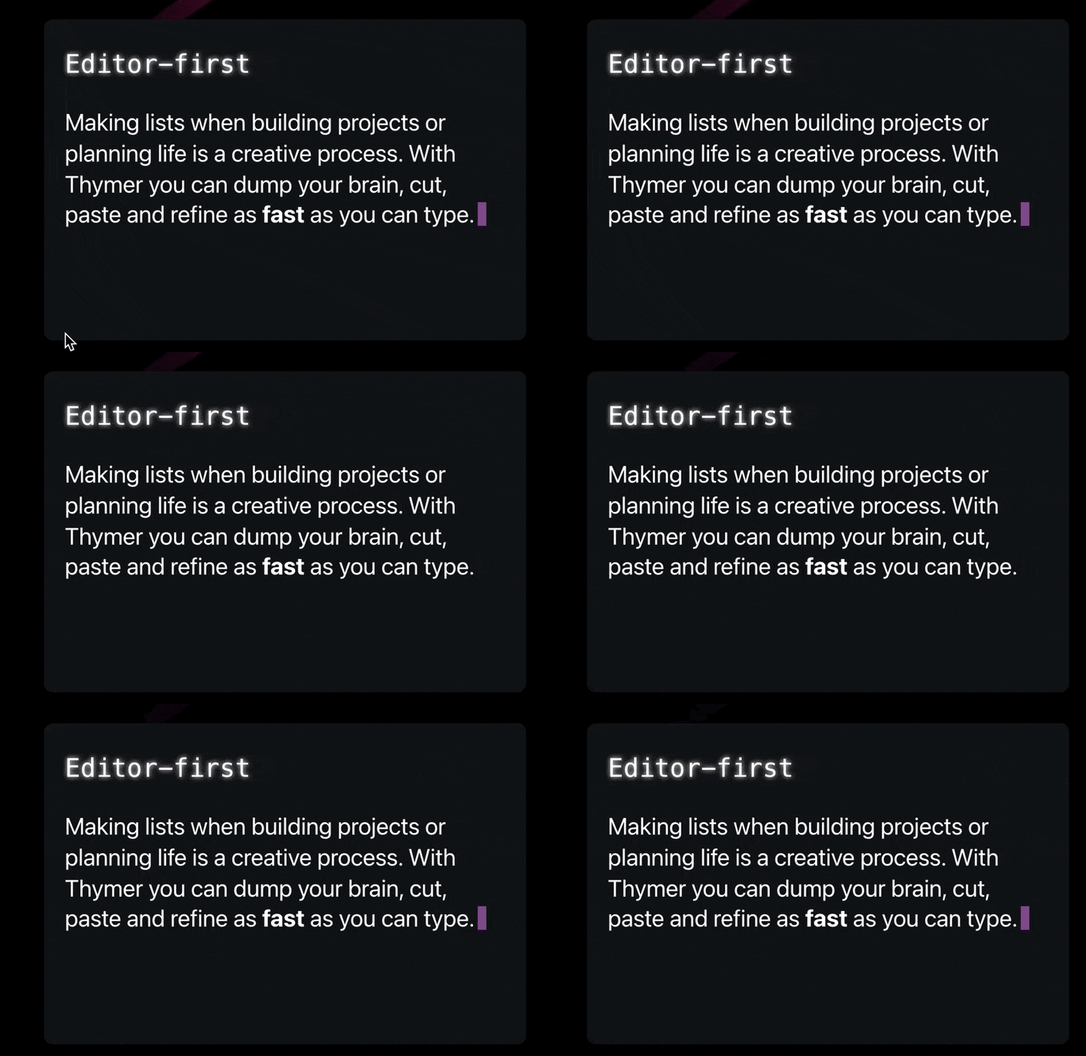
For example, to convey the concept of an editor, adding something dynamic like a blinking cursor makes it immediately recognizable. And because we’re building our own custom editor, even something as simple as the cursor we can customize and make its style part of the brand in a way.

@keyframes blink {
    0% { opacity: 0; }
}

.cursor::after {
    content: "";
    width: 8px;
    left: 3px;
    height: 22px;
    position: relative;
    top: 3px;
    background: purple;
    display: inline-block;
    animation: blink 1s steps(2) infinite;
}
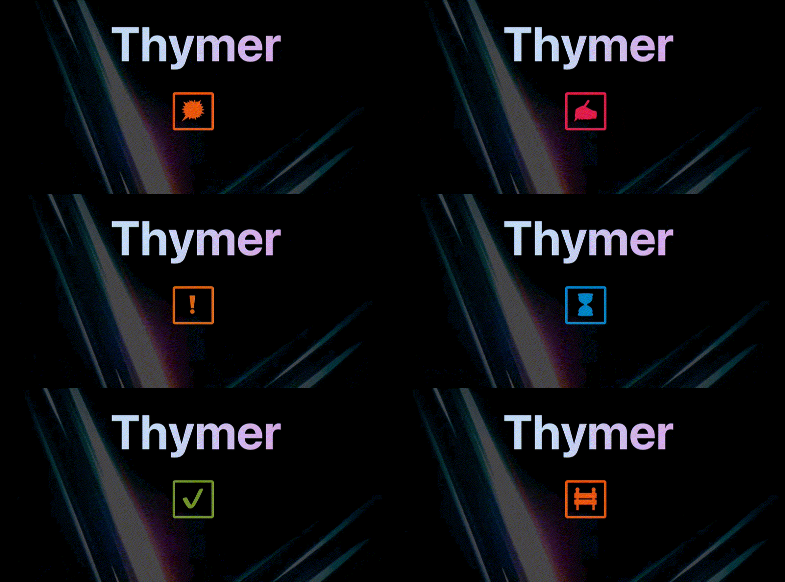
Another feature in Thymer we’ve been thinking of is flags. Rather than just having a checkbox on a line if it describes a task, this way you can add a flag to a task to assign some status to it (like important, working on it, blocked, and so on). Because there’s many things you can track this way, I thought it might be fun to have a kind of animation where one flag morphs into the next.

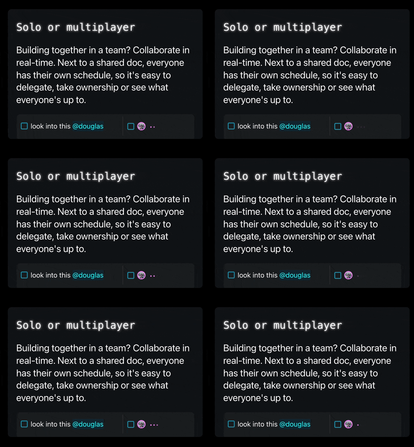
Animations are also really useful to show what’s happening without having to explain it with a bunch of text. For example, the idea is that Thymer will support collaborative editing, where you can work together with people in a team. When multiple people are typing at the same time, we don’t have to add a lot of clutter like “John is typing…”, but can simply use a convention we’re all used to now, animated dots:

Anyway, back to work on finishing the landing page! I’ll try to get to a more detailed write-up of all the steps building it next week.
Ending with another fun demo video (I already shared it before but it’s just a great example of how paying attention to making something mundane more interesting can help your product stand out)

