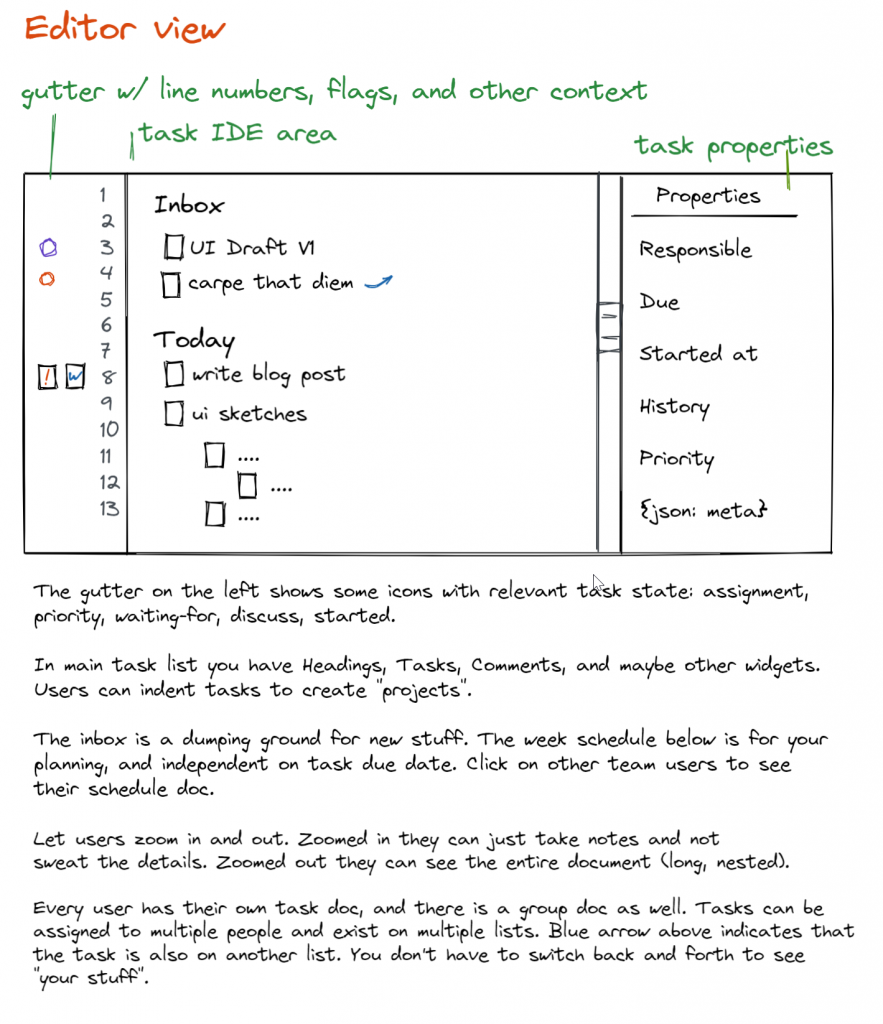
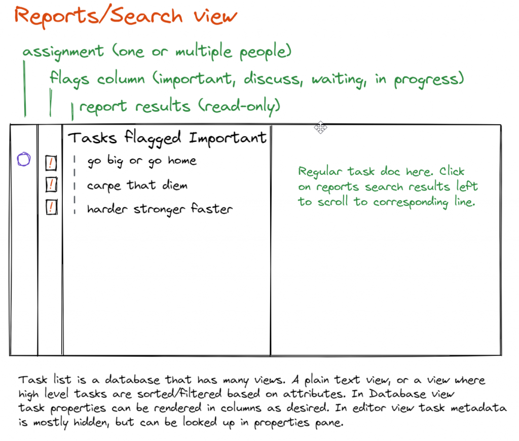
Rough UI sketches for our app. It’s going to take a while for it all to come together. Most of what we design in the very early stages won’t make it in the final version, but this time is critical for us to figure out what’s really important and what can be left out.
We know we want an editor-first experience, because typing is fast and natural. It doesn’t slow you down when you’re thinking. But we also want a structured environment so you can plan tasks and deadlines in the future and not have them get lost in the noise. Because task lists get moved and shuffled around constantly (at least if you’re like me) you want an interface that encourages this free-form use.
80 days is not enough time to get everything right, but if we get enough right we can fix our mistakes in a Version 2.0 down the road. Skipping over the ideas and prototyping phase won’t get us to the finish line any faster.
I’m going to sleep on these ideas during the weekend. Many of our Great Ideas turn into “what were we thinking!?” days or weeks later. Funny how that works. It doesn’t bother me, though. Worst case we’re going to need another complete redesign cycle or two. Best case our ideas start to converge from here on out to something with a strong conceptual core. Then we can start heads-down-coding and we should pick up speed!


This wraps up week 2 for me!

