Okay, so the plan is to build a software startup in 80 days from scratch. On Day 1 we’ll probably begin by exploring an idea of what to build.
For now, we first need a website/blog to share our progress. As we’re building everything in public, we might as well go meta and write about how we make this website before we really start. This post is the only one that isn’t really live, because we had to put up the blog before we could write this post, so we’re calling this day -1 🙂
The idea for this site
A year or two ago, we were thinking it would be fun to share some things we’ve learned while building our SaaS products. In the end we never got around to writing anything. There are so many books on the subject by now, so we just weren’t really sure if anyone would really care about this from two unknowns.
Then last summer we got an idea: how about we set ourselves the challenge to build a new business from scratch, while sharing exactly what we’re doing. This sounded way more fun and different from yet-another-blog-or-ebook. And we get to build something cool (hopefully!) in the process.
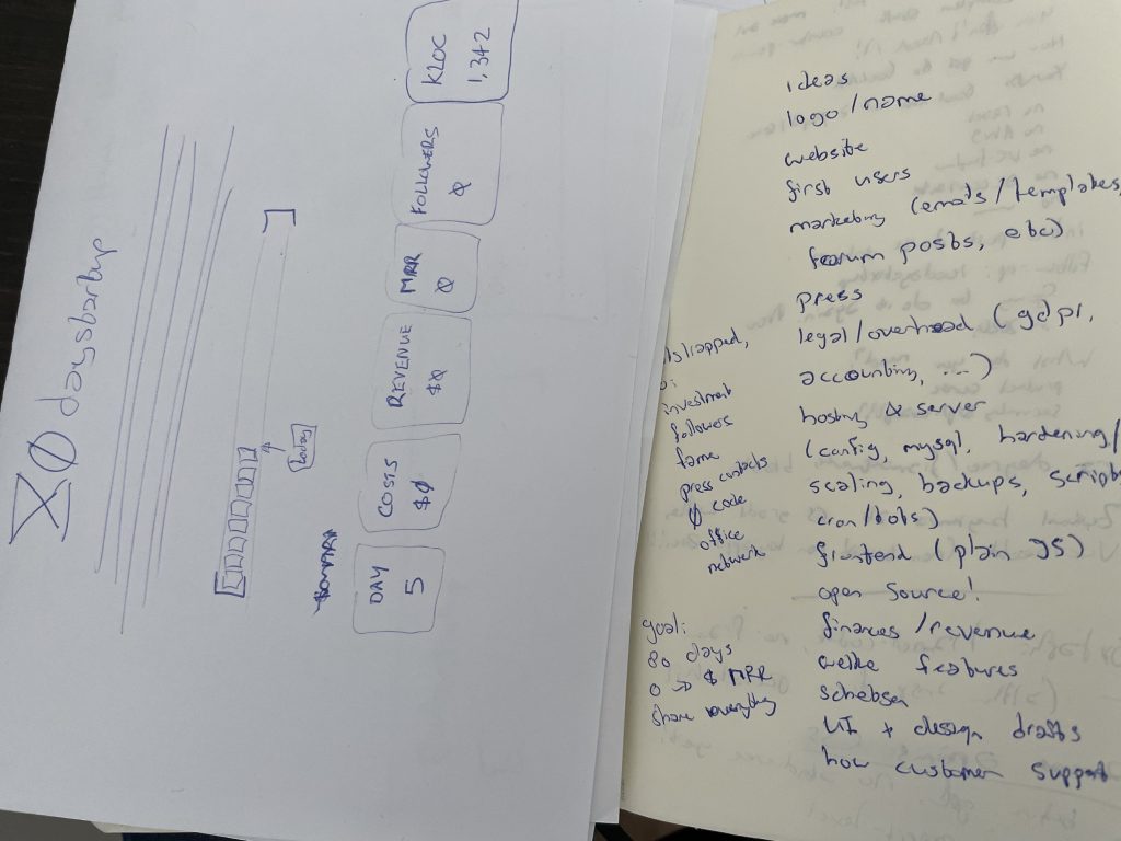
Beach + time is always a great recipe for new ideas: some early sketches I jotted down during a trip in summer
After some doodling, the idea really took shape: there should be 1) a limited time frame for the challenge, 2) we would write update posts every day, 3) we would “open source” everything, and 4) the goal should be a real product with real customers, not just a side-project.
Name and domain
We decided 80 days would be a nice amount of time. In working days, that’s roughly 4 months. Short enough to keep it interesting and challenging but long enough to get some actual work done. So eighty-something. We thought of words like build, maker, product, project, but thought startup would be best. It’s kinda catchy, and also reflects the idea we want to build a real business, not just a demo (and honestly, startups gets more press than projects 😅).
Nobody had claimed the domain yet and we also didn’t find something similar. Lucky break! So we registered 80daystartup.com for around $10. We didn’t have time to work on it for a while, so it’s been sitting there.. until now.
Website
The main function of the 80daystartup site will be to share updates like this about what we’re building (along with some screenshots, videos, embedded tweets, code, and so on).
As tempting as it was to make yet another tool for this, just using WordPress seemed good enough. We did decide to make some sort of own template though, just to make it stand out a bit and we can have different sections for the FAQ, days, topics and so on.
So, step one, design a nice landing page with a logo and visual style for the project. I got started by just coding into a plain HTML file. It’s quick to get some simple design going that way without having to worry about how WordPress themes and templates work yet.
Look & Feel
To design things I usually start by just sketching out some stuff on paper. My initial “feeling” for the site was something 8-bit / retro. Somehow that resonated well with the concept of indie developers for me (possibly from indie games) and the project also has a sort of game/challenge elements to it (time limit, will it succeed?, and so on). Maybe the fact that the name starts with “80s” was another reason.
Logo
For the logo, I was thinking how “80DAYSTARTUP” could be represented by some symbol. So I tried just sketching the “80” part.
The 8 kind of looks like ⧖.Which kind of looks like ⌛️, i.e. an hourglass. And an hourglass fits perfectly with the time-limited element of the project.
It makes sense then to have some pixelart logo to go with the 8-bit/retro theme. I thought of maybe having the hourglass “sand” in patterns of ones and zeros, but that doesn’t really fit with a low-res 8-bit logo (too much detail).

I googled a bit for a retro font to write the 80DAYSTARTUP heading in. I found a font called “Emulogic” but that seemed very old and didn’t really have clear licensing details. I then found there’s a font that looks a lot like it, hosted on Google Fonts (https://fonts.google.com/specimen/Press+Start+2P).

Logo part 2: the hourglass
I wanted to get an hourglass icon in “pixel art” style, but couldn’t really find anything suitable, so I tried to draw something.
After some searching I found a cool pixel editor called aseprite.org, which seems perfect for drawing something up. It’s about $20, which seemed well worth it to create a nice logo.
It took me around 10 attempts and a bit too much time maybe, but eventually got the style I was looking for. I think it looks recognizable as an hourglass but in a similar style as the “8” in the retro font.

Because I needed the logo as a vector image (so it can scale accordingly), I found a “PixelsToSVG” tool (https://cdpn.io/shshaw/debug/XbxvNj). Didn’t even need it: turns out Aseprite can already export to SVG!
index.html
With the logo ready, I started with an empty HTML file, added a heading, and replaced the ‘8’ with the SVG.
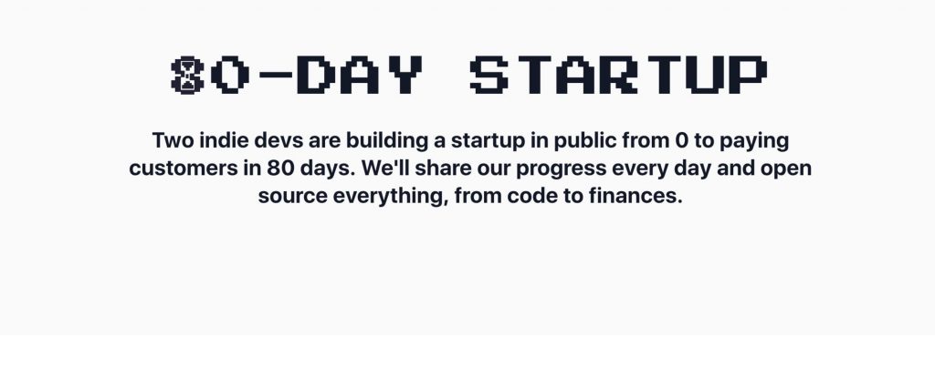
A cool effect I like to color things up a bit is using masks and clip paths. With the background-clip: text option we can give the letters a background from any image. That way we can get an effect similar to giving heading text a gradient color effect, but with more complex textures.
I decided to search Unsplash for a nice colorful texture. I came across a bunch of photos with purple neon lit cityscapes, which has this retro-future feeling to it, so purple seemed like a good fit. Searching for something like “abstract color” I found this image at https://unsplash.com/photos/8CItx_c0CkI:

With the effect below, we get:
h1 {
   text-transform: uppercase;
   font-family: 'Press Start 2P';
   letter-spacing: .1px;
 -webkit-background-clip: text;
   -webkit-text-fill-color: transparent;
   background-clip: text;
 /* https://unsplash.com/photos/8CItx_c0CkI */
   background-image: url(images/bg_texture.jpeg);
   background-position: 0% 20%;
   …
 }
Our hourglass icon didn’t get any background, because it’s not text so the background-clip trick doesn’t work. For SVGs we can use mask-image instead to get the similar effect.

With the logo done, it was time for some more styling to the “hero header”, which is the first part of the site most people will see. Some sort of pixelated pattern sounded like a fitting thing to try. A great resource is http://www.heropatterns.com/, which makes it easy to generate all kinds of pattern, including something blocky/pixelated pattern.
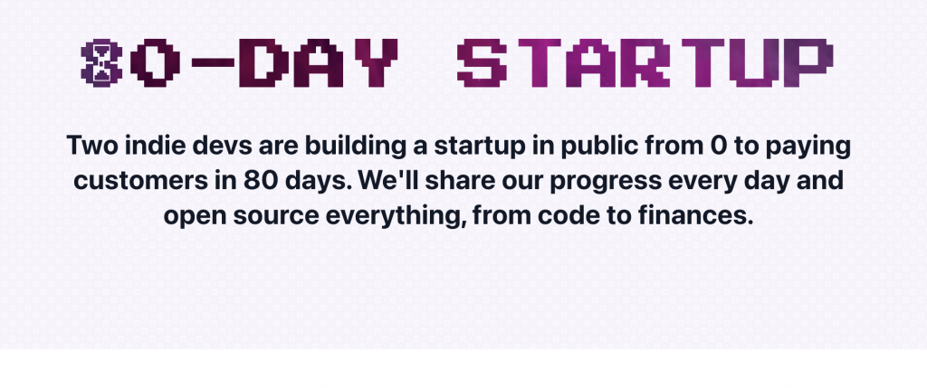
It’s a nice pattern, but I had something more pixel-y in mind, like as if it was drawn by a paintbrush tool, so I drew that in the pixel art editor:
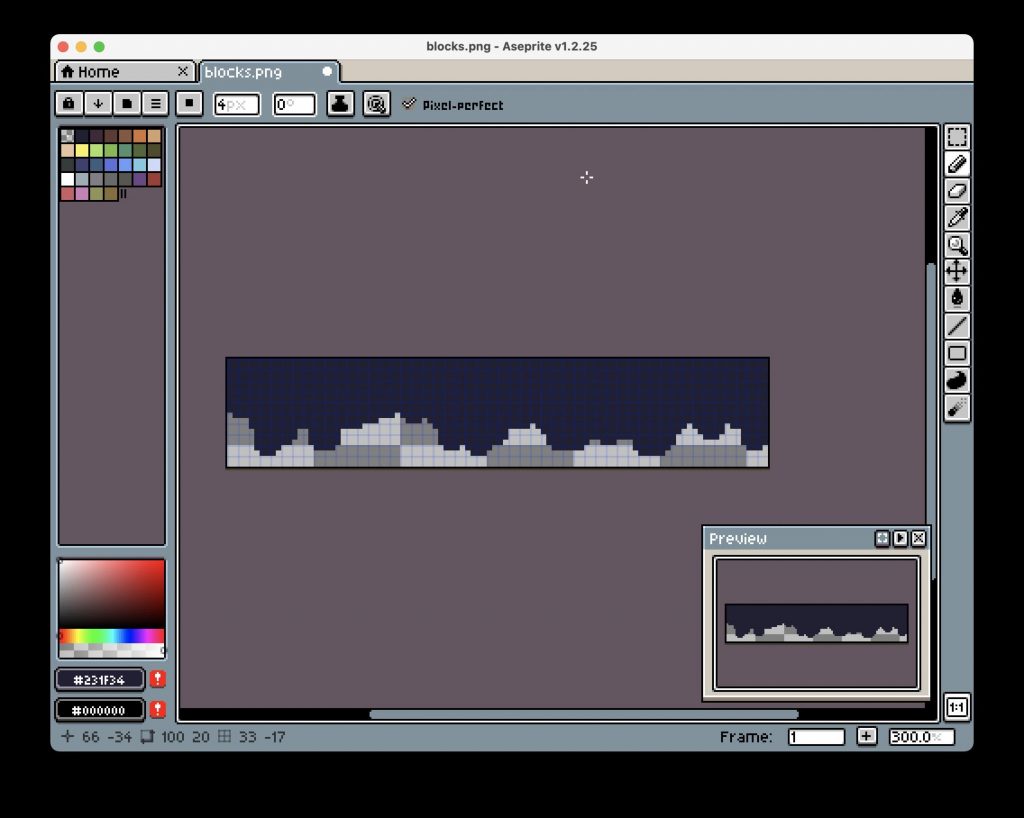
.. and then used it as a mask over the hero element with the pattern background:
-webkit-mask-image: url(blocks.svg);
 mask-image: url(blocks.svg);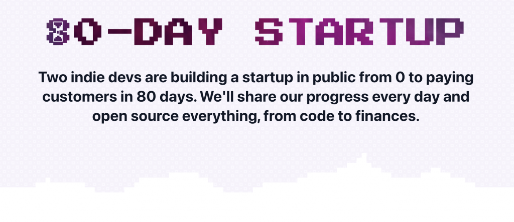
Then I looked into adding a bit of animation to make it more playful. Something with the hourglass being turned over seemed like a good place to start. First, I made the hourglass icon rotate. Instead of a fluent motion, the steps keyword gives it more of a tick-tock clock feeling.
@keyframes rotate {
     100% {
         transform: rotateZ(360deg);
     }
 }
 .icon-hourglass {
     …
     animation: rotate 30s infinite steps(60);
     animation-delay: 0.5s;
 }
Also gave the heading itself a flashy animation by cycling the background:
@keyframes animatedBackground {
     0% { background-position: 0 0%; }
     100% { background-position: -100% 0%; }
 }
 h1 {
     …
 animation: animatedBackground 3s linear alternate infinite;
 }
Logo file
We also needed a .PNG logo file of the end result: a slightly rotated hourglass 8 and the “0daystartup” text together, so we could use it on other pages. One tricky part here is that we need to make sure we get an alpha-transparent background, otherwise the logo file wouldn’t work on backgrounds with different colors (or dark mode).
Safari’s Web Inspector is a great tool for this: simply click Inspect Element on the <h1> tag, right-click on it in the DevTools, and then click Capture Screenshot. Safari will then take a “screenshot” of the node, with an alpha-transparent background (the current Chrome version gives you a background color, so we can’t use that).
Progress bar
Because the idea of the 80-day startup is to post about our progress every day, and then launch on day 80, it sounded like a fun idea to add a progress bar. That way people can see us get closer to our goal, and it’s clear what the idea is. Staying with the retro theme, I had to think about those old-school MS-DOS installers and their progress bars. I loved watching those setup.exe programs as a kid 🙂
Back then they simply used ASCII characters like ▓ and ░ to draw the bar, so why not use those again for that retro look! Another nice thing about drawing the bar this way is that we can make every bar character a link. So we can have 80 characters, and each character will be a link to the entry for that day!
Putting it all together and adding styling for the bar, it looks like this (the arrow I actually “drew” with Mac’s Preview app, because why not).
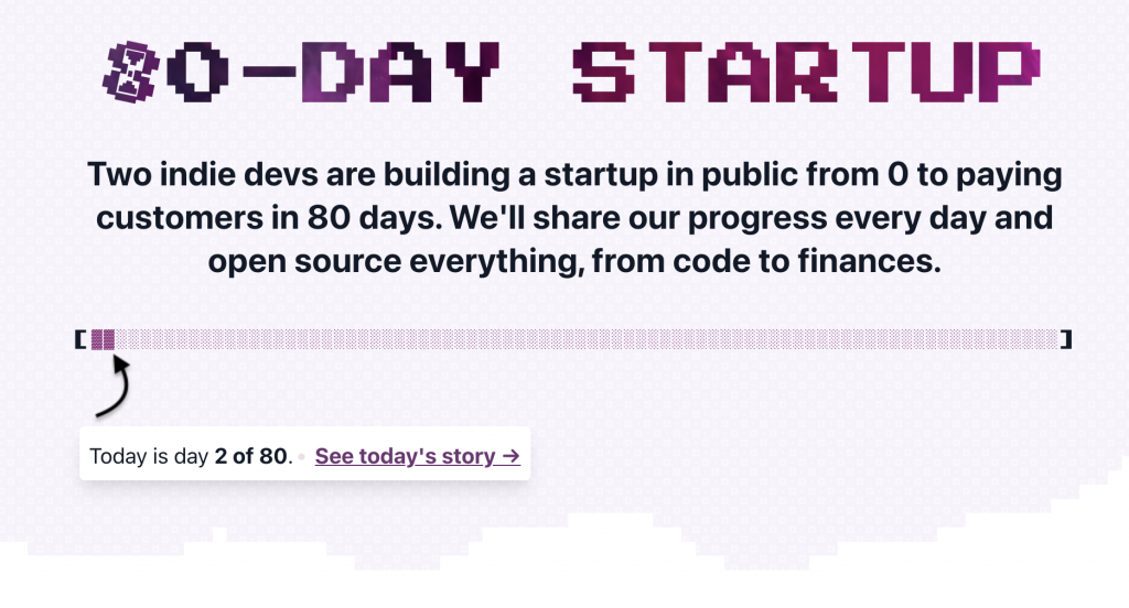
Made the footer in a similar fashion to the elements above. Also added an input + button for the sign up form (which doesn’t do anything yet).
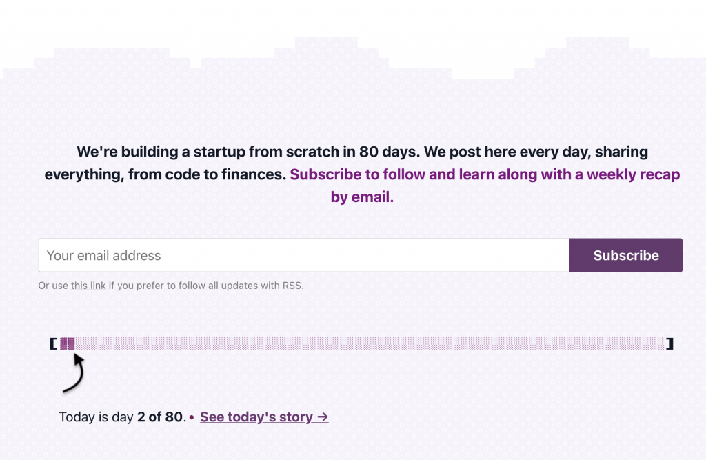
Responsive
The last part to look at was making the design responsive so it looks good on smaller devices. By trying smaller screen sizes with Inspect Element > Toggle device toolbar, most parts already looked good by just using a 100% width. I then took the lazy approach of manually patching a bunch of CSS rules in Inspect Element until it looked good, which was mainly forcing a bit of more height for the hero header, adjusting the font sizes somewhat, and patching the absolutely positioned “info card” on top.
Except for a few lines of CSS, the only part which took a bit more time was getting the progress bar right. We can’t completely size it down, because all individual blocks need to stay large enough to remain clickable/touchable (as each block will link to a day entry). As an alternative, I wanted the progress bar to break in evenly sized lines instead. So instead of 80 blocks on one line, show two lines of 40 block characters, or four lines of 20.
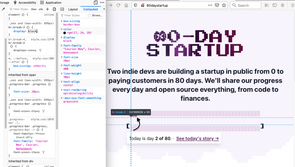
The quick and hacky way without having to introduce a bunch of new containers was to simply add line breaks, which become visible depending on the screen resolution.
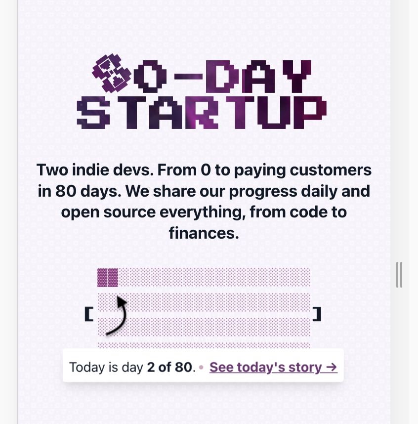
Alright, that’s enough for the design and frontend for now. We’ll look at the (WordPress) backend tomorrow.

