Day 15

~~~~~~~~~~~~~~~~~~~~~~~~~~~~~~~~~~~~~~~~~~~~~~~~~~~~~~~~~~~~~~~~~~~~~~~~~~~~~~~~~~~~~~~~~~~~~~~~~~~~~~~~~~~~~~~~~~~~~~~~~~~~~~~~~~~~
We're building a startup in 80 days in public. Day 15 was on Jan 28 '22. You can find today's entry at Day 67.

Today's posts:

Bootstrapping B2B vs B2C

One of the most important decisions you have to make early on is whether your product is going to be for businesses or for the general public. There are significant advantages and disadvantages to both markets, and in this post I’ll touch on the major differences. You can easily see that the B2C column has more check marks, but that’s deceptive!
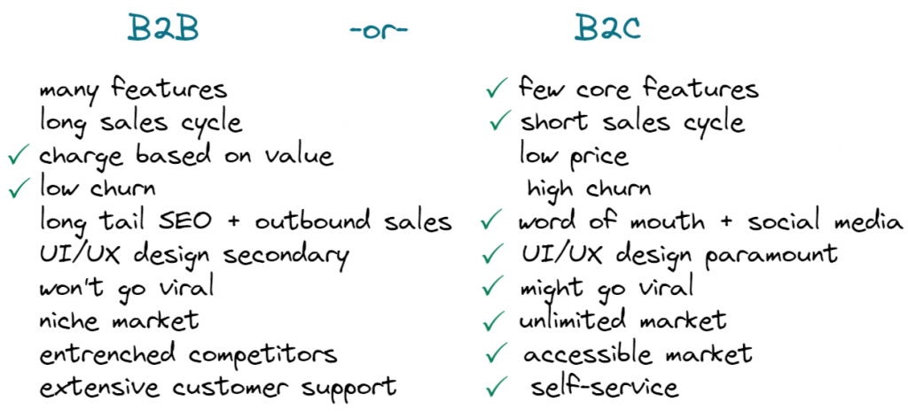
Advantages of consumer apps

With a consumer app you can get to market more quickly because you need less functionality. A consumer app that just does one or two things well can be a hit. Business users demand all sorts of long tail features. Think of single sign-on, permissions, audit features, integrations with other products. These are not features that make your product stand out in the market, these are just features you have to build to get and keep customers. This clearly favors the B2C app.

Consumer apps also sell easily. When you sell to other businesses it can take forever. Accounts payable. Requests for quote. Oh wait, you first need approval from the boss. Phone support. Product demos. Sales is a process and it’s real work.

If you make a cool consumer app everybody wants to try it. Consumer apps become viral hits in a way CRM software never does. Making software that is used by millions of people around the globe is a dream of many software developers, myself included. Happy customers tell their friends. That means that you can have explosive growth manifest from nothing. If you sell business software growth means hiring sales staff.

Consumer apps that look and work better tend to win. That means if you enjoy creating software that works really well you get rewarded for that in the consumer space. Business customers don’t care that much. Either your product saves or makes them money but they won’t care much beyond that. Tragic, but true.

Customer support for consumer apps is also a lot simpler. You can have some kind of self-service forum and some FAQ pages. You can automate almost everything for consumer apps.

That’s a long list of things that favor consumer apps. So what do B2B apps have going for them?

Advantages of business apps

Business software has two major advantages, and those two make up for all the downsides. You can easily charge money for B2B software. This difference is enormous. Businesses have effectively unlimited budgets if you can demonstrate your software is worth it. One B2B sale can bring in the same revenue as 100 or 1000 consumer sales. Would you rather provide customer support for one customer or for 1000? Easy choice.

In addition, your business customers will keep using your software for 5 or 10 years. More if your product is really sticky. When you sell consumer software you are constantly fighting against churn and new developments in the market. For B2B software boring is good. I put the UI/UX checkbox in the B2C column because B2C software is more meritocratic, and that’s good if you want to break into a new market. However, once you’re an established business this benefit turns into a disadvantage for you and an advantage for new up-and-comers.

The reality is that business software is where the real money is. Consumer software is all chasing after the same consumer dollars. It’s hard to compete with the free or nearly free offerings provided by the megacompanies we all know. In addition you’re going to compete with venture backed startups that will happily give away their products for free to get a dominant position in the market. Despite those challenges your consumer app needs to find a massive audience, think millions of users. That requires a small miracle.

The bottom line is that when you write B2B software you enter a far more forgiving market where there are plenty of customers eager to pay real money. If you decide to write consumer software regardless, you better have a few aces up your sleeve.

Some landing page dos and don’ts

As I’m working on the first landing page version for Thymer, I thought I’d write a bit about some observations about what (not) to include.

The H1

The H1, i.e. the main title, named after the <h1> HTML element for a large title. This is the elevator pitch when you only have one floor to explain. You have 5 seconds to prevent someone from closing the browser tab. What are you doing?

You need to come up with a way to explain your product in just a few words. No need to cram all the details in one sentence, but just say what it is so someone who is in your target audience might care enough about it not to close their browser.

❌ Use fuzzy language, such as “We deliver results and synergize your business”. I have no idea what that even means. Generic things like “Work better together” or “Market faster” sound more specific (oh it’s about productivity or it’s about marketing!), but that still mostly works if you’re a big startup. Actually I’m quite sure it doesn’t work, but at a certain size it just doesn’t really matter any more what your H1 is. Be more specific than that.
✅ Use your own voice. Read the title out loud. If that sounds super awkward and you wouldn’t use that in a conversation to explain it to a friend, try picking something which sounds more… human.

A good call (to action)

The call to action or CTA is the main action you want the visitor of the page to take. Something like “start a trial” or “sign up for the mailing list”.

✅ Make it easy to find, and prevent too many distractions pointing the user somewhere else.
✅ Make it easy to do. If you just want to collect an email address for users who are interested in your product, don’t create a link “sign up” to a new page where users need to fill out a form. Add an input with a button next to it on the page and remove all the friction.
✅ Think about the simplest action you really need. If you want people to sign up for your service, don’t make it “Contact us”, let them try the service!

Answer concerns

Ideally you should answer any concerns a visitor/potential customer might have before they even have time to worry about it.

When you’ve bought something online (either a product or service) from a company you didn’t order with before, you have probably tried to do a bit of research about them. Can I trust them? Will they actually ship the product? Can I trust them with my data?

Don’t make people search for this. They will want to know the answer anyway, and if you don’t provide it, they’ll leave your site and search for it (and might not come back). Especially in a market which is as impersonal as software, it helps to know the faces behind the product.

Depending on the stage of your product, the questions users might have are different. The security features of your data center are not relevant when collecting email addresses for a prototype, but you need to include those details when you’re selling to larger companies. Think about the kind of person your visitor is. What are they thinking, what are their concerns? Answer them before they worry about it.

Bonus don’ts

Ending with a few don’ts which I’m personally not a fan of, so I’m trying to convince people to stop these 🙂

❌ Tracking! Nobody likes to be tracked. And thanks to GDPR and friends, tracking now also has a real cost (next to making your site slow!). You can simply collect some simple anonymized traffic statistics using privacy-first analytics services.
❌ Obsessive A/B testing. Related to the previous point, but if you don’t have large amounts of traffics, it’s just not needed. It won’t be statistically relevant.
Cookie banners. Just make it stop! Luckily, if you don’t track, you don’t need them 🙂


← Previous day (day 14)Next day (day 16) →


You can follow us on Twitter @jdvhouten and @wcools and look for #80daystartup

Read more

Work/new-life balance
Durable tech
Dogfooding
Early user feedback
Spending time to save time
Products want to be platforms
Always be launching
Enjoying the journey
Work-life balance
Recap @ Day 59
Perils of caching
Desktop-first
Making sense of contradictions
Trust signals
DIY javascript error logging
Taxes: an automation story
Magical thinking
Start small
High conviction, low conviction
Most deals fail

Post archive