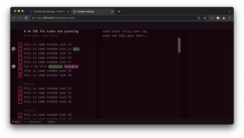
Worked on a few mockups today, trying out different layouts, color themes and components in CSS and HTML. The goal is to eventually settle on a first version of the design for the app, which we can use as a preview for the landing/marketing page. While designing all the different components, we hopefully also get a better idea of the exact details of how the app should work, before we actually build all those parts.
All in all not too much to show today. When I try out different designs I usually delete more than I save, that’s part of the process (we’ll upload some more of the deleted parts later as well to get an idea of how the design has progressed).

Example of a very rough sketch to test out some layouts in HTML

