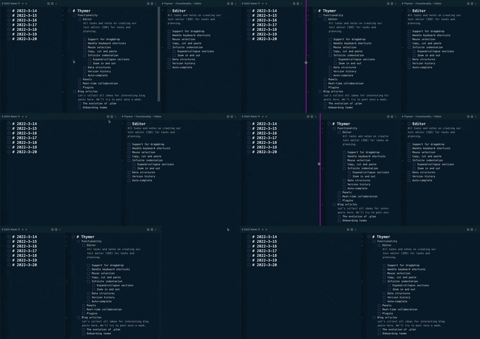
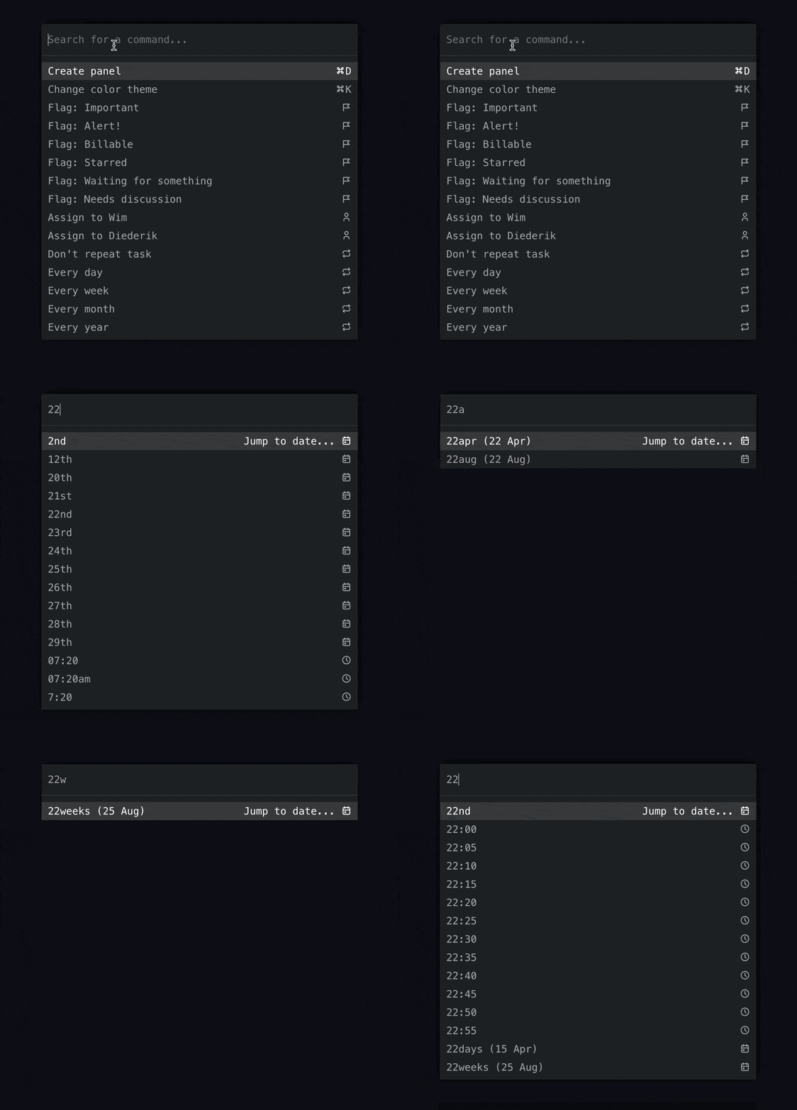
We’ve been working on a bunch more UI components the past two weeks. They’re all part of the core for the MVP for Thymer, but one thing we won’t have time to look at before the launch is making these work on smaller devices like phones.
Part of the process of building an MVP is that we inevitably have to say no to things we really care about. In our case one such aspect is starting with just one platform: the desktop (specifically the web). The first version will be unapologetically desktop-only.
The USP of Thymer is that it works like an editor/IDE. As planning and brainstorming are creative processes, we think being able to simply type, select, copy/paste and change your ideas or schedule as if it was text is a big boost in productivity.
We want to solve this one problem really well. In our case, the UI really matters. If we decide to build something for desktop, iPhones, iPads, Android watches etc etc from the get-go however, not only will we take forever to launch, but we’ll need to take shortcuts at some point to launch at all.
One such approach of building for all platforms at the same time is by building something which is mobile-first. But mobile-first is all-the-rest-last. Instead of coming up with the solution we think is best and then building that, we’ll end up shoehorning a toy UI onto the desktop just to match the constraints of a mobile device.
Of course not having a mobile app from day one is far from ideal. We all work on the road from time to time on our mobile phones. Yet a lot of the real creative work we’re building Thymer for gets done behind a laptop or something else with a keyboard and mouse/touchpad. To solve that problem really well, we think it’s worth delaying some sort of solution to work on a mobile for a while.
So we have the choice: hack something mediocre together for the launch as quickly as possible that works on all platforms, but is perfect for none. Or build exactly what we envision, but start with one platform.
These choices are hard to make when you need to decide what to launch with. In the end it’s better to start with making something smaller in scope but which you think is really great. We need those initial fans who really like the solution we’re building to get off the ground. With some cross-platform responsive app approach we can’t build the kind of editor we want, and it will just look like all the rest.
Once we know people really like the concept, we can look into options to make it easier to work on the road. Because of the way the app works in the backend, it will be quite easy to add offline support so it’s no problem to keep working on your laptop on a long flight. As for mobile, we’ll still have to look into that later.
Because we want to create the best experience we can for desktop without the constraints of it needing to work on mobile, it will most likely be a completely separate app (although we can reuse the API/backend of course). That way we can design the other way around, too: come up with the best possible user interface controls for mobile, without having to stick to desktop concepts. Plus this might make it easier for us to outsource work on the app for a specific platform if we want to go that route.
We also kind of like the idea of a “companion app”. A smaller version specifically designed for mobile use. Rather than cloning every exact feature from the desktop version for mobile, we add just the things you might need most on the road and make those very easy to use. Like looking something up or quickly jotting a thought down which you can then work on once you’re in front of a laptop again.
But all of that is for later. We first want to focus on building something great for just one platform and see if people like the idea in the first place.


