A quick update entry again on how the work on the user interface mockups is progressing. I spent most of the day pushing pixels again: designing and redesigning.
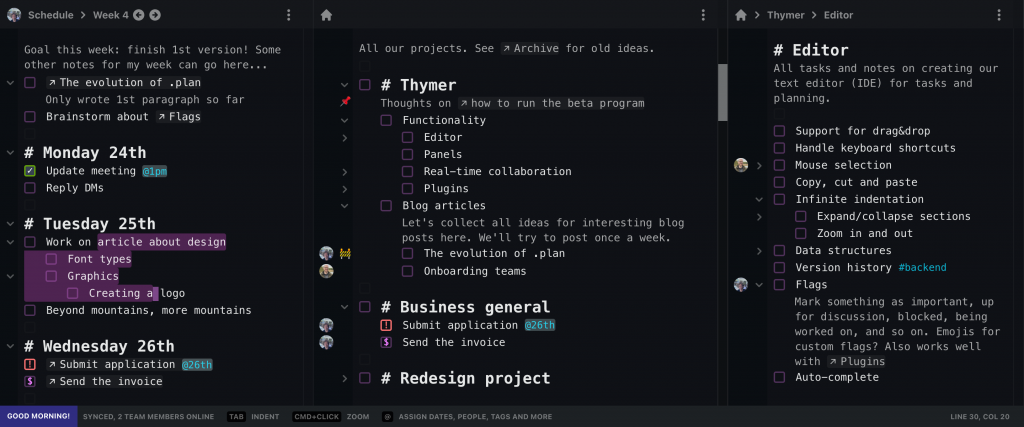
Obviously it’s still just a starting point, and a demo screenshot won’t be able to fully show what the product can do anyway (plus we’ll still need to figure out a lot of parts as we build it). For now, we only need to give a general impression of how the product works to support the pitch for our solution and as a starting point for the implementation.
Some elements which are visible now are the “real editor” aspect (selection, cursor), having multiple panels, mixing notes and tasks, task flags, linking, scheduling and assigning, indentation.

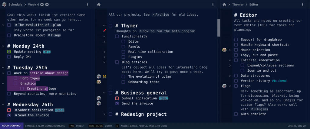
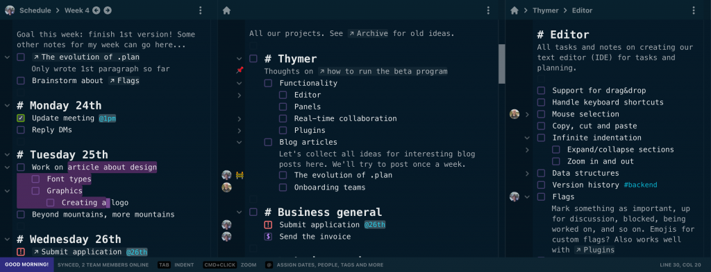
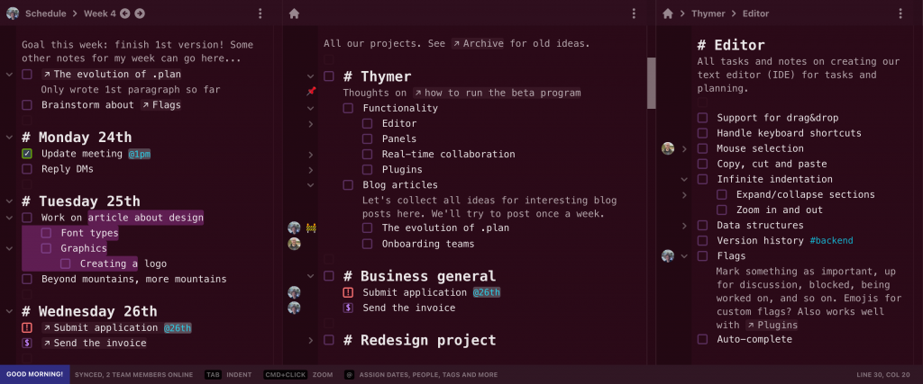
We like the idea of personal computing to be reflected in software. Especially workflows related to todos, thoughts and planning are very personal, so we’ll also allow for custom color themes, plugins and so on. As an example I tried styling the elements in some different colors.


Hopefully we get to finish the landing page tomorrow!

